The Asiana Airlines logo reflects the brand’s direction of growth. Reaching for the sky, the company guarantees passengers safety and reliability, adhering to the highest service standards for long-haul and regional flights.
Asiana Airlines: Brand overview
One of the top airlines in South Korea, Asiana Airlines was founded as a private company in February 1988 to rival Korean Air, the country’s flag carrier, and offer superior services on both domestic and international routes.
On December 23, 1988, the airline operated its first commercial flight, linking Seoul and Busan. Approximately 400 people worked for the company when it started operating two Boeing 737 planes.
The airline started operating international routes in 1990, launching operations from Seoul to Tokyo and Hong Kong. At this point, its global expansion commenced. The corporation reaffirmed its dedication to high service quality and safety standards in 1991 by joining the International Air Transport Association (IATA).
The company aggressively increased the number of destinations it served in the United States, Europe, and Asia during the 1990s. The airline started operating flights to Los Angeles, its first North American destination, in 1993. By introducing flights to Sydney, Australia, in 1994, it increased its footprint throughout the Asia-Pacific area.
This company was the first airline from South Korea to issue shares on the Korea Stock Exchange in 1999. This allowed the company to raise more money for expansion and fleet upgrades.
The airline kept growing its network of foreign routes in the early 2000s, emphasizing China. It began operating flights to Beijing and Shanghai in 2002, and in the following years, it added new routes to other Chinese cities.
In 2003, the airline became the fourteenth member of the international airline association Star Alliance. This allowed it to provide its customers with a comprehensive range of benefits and services for frequent travelers and access to a vast route network that covers over 1,300 destinations globally.
The company started a massive fleet renewal and expansion effort in the mid-2000s. In 2005, the airline became one of the first users of the newest wide-body aircraft when it ordered eight Airbus A330 and nine Airbus A350 aircraft. The largest passenger aircraft in the world, the Airbus A380, was delivered to the company in 2007, and it started operations in Los Angeles, New York, and Frankfurt.
In the 2010s, the airline added new destinations in Europe, the Middle East, and Africa as part of its ongoing route network expansion. Aircraft began operating in Istanbul, Turkey, in 2011 and Cairo, Egypt, in 2012. This company was the first South Korean carrier to offer regular flights to Rome in 2014 regularly.
As the airline celebrated its 30th anniversary in 2018, it confirmed its position as one of the top airlines in Asia and the world. By this point, the airline had over 80 contemporary aircraft in service and was flying to over 90 destinations across 24 countries.
However, the company experienced financial issues in 2019. Elevated fuel costs, fierce rivalry, and a deceleration in the local economy compelled the enterprise to undertake actions aimed at restructuring its enterprise and enhancing operational efficacy.
Plans to acquire the airline by Korean Air, a significant South Korean airline, were revealed that same year. This government-approved acquisition was anticipated to establish the biggest airline in South Korea and one of the biggest globally.
The two airlines are anticipated to merge in 2023 to form a single, united carrier operating under the Korean Air brand. With a fleet of more than 200 aircraft and a broad route network covering many places worldwide, the combined airline will become the largest in South Korea and among the largest in the world.
The brand will vanish upon the completion of the merger, but the airline’s history—including its dedication to safety, innovation, and high-quality service—will remain within the new airline. The company’s accomplishments and expertise will be crucial for the upcoming aviation behemoth.
Meaning and History
What is Asiana Airlines?
It is a major South Korean airline headquartered in Seoul. It operates an extensive network of international and domestic flights, serving destinations in Asia, Europe, North America, and Oceania. Known for its service, it offers a variety of service classes, including economy, business, and first class, focusing on passenger comfort and in-flight amenities. The airline is known for its modern fleet and is a member of Star Alliance.
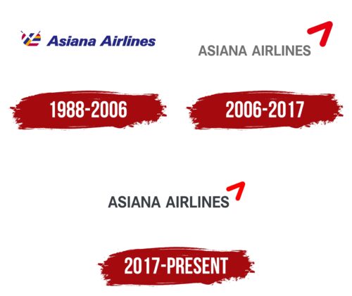
1988 – 2006
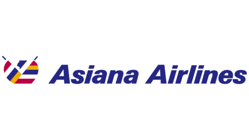
From 1988 to 2006, Asiana Airlines used an eye-catching logo that was unique and deeply rooted in Korean culture and philosophy. The logo’s blue letters of the company’s name conveyed a sense of calm and confidence, reflecting the airline’s reliability and professionalism.
The most noticeable element of the logo is the depiction of a person in a bowing pose with arms raised towards the sky. This symbol carries deep cultural significance. The person is dressed in clothing adorned with yellow, red, blue, and white stripes, each color having a special meaning in the Korean Obangsaek tradition, representing the five directions and elements of the world.
Blue symbolizes the east, and the wood element is associated with growth and development. Red represents the south and fire, signifying strength and energy. Yellow corresponds to the center and earth, embodying stability and fertility. White is associated with the West and metal, symbolizing purity and strength. These colors indicate the geographical coverage of the company’s flights across the country and the world and reflect the philosophy of harmony and balance, which is crucial for the well-being and longevity of any enterprise.
The Asiana Airlines logo served as a visual representation of the brand and a talisman, blessing and protecting the company and its passengers. This logo vividly reflects Korean cultural identity and philosophy, making it significant in commercial and cultural contexts.
2006 – 2017
The updated logo of Asiana Airlines represents a significant visual transformation, symbolizing a new phase in the company’s development. The logo design reflects modernity, dynamism, and the airline’s commitment to innovation.
The main text of the logo is rendered in thin uppercase letters of light gray. This color choice is deliberate: gray symbolizes the strength and reliability of metal, suggesting the durability and longevity of Asiana Airlines’ technologies and their focus on using advanced technological solutions in aviation construction and service.
At the top right of the logo, there is a noticeable red element resembling a checkmark or a stylized bird soaring upwards. This symbol embodies dynamism and speed, key attributes associated with the aviation industry. Red is traditionally used to attract attention and express passion and energy, highlighting Asiana Airlines’ ambition to expand its presence in global aviation.
The letters in the company name stretch upward, creating a visual sense of ascent and growth. This design technique conveys the company’s aspiration for continuous development and progress and reaching new heights in service quality and customer satisfaction.
2017 – today
The company’s redesigned logo features darker and larger letters, enhancing its visual impact and making the logo more substantial and noticeable. These changes strengthen the brand’s visual presence, underscoring its stability and authority in the market.
The red bird in the logo is now smaller, contributing to a more balanced and harmonious image. This small but bright image is a focal point that draws attention without dominating the overall design. This feature adds elegance and lightness to the logo, emphasizing the company’s dynamism and pursuit of progress.
The minimalist design incorporates metallic shades, making the logo modern and stylish. The metallic effect mirrors the company’s focus on innovation and technology while lending a sense of luxury and high quality to the overall look.
FAQ
What is Asiana Airlines known for?
One of the leading airlines in South Korea, it is known for its comprehensive service. It offers domestic and international flights, ensuring high safety standards through aircraft repair and maintenance services. The company provides efficient ground operations and IT support. Customer service is a priority, and the airline offers excellent onboard service, quality food, comfortable seats, and various entertainment programs. The company has a good safety record due to preventive maintenance and strict adherence to international standards.
What is the motto of Asiana Airlines?
Asiana Airlines’ motto, “Beautiful people create a beautiful world,” reflects its good service. This approach aims to improve the world by making every journey enjoyable and filled with kindness. The company focuses on customer service and creating a welcoming environment for everyone. This motto motivates the airline to provide everyone with a memorable and enjoyable travel experience.
Is Asiana a 5-star airline?
It has a 5-star rating from SKYTRAX—a mark of excellence maintained for 17 years. SKYTRAX is known for its thorough assessment of airline service quality in the air and on the ground.
Does Korean Air own Asiana?
Yes, Korean Air owns Asiana Airlines. According to a Reuters report, the European Union approved the acquisition on February 13. Korean Air made major concessions to win regulatory approval, such as selling Asiana Airlines’ cargo division and transferring flight routes to four European cities to another airline. Korean Air acquired the airline to strengthen its market position and expand globally. The merger aims to make both companies more competitive and efficient as they face growing challenges in the airline industry.
