


![]() Asking Alexandria Logo PNG
Asking Alexandria Logo PNG
The Asking Alexandria logo is original and reflects the brand’s main principle, “music for people from people.” The textual sign symbolizes the confidence in protection from negative consequences that the band’s creativity instills in listeners.
Asking Alexandria traces back to Ben Bruce, born in London and raised in Dubai from age six. He picked up an electric guitar at 12, influenced by Eric Clapton, B.B. King, and Gary Moore. In 2003, he launched a band that went through names such as Amongst Us and End of Reason before becoming Asking Alexandria in 2006, a name he chose for its human tone.
The Dubai lineup released the EP Tomorrow. Hope. Goodbye in 2006 and the independent album The Irony of Your Perfection in 2007. At 17, Bruce returned to Nottingham, and the original members eventually left. He rebuilt the group from scratch while keeping the name.
Danny Worsnop joined as vocalist after meeting Bruce on MySpace. The lineup expanded with James Cassells, Cameron Liddell, Sam Bettley, and Ryan Binns. This version gained traction on the UK underground circuit through constant touring.
In 2009, the band signed with Sumerian Records and released Stand Up and Scream, combining metalcore with electronic elements and alternating between clean and growled vocals. The sound set them apart from peers like Bring Me the Horizon. The follow-up, Reckless & Relentless, reached No. 9 on the Billboard charts in 2011.
After Worsnop’s vocal injury in New York in 2012, the band continued recording. From Death to Destiny in 2013 shifted toward a more restrained style. Worsnop left in 2015 to focus on We Are Harlot. Denis Stoff from Make Me Famous joined The Black in 2016 but exited later that year.
Worsnop returned in late 2016, and the band released Asking Alexandria in 2017, moving toward arena rock and entering the Billboard 200. Later albums included Like a House on Fire in 2020, See What’s on the Inside in 2021, and Where Do We Go from Here? in 2023.
On January 19, 2024, Bruce announced his departure to focus on family. The group continued as a four-piece with Worsnop, Liddell, Bettley, and Cassells.
Meaning and History
![]()
The band’s emblem features its name, which dates back to 2006 and was retained after the 2008 relocation. Ben Bruce himself came up with it while living in the capital of the United Arab Emirates. He used a common human name, in line with the concept of “people for people.”
The words “Asking” and “Alexandria” share the common letter “A.” It occupies two lines and looks original due to its elongated strokes. The font of the inscription is unique: all characters are wide, uneven, and sans serif. To emphasize visual individuality, the logo looks like a frame from an old movie. Grain, noise, and stripes that distort the image create a retro effect.
What is Asking Alexandria?
Asking Alexandria is a British metalcore band formed in 2008. They perform in genres such as electropunk, metalcore, and post-hardcore. Their style combines aggressive vocals, complex guitar riffs, fast percussion, and electronic elements. The band has released several albums, including “From Death to Destiny,” “Reckless & Relentless,” and “Stand Up and Scream.”
The emblem appears on album covers released between 2009 and 2013. The Black (2016) and Asking Alexandria (2017) collections depict a completely different graphic sign. In those cases, the band’s name is written in small letters of the same size. The font is classic with serifs. Large spaces separate the characters.
There is also another logo: two letters “A” joined to form the letter “M.” This version has never been used for studio album design.
Font and Colors
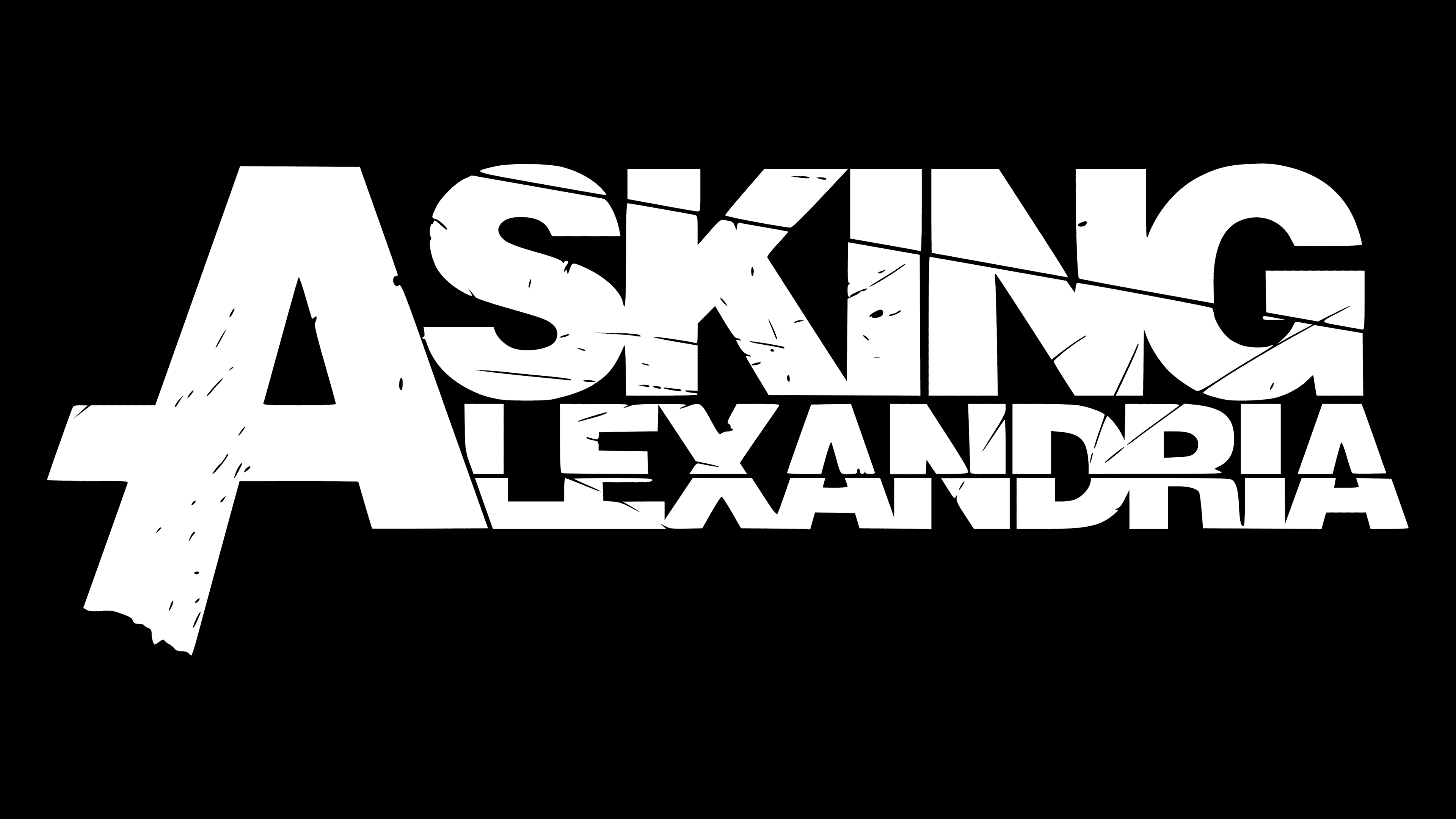
The musicians approved a logo font resembling Helvetica. They chose it for its straight lines and the confidence it instills. The wide letters resemble an unbreakable wall behind which one can hide from the negative circumstances of the external world. Both words share the common letter “A,” giving the emblem durability, integrity, and unity of ideas.

The color palette was chosen to be as simple as possible, monochromatic. Depending on the situation and location, it can be colored in three combinations: ash on charcoal, black on white, and, like a negative on photographic film, white on black.