The Atalanta logo speaks of unchanging quality and tradition inherited through the decades. The emblem predicts the revival of the old style and shows a combination of beauty and functionality. The logo’s balance and harmony indicate that the owner plans to reach the same heights and prosperity again. The Atalanta Motors symbol embodies a once-famous brand’s revival and new ascent.
Atalanta: Brand overview
Atalanta is a British manufacturer of expensive handcrafted sports cars that first opened in 1936 and resurrected in 2011. The Atalanta logo can be seen on 22 vintage cars from the early 20th century and dozens of more modern versions.
Modern Atalanta Motors Ltd is located in Oxfordshire and produces luxury cars to order. One model in the price list can be transformed according to the customer’s request.
Meaning and History
The company logo is simple and concise. It conveys the concern’s amazing history, stretching back years, and tells about the brand’s two births.
What is Atalanta?
It is a British manufacturer of expensive handcrafted sports cars. Known for their individual design and high-quality craftsmanship, the cars combine classic styling with modern technical solutions. The brand continues the tradition of creating luxurious and exclusive cars that appeal to enthusiasts who value performance and elegance.
Old
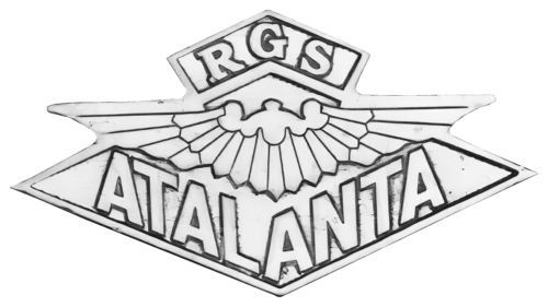
The logo is related to the Atalanta car, produced in the 1930s by Atalanta Motors. The emblem from that period did not survive because only 20 cars were made.
The current symbol is post-war and associated with the company RGS Atalanta. The letters RGS at the top of the emblem represent the name of the entrepreneur who revived the brand, Richard Gaylard Shattock.
The diamond at the base of the image symbolizes a commitment to leadership, meticulous attention to detail, and flawless execution. The vehicles were assembled using powerful engines from leading manufacturers such as Ford and Jaguar, which gave the cars durability and excellent performance.
The emblem is adorned with a symbol of outspread wings. The company’s cars seem to fly along the road, capturing the sensation of breezy travel. Thanks to Atalanta Motors, it feels like one has gained the freedom of flight.
The name is divided into two parts by the angle of the diamond, creating an unusual appearance. Atalanta translates to “fleet-footed runner,” a choice that emphasizes the speed of the cars, which were initially created as sports vehicles.
New
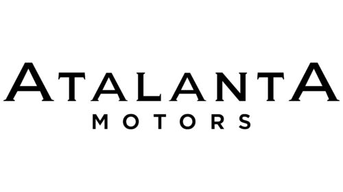
The word Atalanta occupies a central position. The company’s name and the car’s brand were chosen in honor of the Greek goddess of the hunt. Her main features were endurance, speed, and beauty combined with machines.
The first and last letters of the logo are capitalized. They point to two firms with the same name but different founders.
In 1936, three English engineers in the county of Middlesex opened a new company to produce ultra-modern and fast sports cars. They developed two main models: the engine of one of the engineers, Albert Gough (for 78 and 98 horsepower), and the V-12 Lincoln-Zephyr (112 hp). On the best steel chassis of the time, cars were assembled for 2 and 4 passengers, with an open and closed top. The first capital letter of the emblem represents the company from Middlesex.
Before the war, a little more than 20 cars were sold. This was followed by a long series of changes in the type of activity, which is indicated on the logo in lowercase letters “talant.” Here, military equipment, pumps, and machines of various quality and configurations are produced.
In 2011, a group of enthusiasts led by motorist Martyn Corfield decided to revive the company’s legendary cars and glory. They released an improved retro version of the Sports Tourer using modern materials. The second capital letter speaks of the Martyn Corfield enterprise.
So, the logo showed the company’s entire history, from Atalanta in 1936 to Atalanta in 2011—smooth flow from the first firm to the last.
Below the name, the word Motors is added in the center, in smaller letters. It makes the inscription symmetrical. The composition resembles the image of a car with two raised wings above the wheels.
Font and Colors
The main color is black. It conveys the image of a brand that has stood the test of time and demonstrates high value and durability.
Biondi Book font. The letters of the inscription are smooth, with smooth roundings and small serifs, organically protruding at the ends of the lines. The composition embodies all brand cars’ harmony, balance, and streamlining characteristics. The details for each are 90% handmade. The most progressive materials and technical solutions are taken.


