The Atlassian logo is strong and reliable. The emblem expresses the idea of support and foundation that the company provides to other developers. In the emblem are growth and the constant expansion of the portfolio, which has one goal – to supply IT professionals with a working distribution.
Atlassian: Brand overview
| Founded: | 2002 |
| Founder: | Mike Cannon-Brookes, Scott Farquhar |
| Headquarters: | Sydney, New South Wales, Australia |
| Website: | atlassian.com |
Atlassian is an Australian software development company that solves programming problems. Its products generate a net profit of $614 million. The company employs around 9,000 staff who serve approximately 240,000 clients in 190 countries. The developer has opened central offices in London, Sydney, and San Francisco and has representations in 13 countries.
Meaning and History
The company has a well-thought-out, harmonious identity that has undergone consecutive transformations with each acquisition and addition of new products. The visual identity is united by the overall idea of myths, with the main character being a strongman and titan appointed to support the sky. The theme combines the name, logo, and brand positioning. The hero’s image runs through all the symbols. The emblem instills confidence in users: they will never be left alone with their problems.
What is Atlassian?
An Australian developer focused on helping programmers. Its arsenal includes software and services such as Bamboo, HipChat, Clover, Crucible, Trello, and Jira for bug detection and collaborative code work. Ten million followers use the products monthly.
2002 – 2008
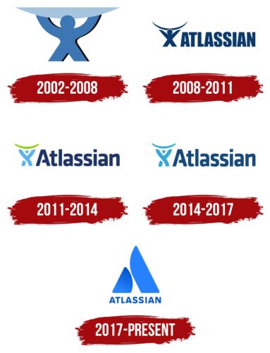
The first brand logo consists of a schematic image of a person lifting a heavy object above their head. The emblem represents Atlas – the hero of Greek mythology in whose honor the company is named.
Just as the titan holds up the celestial sphere, so does the company support the fundamental process of the network – programming. Without successful code writing, there would be no internet. The company is committed to providing IT workers with maximum support to help them cope with tasks.
The drawing is understood in any language, which is important for establishing in the minds of users the connection between the image and the firm.
2008 – 2011
First and foremost, there’s a human figure holding the Earth—in this case, a cable for internet connection. The Titan is easily recognizable because it has distinct arms, legs, and a head, although it resembles an “X.” The drawing was reduced to the size of the adjacent inscription. The company’s name appeared on the logo for the first time during this period. It occupied a single line and was stretched horizontally, resembling a solid fence capable of protecting against undesirable situations, perfectly aligning with the brand concept. The font was uppercase, monolithic, sans-serif, and bold. Block-style letters contained both angles and curves, providing a well-balanced look.
2011 – 2014
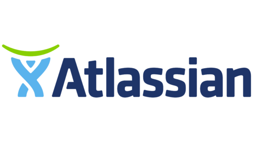
After the redesign, the Atlassian logo took on a new appearance: it became simpler and less corporate. The most significant change occurred in the Titan figure. The resemblance to an “X” was left behind—a precise stylization emerged of a human with arms extended upwards. The symbol consisted of three fragments: an inverted triangle, a slightly bent trapezoid, and a structure resembling the letter “y.” Together, they formed Atlas: his head, torso, arms, and legs. Above him was an inverted green bracket symbolizing digital technologies and virtual space.
The inscription used a soft sans-serif font with rounded glyphs. None had angles—even the square above the “i.” The first letter was particularly distinctive: it was uppercase, with a third of its crossbar cut off, preventing it from reaching the opposite side.
2014 – 2017
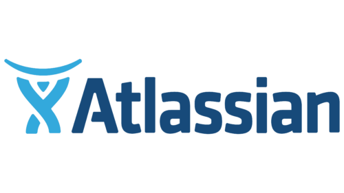
Designers revisited the color scheme of the emblem, switching from a dark shade of blue to a lighter one. This change only affected the inscription. The Titan figure remained blue. The arc he held above his head was painted the same color.
2017 – today
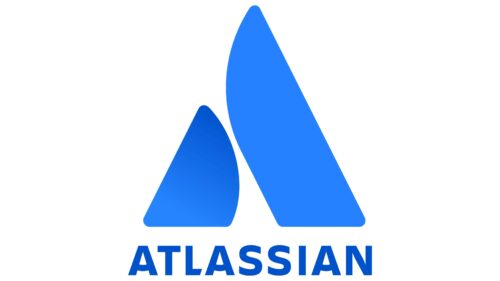
The new logo consists of a triangular image and the Atlassian inscription.
The symbol is formed from two separate blue constructions, reminiscent of:
- Hands raised to the sky. The technique returns the viewer to the theme of supporting the celestial sphere.
- A pyramid. Man-made evidence of human greatness.
- A simplified letter A, the first letter in the company’s name.
The figure aspires upward, conveying the developer’s ambitions. The idea of leadership is embodied in the constant acquisition of new products and their integration into the package offering. Gradually, the company has fewer and fewer competitors, and, according to the plan, only it will remain at the top.
Two large blocks convey the weight and complexity of the task. It involves two sides working together: IT workers and Atlassian, which acts as a support.
The name consists of two parts: “Atlas” refers to the Greek mythological hero, and “ian” is a suffix indicating belonging. By choosing this name, the company shows that it belongs to the Titans of Atlas. The name serves as another way to emphasize the strength of support provided to programmers.
Font and Colors
The logo features a blue color typical for computer companies. In this niche, it is associated with logic, technology, and programming, complementing the image of a developer. The light shade touches on themes of the sky, dreams, and aspirations toward the sun, supporting the story of the Greek giant. The company believes that the internet contributes to the development of civilization and dreams of participating in Earth’s future.
Unusual elements are added to the letters, giving the font a unique touch: arc-shaped crossbars on the A and slanted glyphs on the L.
Atlassian color codes
| Cerulean Blue | Hex color: | #0052cd |
|---|---|---|
| RGB: | 0 82 205 | |
| CMYK: | 100 60 0 20 | |
| Pantone: | PMS 2728 C |
| Azure | Hex color: | #2581ff |
|---|---|---|
| RGB: | 37 129 255 | |
| CMYK: | 85 49 0 0 | |
| Pantone: | PMS 2727 C |
