The wires of the organization wrapped around the whole Earth. The AT&T logo shows the scale of the telecommunications leader and the stability of its work. The symbols show the speed and continuity of the signal. In the “heart” of the company, there is enough energy, and the most modern technologies are used.
AT&T: Brand overview
| Founded: | October 5, 1983 |
| Founder: | Alexander Graham Bell and Gardiner Greene Hubbard |
| Headquarters: | Dallas, Texas, U.S. |
| Website: | att.com |
Meaning and History
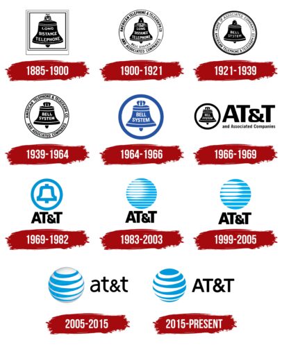
The telecom giant’s identity has been influenced by structural reorganizations and conflicts with the US government, so its history can be traced back to AT&T emblems. And she is very rich because this company was founded by one of the founders of telephony – Alexander Graham Bell.
What is AT&T?
It is an American telecommunications tycoon, the largest conglomerate providing local and long-distance telephone communications, and the second-largest cellular operator in the United States. He has been working in the profile market since 1885.
1885 – 1900
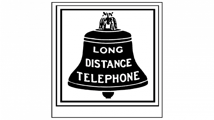
In 1885, based on the Bell Telephone Company, the American Telephone and Telegraph Company was created, engaged in laying cable lines for long-distance communications. Its logo reflected the Bell name: the artists depicted a black bell with the white inscription “LONG DISTANCE TELEPHONE” in a frame of three quadrangles.
1900 – 1921
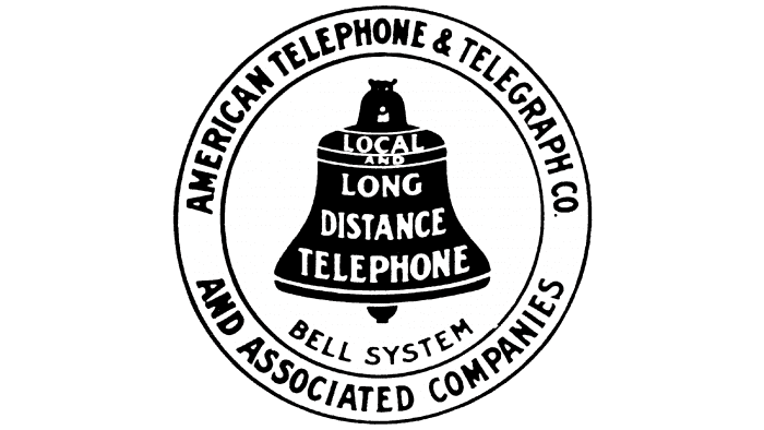
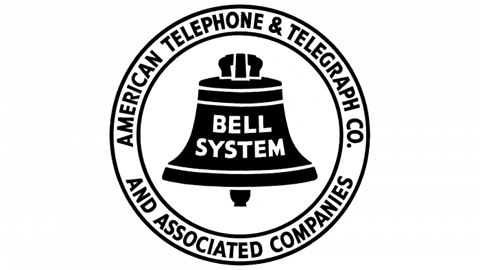
At the beginning of the new millennium, the emblem became round. The words “LOCAL AND” have been added before the phrase on the bell to clarify the company’s scope. Also, new inscriptions appeared: “AMERICAN TELEPHONE & TELEGRAPH CO. AND ASSOCIATED COMPANIES “in a ring,” BELL SYSTEM “in a circle, and” 1900 “outside geometric shapes.
1921 – 1939
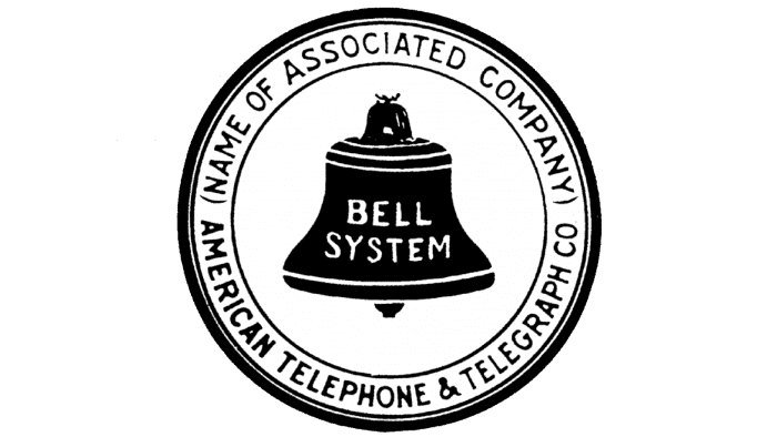
For regional companies, the same logo was used, but with different inscriptions. In the upper half of the ring was the company’s name, and in the bell was the phrase “BELL SYSTEM.”
1939 – 1964
In 1939, the design of the bell was slightly changed. The font has become clear and strict.
1964 – 1966
1966 – 1969
The logo, adopted in 1964, first featured an abbreviated telecommunications company name: AT&T. It was on the left, above the phrase “and Associated Companies.” On the right was a mini bell in a black ring.
1969 – 1982
American graphic designer Saul Bass has simplified the logo by removing all unnecessary lettering. He left only the abbreviation “AT&T” (bottom) and a minimalist bluebell in a white circle (top).
1983 – 2003
The US government did not like the fact that AT&T was a monopoly in its niche. To rectify the situation, it was forcibly divided into several parts. The authorities also banned her from using the old logo, which forced the designer of Soul Bass to redesign the identity elements. He changed the bell for a globe, giving the drawing a three-dimensional effect.
This is how the emblem called “Death Star” appeared. The globe consisted of twelve blue lines of varying thickness, which represented the telecommunications network. Under the segmented circle, as before, was the inscription “AT&T” in Omnes.
1999 – 2005
In 1996, four lines were reduced by the improvised globe, but its size did not change because the remaining eight lines were increased.
2005 – 2015
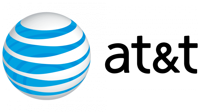
When the company merged with SBC Communications, its logo acquired a full 3D effect. To do this, a radial gradient was added, the blue and white lines were swapped, and the globe had clear boundaries. The changes were intended to symbolize the expanding range of AT&T services. The letters in the inscription are now lowercase. The author of the new design is the Interbrand consulting agency.
2015 – today
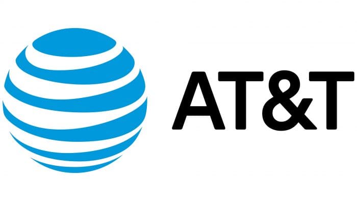
In 2015, Interbrand undertook another redesign with AT&T Brand Identity & Design. They developed the current version of the emblem, in which the white and blue stripes were reversed again – Circle two-dimensional like Death Star in 1982. Lettering moved to the upper case.
AT&T: Interesting Facts
AT&T is a big name in American telecommunications, known for its long history, big scale, and innovative work.
- Early Days: AT&T started with Alexander Graham Bell in the late 1800s, making it a foundational company in the telecom world.
- A Big Comeback: After a major legal case in 1984 forced it to split up, AT&T came back strong. It offers more than just phone services, including internet, TV, and digital services.
- Huge in Cell Phones: The second-biggest cell phone provider in the U.S. serves millions, from simple calls and texts to high-speed internet.
- Phone Service Pioneer: For a long time, AT&T was the go-to company for long-distance calls and still offers local phone services to many homes and businesses.
- Leading 5G Efforts: AT&T is pushing hard on 5G, which means faster internet and new tech possibilities, like self-driving cars and smart cities.
- Massive Network: Its network is one of the largest and most advanced, covering landlines and mobile to keep people connected far and wide.
- More than Phones: With the purchase of Time Warner in 2018, now called WarnerMedia, AT&T also owns big names like HBO, CNN, and Warner Bros., making it a big deal in entertainment.
- Space Tech Contributions: Its Bell Labs division has been key in developing space communication, including creating Telstar’s first active communication satellite.
- Social Good: AT&T is serious about helping with education, climate change, and community work, using its tech for more than just business.
- Worldwide Influence: While mainly known in the U.S., AT&T also works globally, helping multinational corporations stay connected.
AT&T has moved from just a telephone company to a giant in telecommunications and media. Its ability to change and grow over a hundred years and its focus on keeping people and businesses connected make it a crucial player on the world stage.
Font and Colors
The graphical element used to be three-dimensional, but AT&T executives felt the 2D version better reflected the company’s image. It combines style, simplicity, versatility, and the absence of unnecessary details. As for the meaning of the circle, it remains a globe, which symbolizes the brand’s global nature. Lines, in turn, represent telecommunications links between cities.
From 1969 to 2005, the text on the logo was written in Omnes. In 2005, the designers switched to Avenir Medium, created by Adrian Frutiger. Moreover, as AT&T developed, not only the style of the inscription changed but also the size of the letters: until 2015, they were lowercase – an atypical solution for most companies.
There is a smooth transition from the classic black and white monochrome to the signature black and white and blue palette for the color matching.
FAQ
What is the AT&T slogan?
AT&T’s slogan is “Connecting changes everything.” This slogan shows the brand’s commitment to providing reliable and innovative communication services that transform how people live, work, and interact.
It suggests that brand services impact people’s lives by enabling better communication, access to information, and seamless technology integration. The brand aims to enhance connectivity through mobile networks, internet services, and advanced technology solutions.
What does the AT&T logo represent?
The AT&T logo includes several key elements that convey the brand’s identity: the globe, the wordmark, the quicksilver line, the tagline, and the company name.
Globe: The globe represents the brand’s global reach, showing that the company operates internationally and provides communication services worldwide.
Wordmark: The wordmark spells out a clean, modern font that conveys professionalism and reliability.
Quicksilver Line: The line symbolizes brand speed and efficiency, indicating swift and seamless service delivery.
Tagline: “Connecting changes everything” complements the logo, emphasizing the transformative power of connectivity and aligning with the brand’s mission to enhance communication and information access.
Company Name: Including the company name in the logo ties all the elements together, reinforcing brand recognition and ensuring immediate association with the company.
What is the AT&T logo?
The AT&T logo represents the company’s global reach and extensive communication services. It features alternating curved blue and white stripes that form the outline of a circular planet.
The curved stripes create a sense of movement and connectivity, symbolizing dynamic communication and seamless service delivery. The blue color stands for trust, reliability, and professionalism. The white stripes add clarity and openness, showing the brand’s commitment to transparent communication.
What did AT&T originally stand for?
AT&T stands for American Telephone & Telegraph. This name reflects the company’s original focus when it was founded in 1885, primarily dealing with telephone and telegraph communications. The brand pioneered these technologies and played a key role in expanding the telephone network across the United States, making communication more accessible.
Over the years, the company expanded its services beyond its original scope. It became a major player in the telecommunications industry, branching into mobile networks, internet services, and advanced technology solutions. Despite this growth, the acronym still symbolizes its historical roots and commitment to innovation and connectivity.
Who designed the original AT&T logo?
Saul Bass designed the original globe-shaped AT&T logo. He was a renowned graphic designer known for his work in logo design and film title sequences. Bass created the final bell emblem for the brand, simplifying it to a minimalist design that became iconic.
Later, Interbrand, a global branding agency, designed the first curved stripe version of the logo. This design introduced the alternating blue and white curved stripes that form the outline of a circular globe.
These contributions from Saul Bass and Interbrand significantly shaped the brand’s visual identity, making it one of the most recognizable logos in the world.

