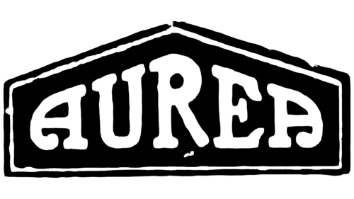
The Aurea logo symbolizes growth and development. Each emblem element aligns with the overall strategy and reaches upward toward the peak. The mark’s direction emphasizes focus on the goal. The brand does not forget to work on individual details, making its products solid and luxurious.
Aurea: Brand overview
Aurea was founded in 1920 in Turin, Italy, as Societa Italiana Ferrotaie translates to “Italian Railroad Company.” However, two years later, in 1922, it was transformed into Fabbrica Anonima Torinese Automobili (FATA) and refocused on automobile production.
Known for its luxury and sports cars, Aurea built its reputation on advanced engineering and design, such as overhead camshaft engines. The 1920s saw several outstanding Aurea models, such as the Tipo 31, 41, 48, and 54, powered by powerful 6-cylinder engines.
During its heyday, Aurea employed over 500 people and produced luxury cars for wealthy customers. Unfortunately, the Great Depression devastated Aurea, causing sales to plummet. Despite attempts to adapt by switching to producing more affordable small cars, the company could not turn the tide and went bankrupt in 1933.
Aurea produced about 1800 cars during its 12 years of existence. The brand symbolized Italy’s desire to compete with the luxury cars of France and England. However, it eventually fell victim to the financial turmoil of the 1930s.
Nowadays, Aurea cars are valuable collector’s items. They are a testament to the pre-war era’s exceptional Italian engineering and custom bodybuilding craftsmanship.
Meaning and History
What is Aurea?
It is an Italian automobile manufacturer that operated in the early 20th century. Based in Turin, the company produces a range of small- and medium-sized cars known for their quality of workmanship and engineering. Despite producing well-known models, the brand faced stiff competition from larger manufacturers and ceased production.
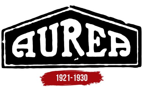
1921 – 1930
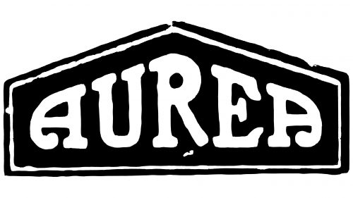
The Aurea logo, displayed on Italian retro cars, captures classic automotive artistry with its distinctive and elegant design. The logo features a one-color design with the model name inside a rectangular shape that culminates in a triangular top, all set within a double frame. This structured look emphasizes the logo’s main elements.
The black background creates a striking contrast with the white text. The word “Aurea” is written in a Roman font, all in capital letters, adding a timeless and authoritative feel. The letters vary in height, with the center letters larger and the outer letters smaller, drawing the eye to the center.
The largest letter, “R,” is the focal point, providing balance. The final letter, “A,” stands out with its symmetrically twisted legs and bold dots, adding a playful yet sophisticated touch.
The Aurea logo evokes nostalgia, reminiscent of a bygone automotive era. The wavy “A” letters at both ends impart a lively and dynamic feel, while the prominent “R” provides balance and stability. The white letters against the black background demand attention.
This logo, with its classic design elements and unique typography, feels like a treasure on the hood of a vintage car. The interplay of letter sizes, bold Roman font, and the intricate final “A” create an elegant and memorable design. The double frame adds a finishing touch, enhancing its visual appeal and sophistication.
The Aurea logo blends classic elegance with distinctive design. The structured frame, varying letter heights, and playful final “A” create a logo with grace and charm. It captures the essence of Italian retro cars, making a strong statement of style and heritage. This logo represents the brand and evokes classic automotive design’s rich history and timeless beauty.


