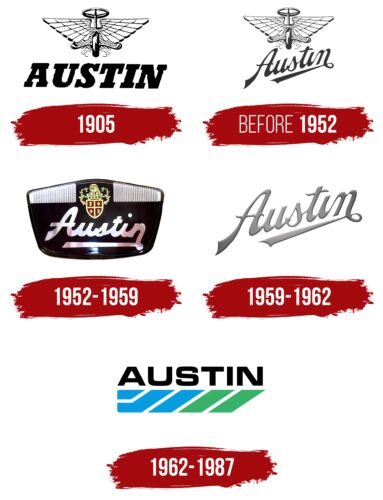
The Austin logo is expressive and nostalgic at the same time. Moving forward relies on a wonderful time to start and experience. The emblem demonstrates the connection of generations, the road to immortality.
Austin: Brand overview
| Founded: | December 1905 – 1952 |
| Founder: | Herbert Austin |
| Headquarters: | Longbridge, England, U.K. |
Austin is an English automobile company that existed for 50 years until 1952. The manufacturing facility was located in Birmingham. The Austin logo united a whole generation of cars: 18/24HP Endcliffe, 12, 7, FX3, FX4.
Baron Austin, I dreamed of making cars for the nobility. He began production in 1905. But best of all, as the 1st and 2nd World Wars showed, he made armored cars and trucks. When the wars ended and the nobility became poorer, management had to be transferred to more flexible owners. Since then, the company’s legacy and the Austin name have been passed down from customer to customer.
Meaning and History
Once upon a time, Austin cars were the number one choice for British nobility, Spanish officials, dignitaries, and bishops. Now, the legendary company is remembered for its eponymous trademark, which has not been used since 1987 and currently belongs to the Shanghai Automotive Industry Corporation.
Although Austin cars have not appeared on the market for several decades, the brand itself continues to exist. The history of its logos allows us to trace the evolution of the automotive industry over a certain period of time. For instance, the earliest emblems show that the company did not always produce four-wheeled vehicles. In turn, the logo used until 1987 looks stylish and minimalist, in line with contemporary design trends.
What is Austin?
The Longbridge Automobile Company designed the Austin 7. An 800-engine subcompact that was produced under license in Germany, Japan, France, and the United States. The company also invented the famous London cabs, the circulation of which is 75 thousand copies.
1905
One of the oldest Austin logos features an image of a wheel, to the center of which is attached a round car steering wheel. The design is balanced by two large wings consisting of several rows of stylized feathers. At the bottom, they transition into a lattice-like triangle with smooth curves at the ends. This element resembles the letter “A.” From under the wheel, clouds of dust fly in all directions, signifying continuous forward movement. This symbolizes freedom and development. Below the illustration is the brand name, written in large black letters with rectangular serifs. The italic font is as dynamic as the vehicle itself.
before 1952
This is another version of the emblem with wings, and it is almost indistinguishable from the previous one. The only change is the inscription, which is now positioned diagonally and underlined by a long line emerging from the loop at the end of the “n.” A cursive, handwritten font is used for the word “Austin.”
The single wheel with the steering wheel serves as a reminder that the company produced more than just four-wheeled cars. For example, in 1919, it began manufacturing motorcycles under its own trademark. Three years later, it introduced the three-wheeled Austin Seven, designed for traveling on narrow roads.
1952 – 1959
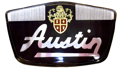
In the 1950s, Austin cars featured an emblem with a coat-of-arms shield divided into four red sections. The gold figures inside symbolize the company’s historical traditions and British origins. The crown depicted on top represents the brand’s connection to royal families. Below the shield is a silver inscription – smooth enough to appear elegant but too bold to be easily readable. Designers retained the handwritten font and kept the long line extending from the letter “n” to the left side.
1959 – 1962
The company logo is full of dynamics and movement. It is represented by the name placed obliquely, with the ending going up.
The first glyph of the letter A is expanded and gradually narrows upwards, as is the underline formed by the end of the letter N. The symbols resemble a road that goes beyond the horizon. The company’s cars are suitable for long trips and have traveled many tracks in England and abroad. The emblem calls not to stop. Do not deny yourself travel.
A fused copybook, rising to the top, indicates gradual growth and development step by step. The founder of the house designed the first car of the brand. For production release, he registered The Austin Motor Company Limited in 1905 and bought the former printing house, and by 1920 he was already the largest manufacturer of cars in Europe.
The company’s rise, indicated on the logo, is also visible in sales volumes. If the first cars were considered elite and were bought by the nobility in small quantities, then by 1922, Austin 7 had sold 400 thousand copies in 16 years.
The handwriting style gives the logo a personality, a connection to the individual, the individual behind the brand. The name of the machines comes from the name of the founder – Baron Austin I. He had a hand in developing most models, and his close friend remained the enterprise’s chief designer throughout his reign.
The connection of the letters with each other and the upward movement also shows that the enterprise was passed along the chain from hand to hand in ever larger concerns. Today, the right to the brand belongs to the Chinese company Nanjing Automobile.
The color scheme of the Austin logo is various gradations of gray. The shade conveys metal – the main structural material of machines. Brilliant, as if forged, the sign’s letters indicate the structures’ progressiveness, modernity, and strength.
The lettering font is similar to Spills Base but with modified first and last letters.
1962 – 1987
The Austin automobile brand logo contains its name, composed of uppercase black letters. The MicroSquare Bold Extended font by FontSite Inc. is a nearly exact match. Underneath the inscription are five very wide stripes: three blue and two green. The far-left figure is horizontally elongated, the polygon following it forms an angle, and all the other lines have the shape of a parallelogram turned on their side. These elements create an effect of volume and depth. In addition, they symbolize energy, as they resemble a battery charge level.
Font and Colors
For a long time, Austin’s textual symbols utilized a unique handwritten font that appeared light and flowing. However, the later version of the emblem changed the rules: the brand name was written in bold, serif-less letters. This typeface most closely resembles MicroSquare Bold Extended by FontSite Inc. The color scheme also changed significantly: as the logos evolved, a transition from gray and silver shades to a combination of black, light blue, and green can be observed.
Austin color codes
| Dim Gray | Hex color: | #6d6b6b |
|---|---|---|
| RGB: | 109 107 107 | |
| CMYK: | 0 2 2 57 | |
| Pantone: | PMS 424 C |


