A wide range of services and a willingness to go to the most remote points of the country to provide them – such a message is contained in the symbols of the Australia Post logo. The emblem shows that the department is always nearby, on the road, which makes it easy to solve all issues.
Australia Post: Brand overview
Meaning and History
Australia Post was established in 1975, but its history can be traced back to April 25, 1809, when the first colonial letter delivery service was introduced. After the unification of the colonies in 1901, the disparate postal systems became part of the Postmaster-General’s Department, which provided telecommunications services to the continent’s inhabitants. 1975, the department was abolished, and special commissions took over its functions. The Australian Postal Commission was among them and later became the Australia Post.
As the postal service evolved, a new positioning was needed —more modern and appropriate to the era of e-commerce. Simultaneously, the visual identity had to preserve the brand’s heritage, contrary to the desire for progress. Therefore, if there were any changes, they were minor.
What is Australia Post?
As its name suggests, it is a post office operating on the Australian continent. It has 4 462 branches and serves more than 10 million customers daily, providing several types of mail delivery: standard, courier, and express.
1975 – 1996
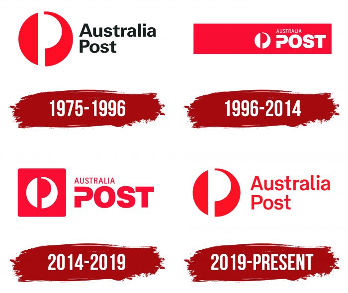
Pieter Huveneers was hired to create the first Australia Post logo. The artist played with the letter “P,” depicting it as a strip and a semicircle in negative space. The stylized “P” divides the red circle in two. The left side looked like half an oval, and the right had the shape of a horn, which heralds used in the Middle Ages.
The inscription “Australia Post” on the right in two lines complemented the drawing. The designers made it black and chose a simple sans-serif font. The first letters in both words were in capital letters.
1996 – 2014
In 1996, the logo was based on a long red rectangle. In this case, the semi-oval and the pictogram were repainted in white and “P” in red. Next to them was the name of the postal service. The word “AUSTRALIA” was written in small print. “POST,” on the other hand, immediately caught the eye because of the large letters and the stylized “P.” The same wordmark, “POST,” with an open “P,” was created in 1991. The designers took it and moved it into a rectangle to complement the circular emblem.
2014 – 2019
Australia Post redesigned again after acquiring StarTrack delivery service. The developers visually separated the horn symbol, removing the common base – the rectangle. But they put the icon in a red square to stay white. Only the color of the inscription has changed, which turned out to be on a light background.
2019 – today
In 2019, Melbourne-based firm Maud revived the original Australia Post logo, which was created in 1975. Designers only slightly redesigned the typography, making the letters large and red. Before the rebranding, executives and general managers participated in a survey. Experts learned stakeholders’ opinions and created a business strategy based on the data obtained.
The designers gave the Pieter Huveneers horn a second life as part of the project. The iconic symbol has returned to uniforms, signage, liveries, merchandise, and automobiles and burst into the digital world in its original form. It is now found in post offices nationwide with a new wordmark. In the classic version, the inscription is on the left, but there is also a horizontal version where the phrase “AUSTRALIA POST” is at the bottom.
The logo contains an icon of a wind instrument previously used to signal a postman’s arrival. Messengers blew the horn when they brought mail or left the city. This attribute, popular in the Middle Ages but lost its original meaning, has survived as a traditional element of many emblems, including the Australia Post branding.
Australia Post: Interesting Facts
Australia Post, officially known as the Australian Postal Corporation, is a government-owned company that delivers mail in Australia. It started in 1975 but has roots in 1809 when the first post office opened in Sydney.
- Early Days: Postal services began in Australia in 1809, when Isaac Nichols, a former convict, opened the first post office in Sydney.
- Nationwide Coverage: Australia Post serves everyone in the country, ensuring people in remote and rural areas can access postal services.
- Innovation: It’s been a leader in postal innovations, introducing the world’s first prepaid postage stamp, the “Sydney View,” in 1838.
- Beyond Mail: Australia Post is more than mail; it’s an essential part of Australia’s economy, offering retail, bill payments, logistics, and even banking services in partnership with over 70 banks.
- Digital Shift: Due to digital communication, there are fewer letters, so Australia Post now focuses on e-commerce, parcel delivery, and online services to meet modern needs.
- Eco-friendly Efforts: It’s working on reducing its environmental impact, using electric vehicles and bikes for deliveries, and aiming to be more energy-efficient.
- Stamp Collecting: There’s a philatelic branch for stamp collectors, issuing stamps that celebrate Australia’s wildlife, history, and culture.
- Postal Museum: Australia has a National Postal Museum that displays the postal service’s history, including rare stamps and historical postboxes.
- Extensive Network: It has one of Australia’s largest retail networks, with thousands of post offices ensuring everyone can access their services.
Australia Post has evolved from a simple mail service to a versatile organization, playing a key role in connecting people and supporting the country’s development.
Font and Colors
On logos 1996-2019, sans serifs from the Zurich family are presented: Zurich Condensed was used for the first word, and a modified Zurich Extra Black for the second. In 2019, the designers emphasized Australia’s importance, increasing the country’s name, equating it with “Post.” A custom sans serif font balances out the stylized “P” in a circle. It is similar to the Brix Sans Medium created in 2014 by Livius Dietzel and Hannes von Döhren. A similar typeface is Neology Grotesque Regular. It was released the same year by Shinntype.
Both the inscription and the post horn are colored red. The rich shade # DD1223 is the foundation of Australia Post’s visual identity. It is complemented by white, which serves as the background and forms a “P” -shaped gap inside the circle.
FAQ
What colors are Australia Post?
The brand uses red and white as its main colors. Bright red can be seen on vehicles, uniforms, and other materials. White is used with red to create an easily recognizable image. Red shows urgency and efficiency. White is used for logos and text to make them easy to read. This color scheme is used on mailboxes, RVs, their websites, and marketing materials.
What is the Australia Post symbol?
The symbol combines history and modern design. It is inspired by the shape of the postal horn that European postmen used to announce their arrival and deliver messages. This design element brings a sense of tradition and reliability to the brand.
The letter “P” is formed in the logo’s negative space and directly refers to the “post.” This letter is seamlessly integrated into the shape of the horn, making the logo expressive and meaningful. The overall round shape of the logo symbolizes the comprehensiveness and global reach of the brand’s services.
The red and white color scheme increases visibility and recognition. The bright red signifies urgency and efficiency, which are important qualities for the postal service. The white provides a clean contrast, making the logo easy to read and stand out on mailboxes, delivery vehicles, and marketing materials.
The symbol represents the brand as a reliable and forward-thinking service provider ready to meet customers’ needs locally and internationally.
What is the Australia Post logo?
The logo combines two important symbols. The first is the letter “P,” seen in negative space, representing “post.” This design makes what the brand stands for clear. The second symbol is a stylized postal horn, historically used by European postmen to make deliveries. These two symbols create a unique and memorable logo that is easily recognizable and meaningful.
The red and white color scheme improves visibility. This logo represents the brand’s personality. The design ensures the logo is functional and symbolic, reflecting the brand’s mission to connect people and businesses worldwide.
What font is Australia Post?
The logo font has changed over the years. For a long time, it used a font similar to Helvetica Heavy. This bold and clean font is easy to read and gives it a modern look. Eduard Hoffmann and Max Miedinger developed Helvetica Heavy.
The use of Helvetica Heavy demonstrates the brand’s focus on reliability and efficiency. The bold font ensures the logo’s visibility and readability, which is important for the postal service. The brand has slightly changed the logo typography to keep up with design trends. Despite these changes, the basic features of the font have remained the same, making the logo recognizable and impressive.
Is the Australia Post symbol copyrighted?
The symbol is protected by copyright and trademark laws. The logo features unique design elements such as a stylized “P” and a postal horn that are original and creative. These elements make the logo easily recognizable and associated with the brand.
The symbol is not available for public use. Unauthorized use may have legal consequences as it violates the brand’s intellectual property rights. Companies register their logos to protect their identity and prevent misuse.
In addition to copyright protection, the symbol is a trademark. This provides additional legal protection by ensuring no other organization can use a similar logo.
How is Australia Post funded?
The brand is self-financing and generates its income for development and profit. It operates as a government business, using its assets and income from various services to cover expenses and invest in growth.
The main sources of income are postal services, parcel delivery, retail services, and digital services. Postal services process and deliver letters and parcels domestically and internationally. Parcel delivery has become a major source of revenue due to the rise of online shopping.
The Australian Government is the sole shareholder. The profits made are returned to the government, contributing to public funds. The government monitors the brand to ensure it operates according to national interests and public service obligations.


