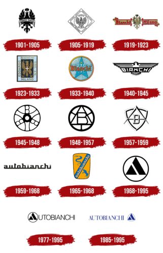
The Autobianchi logo stands out for its simplicity and geometric precision. This emblem embodies the expertise of numerous generations of automakers and their predecessors. The traditions and years of craftsmanship have culminated in the logo’s elegant and flawless lines, effectively conveying the superior quality of their vehicles.
Autobianchi: Brand overview
Autobianchi was born in 1955 due to a collaboration between the bicycle manufacturer Bianchi, the tire company Pirelli, and the car manufacturer Fiat in Desio, Italy. The collaboration aimed to create affordable small cars for the masses after World War II.
Autobianchi’s debut models, the Bianchina economy car and the Primula mid-size hatchback gained considerable popularity in the 1960s. In 1968, Autobianchi became fully owned by Fiat. In the 1970s and 1980s, it became a testing ground for developing Fiat’s small cars.
Models such as the short-lived Stellina roadster and the compact Y10 found a unique place in the Fiat portfolio. The A112 hatchback, a small but successful Autobianchi model launched in 1969, remained in production until the mid-1980s.
Despite its successes, Autobianchi was unable to maintain profitability. 1995, it was incorporated into Lancia and ceased to exist as an independent brand. During its heyday, Autobianchi played a critical role as a manufacturer of Fiat small cars, offering distinctive models in the Fiat lineup for nearly four decades.
Meaning and History
What is Autobianchi?
It is an Italian automaker known for its small, stylish cars. It was created as a joint venture between Bianchi, Pirelli and Fiat. The company aimed to create cars that combine advanced technology with compact and practical design. The brand was recognized with models such as the Bianchina, Primula, and A112. The brand became a testing ground for new Fiat technologies and designs before they were incorporated into Fiat-branded cars. Despite its success, the company was absorbed by the Fiat Group, and its models were discontinued.
1901 – 1905
In the late 19th century, Edoardo Bianchi established a bicycle company that quickly gained a reputation for quality and innovation. The company’s first logo featured an imperial eagle, a symbol commonly used in various European emblems, including the ancient Sicily flag and the Italian king’s royal standard of the time.
This eagle represented where the bicycles were assembled, signifying their premium, royal quality. Bianchi pioneered bicycle sports and was among the first manufacturers to adopt uniform tire sizes.
Bianchi designed a special bicycle for the Queen of Italy and often accompanied her and the king on their rides. This prestigious association earned Bianchi the title of official supplier to the royal court, a status symbolized by the crowned eagle in the logo.
The eagle was also chosen because a Bianchi bicycle had won a race in France two years prior, symbolizing national pride and achievement. At the center of the emblem, the founder’s name was proudly displayed on a heraldic ribbon, emphasizing the brand’s heritage and legacy.
1905 – 1919
The 1905 emblem is linked to the car production that Bianchi embraced. The royal eagle remains present at the center of the emblem. Instead of a crown, a shield with a cross is used, which was featured on the monarch’s standard.
The heraldic ribbon has been moved upward. The designer’s first name was removed from the title, leaving only the surname, which had become the brand.
The circle that outlines the eagle is placed inside a diamond. The figure’s contours indicate what the company represents and its location. Società Anonima Edoardo Bianchi was a joint-stock company formed by people who invested in the production. The diamond, made of equal sides and right angles, symbolizes stability, solidity, and steadfastness. Four hundred people supported the company financially by placing a wheel inside the diamond.
Bianchi produced cars and motorcycles, albeit in small quantities and the premium segment.
1919 – 1923
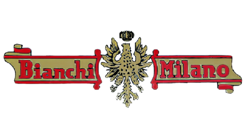
In the 19th-century emblem created for the Italian company Bianchi, significant emphasis was placed on the brand and its origin. The emblem featured a style emphasizing the manufacturer’s deep traditions and high status. At the center of the emblem was an eagle—a symbol of strength and high aspirations, a widely recognized heraldic sign. Artistically arranged around the eagle were two parts of a heraldic ribbon, which visually balanced the brand name and its geographical affiliation: “Bianchi” on one side and “Milan” on the other.
These logo elements were executed in gold with red trim, creating an impression of luxury and elitism. This design reflected the brand’s prestige and symbolized its commitment to providing the highest quality products. Gold and red are associated with Italy’s historical and cultural roots, emphasizing the brand’s origin and deep connection to its homeland.
During World War I, Bianchi remained at the forefront of innovation by developing a new type of bicycle with suspension, significantly improving the quality and durability of two-wheeled vehicles. This innovation marked an important step in the development of bicycle manufacturing and substantially impacted military mobility by providing more reliable and comfortable transportation in wartime conditions.
1923 – 1933
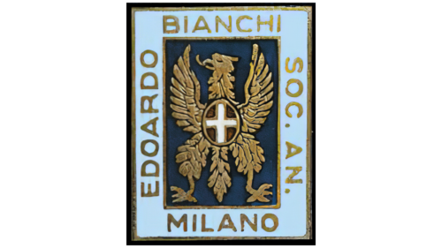
The emblem of Edoardo Bianchi bicycles is distinguished by its unique shape and famous color, which has become the brand’s hallmark. The elongated rectangle featuring an eagle is surrounded by a wide sky-blue border known as Celeste Bianchi. This beautiful shade carries deep symbolic meaning, serving as the subject of urban legends and stories.
The blue sky is associated with dreams and the expansive skies over Milan, reflecting the brand’s aspiration for freedom, innovation, and limitless possibilities in bicycle design. According to legend, this color was chosen because of the eyes of an Italian queen, which adds a romantic and almost mythical dimension to the brand’s story, strengthening the emotional connection with consumers and emphasizing the royal quality of the products.
Gold lettering along each side of the rectangle states that the emblem represents the Edoardo Bianchi company. The gold lettering complements the sky-blue background and symbolizes the highest quality and status. Together, these elements create an aesthetically pleasing yet striking visual impact that enhances the brand’s recognition in the global market.
1933 – 1940
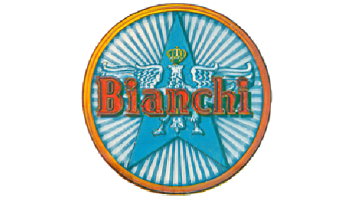
The brand’s logo visually represents a wheel with an orange rim reminiscent of the sun. This element symbolizes the brand’s rise and flourishing, emphasizing its dynamic development and energy. The multitude of spokes in the wheel adds detail and visually enhances the sense of movement and progress, which is directly associated with the company’s continual drive for innovation and improvements in production.
An additional design element is a blue triangle pointing upward as if reaching for the sky. This triangle represents the company’s ambitions, high aspirations, and desire to achieve greater heights. The placement of the triangle directly under the wheel creates an image resembling the sunrise on the horizon, further enhancing associations with the start of a new day and new opportunities.
The eagle’s wings spread out on either side of the triangle give the composition the star shape, adding a sense of solemnity and grandeur to the logo. This element enhances the visual perception of the logo as a symbol of leadership and high achievements. Using blue for the eagle’s wings provides a visual echo of the color characteristic of the brand’s bicycles. This aids recognition and establishes a clear link between the products and the corporate symbolism.
Every element of this logo is thoughtfully designed to create a beautiful and memorable image and to emphasize the key aspects of the company’s ideology: innovation, commitment to growth, and high product quality.
1940 – 1945
During World War II, the company’s logo became particularly symbolic as tension and uncertainty engulfed the world. The black emblem used during those years reflected the country’s and the manufacturer’s difficult times. The black color of the logo, symbolizing mourning and suffering, reminded people of the destruction and losses suffered as a result of the war.
The eagle in the logo, with its wings still spread, was depicted in white, adding a note of peace and hope to the image. This image echoed the dove of peace—a universal symbol of the desire to end the war and to rebuild. The manufacturer, by choosing this design, aimed to express a wish for peace and harmony at a time when such feelings were especially relevant and meaningful.
The somber colors of the logo underscored the complexity of the period for the whole world, as well as for the country and the company, which faced external threats and the direct destruction of its production facilities during bombings. This emblem became a symbol of resilience and the unyielding spirit of the company, which, despite all challenges, strived to maintain its principles and hope for a better future.
1945 – 1948
After World War II, the factory was restored, yet the events of the following years left a deep mark on the company’s history. The brand’s founder tragically died in a car accident, leading to significant changes in management. His son, Giuseppe, took over the company’s leadership, facing the challenging post-war conditions and the need to adapt the business to new realities.
During this difficult period, the logo was kept in black, symbolizing the founder’s ongoing mourning and the tough times the company was enduring. The black color reflected the brand’s seriousness and resilience in facing challenges, emphasizing its determination to maintain a leading position despite all obstacles.
The new emblem was carefully designed to reflect the historical legacy and a new beginning. It featured an unusual bicycle wheel figure, replacing traditional spokes with the three letters’ B.’ These letters represented different generations of the Bianchi family who continued the work founded by their ancestors. This design highlighted the deep family connections within the company and illustrated the transmission of experience and values from one generation to another.
1948 – 1957
The company’s bicycles, known for their outstanding features, have repeatedly demonstrated their superiority by winning various races. These victories confirmed the company’s quality and manufacturing capabilities and inspired further innovations in design and technology. In recognition of these achievements, the company’s logo was changed. Instead of the previous symbol with three ‘B’ letters, the new emblem now includes an image of a triangle within a wheel, symbolizing forward momentum and the pursuit of new peaks.
In the center of this triangle, a large ‘B’ focuses on the brand name and its roots, reminding us of the company’s heritage and foundational principles. The elements of the emblem reflect the stability and support the company finds in its traditions and its ability to continuously evolve and strive for innovation.
While many companies aimed to expand their production to include automobiles, this company remained true to its roots, continuing to produce premium-quality bicycles. This decision highlights its uniqueness in the market and its commitment to the values established by its founders.
An additional dramatic element in the company’s story relates to the founder’s son, who, after his father’s death, temporarily abandoned the development of the automotive line due to limited financial and production resources. Instead, he focused on improving and perfecting the bicycle line, emphasizing the company’s ability to overcome challenges and adapt to changing circumstances while maintaining its core specialization and high product quality.
1957 – 1959
The logo features the emergence of the letter ‘A,’ signaling the birth of a new company. Involving the Bianchi brand, two giants, Fiat and Pirelli, founded an automobile manufacturing company named Autobianchi.
The new brand inherited previous automotive developments from the bicycle giant and a well-known name. Initially, the Bianchi family owned 33% of the shares and assembled cars using Fiat parts and Pirelli tires.
The addition of “Auto” helped distinguish the brands. Bianchi translates to “white” in Italian. In the context of the new company, this color referred to the bodies of early Autobianchi models. White was popular at the time and symbolized luxury and elegance.
The logo is composed of curved iron corners. Three of them form a shield, mirroring the shape of the radiators on the first cars. Inside is the letter ‘A,’ with a smaller ‘B’ on its crossbar. Bianchi is at the heart of the company. The brand aims to adhere to the values of the renowned bicycle master and produce only high-quality, premium automobiles.
1959 – 1968
In 1959, the company took a significant step in developing its brand by including its full name in the logo for the first time. This change aimed to enhance the brand’s recognition in the market and highlight its history and roots. The logo featured black letters, adding strictness and elegance while ensuring good visibility and readability on all the company’s advertising materials and products.
A distinctive design feature was the interconnected letters, which created an aesthetically pleasing visual effect and conveyed a deep symbolic meaning. This technique highlighted the connection across generations within the owners’ family and among generations of consumers who have remained loyal to the brand for many years. The linking of the letters symbolized the company’s continuous development and ability to adapt to market and technology changes while maintaining its traditions and quality.
1965 – 1968
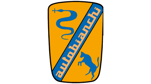
The Autobianchi brand emblem, introduced as a symbol of innovation and quality, was designed as a car mirror transformed into a shield. This design choice was intentional: the mirror turned into a shield, symbolizing protection and safety, highlighting the particular durability of the brand’s vehicles. Additionally, it reflected the company’s innovative approach. Autobianchi cars were among the first to receive bodies made of fiberglass, a material considered cutting-edge and offering enhanced strength and lightness.
The orange color in the emblem’s design was chosen to symbolize warmth and comfort, qualities felt inside the vehicles, emphasizing the comfort and hospitality of the Autobianchi car interiors. The brand name was gracefully placed diagonally on a blue ribbon, adding visual dynamism and drawing attention, emphasizing aesthetic appeal and brand recognition.
The emblem’s design incorporated many symbols, each with special significance. In the upper corner, a serpent, an ancient symbol of Milan, where Pirelli’s production was located, known for its innovations in automotive tires, was depicted. At the bottom of the emblem, a bull symbol was placed, associated with the city of Turin, known for its Fiat automotive factories where many vehicle components were produced. These two symbols highlighted the geographical connection and interaction between two important centers of automobile manufacturing in Italy. It symbolized the merger of tradition and innovation in creating a unique product.
The name “Autobianchi” was emphasized with the traditional Bianchi color, adding recognizability and underlining the company’s rich history and heritage.
1968 – 1995
In 1968, Bianchi underwent significant changes reflected in the update of its corporate identity. These changes followed the sale of a company stake and the brand’s transition under the control of two major players in the automotive industry—Fiat and Lancia. This event catalyzed a complete reassessment of the brand’s visual image, highlighting a new stage in its history.
The designers chose a circle in the redesigned company logo, symbolizing a wheel and perpetual motion, reflecting the endless drive for innovation and development. Inside this circle is a triangle, split into two parts, symbolizing new leadership and starting a new path for the brand. The triangle is traditionally associated with dynamism and determination, reflecting the company’s desire to adapt to changes and continue leading in the industry.
The emblem’s design is meticulously thought out to emphasize that Bianchi retains its fundamental essence despite changes in leadership and management structure and continues to reach new heights. The new elements in the logo are not merely design tricks but a visual manifestation of the company’s strategy, now bolstered by the resources and experience of two automotive giants.
1977 – 1995
The previous brand logo was carefully enhanced during the latest redesign to improve visual perception and recognizability. The main innovation involved adding the brand’s full name to the existing symbol, significantly enhancing its communicative capabilities.
The updated logo’s central element is the first letter “A” of the brand name, creatively depicted as a triangle within a circle that symbolizes a wheel. This approach introduced novelty to the design and created a sense of unity and completeness among all the image elements. The integration of the triangle into the circle symbolized a drive for innovation and forward movement, emphasizing the brand’s dynamism and modernity.
An important design detail was the thickness of the letters, which were carefully aligned with the thickness of the circle’s line. This decision improved the logo’s visual perception, making it more harmonious and balanced. It also highlighted the brand’s technical solidity and attention to detail.
Adding the full brand name to the logo significantly increased its recognizability. This change helped the brand better associate with its products and strengthened its position in the market. The transformation of the logo in 1968 marked an important milestone in the brand’s history, reflecting its development and adaptation to changing market conditions and consumer needs.
1985 – 1995
The Autobianchi logo, an iconic Italian family car manufacturer, is a geometric design masterpiece. It features a segmented black triangle with two primary shapes inside: a diagonal trapezoid and a small equilateral triangle. These shapes form a striking figure. A bold white stripe runs through the center, symbolizing a road flanked by three thin convex arcs adding depth.
To the left of the emblem is the company’s name, “Autobianchi,” in bold, uppercase Roman letters. The typeface has well-defined serifs merging in two places, creating a sense of unity and flow. This unique feature makes the name appear cohesive with the logo.
The design evokes a jigsaw puzzle, with each shape fitting perfectly. The white stripe symbolizes the journey and adventure of driving an Autobianchi car. The three convex arcs enhance the logo’s visual complexity and appeal.
The placement of the company name beside the emblem acts like a signature, confidently stating, “Yes, we did it.” The connected letters of the name create an artistic statement—this integration of text and geometric forms results in an aesthetically pleasing and meaningful logo.
The black triangle and white road-like stripe convey direction and purpose, reflecting Autobianchi’s commitment to quality and innovation. The bold, uppercase letters of the company’s name reinforce the brand’s strength and reliability, while the intricate serif connections add elegance and sophistication.
The Autobianchi logo blends geometric precision and artistic flair. The segmented triangle, symbolic white stripe, and unique typographic details create a memorable and visually striking logo. It communicates the brand’s heritage and dedication to crafting reliable, stylish family cars, capturing the essence of Autobianchi in a single, cohesive design.

