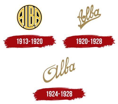
The Automobiles Alba logo reflects the spirit of France, similar to small auto companies. The emblem displays elegance, French charm, and a commitment to providing customers with the best and most reliable compact vehicles.
Automobiles Alba: Brand overview
Automobiles Alba, founded by the renowned French industrial company Constructions Métallurgiques, came into being in 1913 in Suresnes, France. Before World War I, Alba introduced a small two-seater car with a 1.1-liter engine, which gained a reputation as a high-quality machine built with reliable metallurgy and components supplied by the parent company.
After the war, Alba produced an improved Type A model. This car received a more powerful 1.5-liter engine, which allowed it to reach speeds over 90 km/h. By the mid-1920s, the Type B model was introduced, characterized by increased power and design changes. Annual production peaked at about 100 units.
However, Alba’s high cost and limited production volume posed problems, especially as the French automobile industry developed. In 1928, after producing about 2,000 cars in 15 years, Automobiles Alba ceased operations.
Although Alba did not last long, it represented an early era of French automobile manufacturing, dominated by larger automakers by the late 1920s.
Meaning and History
What is Automobiles Alba?
It is a French automaker known for producing luxury cars in the early 20th century. The company was recognized in Lyon for its high-quality workmanship and elegant design. The cars were popular for their advanced engineering and stylish appearance. Despite its success in the luxury car market, the company ceased operations.
1913 – 1920
Automobiles Alba, active from 1913 to 1920, held a unique place in the country’s automotive history. The brand skillfully integrated design elements into its logo that reflected its core principles and values while highlighting its innovative approach to car manufacturing.
The logo’s central element is an image of a wheel, and the designers incorporated all the letters of the brand’s name into it. This showcased the compactness of the two-seater cars produced by the company and symbolized the harmony and brilliance of the engineering thought underlying their design. This design choice emphasized how functionality and aesthetics were intricately intertwined in every vehicle released under the Alba brand.
Alba’s vehicle construction details were known for their durability and reliability, thanks to using the finest materials. This gave the cars a reputation for longevity and quality, an important factor for buyers.
The logo’s black background was associated with the tires’ color, adding confidence and stability to the design. Black symbolized the company’s pioneering spirit, emphasizing its role as one of the founders of the country’s automotive industry. The white color of the letters, contrasting with the black background, added a sense of novelty and purity, highlighting the brand’s progressive nature.
Yellow, resembling golden streaks in the logo’s symbols, hinted at the premium nature of Alba vehicles. At a time when the automobile was still a luxury accessible only to the affluent, these golden accents emphasized the exclusivity and high status of Alba car owners.
1920 – 1928
Always aiming to improve its products, the company significantly enhanced the original car model. With the introduction of the third modification, they unveiled a new logo that symbolized their commitment to innovation and quality. The new logo featured an ascending golden script with the brand name, which refreshed the visual identity and highlighted the enduring traditions at the core of the company’s compact car production. This emblem was designed to reflect the brand’s prestige and focus on development and refinement.
1924 – 1928
The Automobiles Alba logo features elegant lettering on the grille, highlighting the extravagance of their retro-style cars. The smooth font showcases the cars’ graceful movement, elegance, and fashionable design. The lettering is set diagonally, adding a dynamic and stylish element. It features a mix of lowercase and uppercase bold letters, creating a visually interesting contrast. These rounded characters belong to a family of soft fonts with fluid lines, enhancing elegance.
The golden text stands out against a white and neutral background, catching the eye. This color choice creates a luxurious and sophisticated appearance, making the logo as captivating as the cars it represents.
The lettering dances across the grille, reflecting the car’s stylish nature. The text’s diagonal slant adds a playful and dynamic touch, suggesting movement and energy. The inscription’s golden color exudes luxury, making the car look adorned with fine jewelry. This enhances the vehicle’s unique allure and charm.
The font’s smooth and fluid lines convey a sense of seamless design and craftsmanship, indicative of the quality and attention to detail Automobiles Alba puts into its cars. The mix of uppercase and lowercase letters adds a layer of sophistication and creativity, making the logo elegant and approachable.
The golden lettering on the neutral background creates a striking, elegant, eye-catching visual contrast. This combination emphasizes the brand’s commitment to luxury and high-quality design. The overall effect is one of timeless elegance and modern style, perfectly capturing the essence of Automobiles Alba.


