 Automobili Turismo e Sport Logo PNG
The Automobili Turismo e Sport logo is reminiscent of a medal awarded at knightly tournaments. The symbol showcases the manufacturer’s strength, draconian power, and ability to dominate on the track. The emblem embodies multiple victories and an unyielding spirit that never accepts defeat.
Automobili Turismo e Sport: Brand Overview
Automobili Turismo e Sport (ATS), an Italian automobile manufacturer, was founded in Bologna in 1962 by former Ferrari engineers Carlo Chiti and Giotto Bizzarrini. The company’s history dates back to the famous “palace riot” of 1961, when engineers, including Chiti and Bizzarrini, decided to part ways with Ferrari.
Intent on competing with Ferrari, they formed ATS to create high-performance sports and racing cars. In 1963, ATS produced its debut car in Formula 1, and in the 1964 season, it repeatedly took podium places. However, a lack of funds prevented further racing development.
At the same time, ATS entered the production car market by introducing the 2500 GT road car in 1963. However, only about 100 cars were produced before the company ceased operations in 1965. The cause of ATS’s demise was poor management and financial difficulties that drove the company into bankruptcy after only a few years of operation.
Despite its short existence, ATS demonstrated considerable engineering potential. However, its ambition to become independent failed in the face of established industry giants.
Meaning and History
What is Automobili Turismo e Sport?
It is an Italian automaker known for producing sports cars. Founded by a group of former Ferrari employees, the company aimed to create competitive road and race cars. The brand attracted attention for its engineering and design, with standout models including the ATS 2500 GT, an elegant and powerful sports car. Despite the difficulties at the beginning and limited production, the company has taken its rightful place in automotive history. It has been revitalized recently, continuing its legacy of creating exclusive cars.
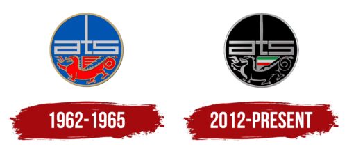
1962 – 1965
The wheel shape is common among transportation companies because it embodies harmony and the seamless operation of all components. Inside the wheel, there is a sense of comfort and safety.
The sky blue color corresponds to the coat of arms of Bologna, where the car manufacturer was founded. This shade reflects themes of freedom and victory in the uprising. The company’s vehicles surpass conventional expectations. Their designs incorporate new approaches that break away from stereotypes.
A red dragon with golden trim breathes fire, harboring a formidable ancient power. Dragons are used in Italian heraldry, symbolizing courage, vigilance, and strength, qualities the beast transfers to the emblem. The emblem represents the engine, the heart of the machine, underscoring its performance.
Above the dragon, the initials for Automobili Turismo e Sport feature a letter “t” shaped like a sword, enhancing the heraldic theme. The brand is a formidable competitor, ready to fight for victory.
2012 – today
This logo designer uses the abbreviation “ATS” instead of the full name, giving it a distinct and memorable appearance. The letters “a” and “s” share a unique design, with the “a” lacking a traditional right tail. The letter “t” stands out with a tall vertical line, separating the other two letters and extending to the frame. The geometric shapes of the letters have a sleek silver-chrome finish.
Beneath the abbreviation is a black-gray dragon with a wing painted in Italian flag colors. The dragon’s back is adorned with large, prominent spikes and breathes flames from its mouth.
The dragon element adds an aura of magic and mystery to the logo. The spikes suggest power and aggression, hinting that the car is formidable. The flames from the dragon’s mouth symbolize speed and intensity, implying that the vehicle possesses extraordinary performance, akin to being fueled by dragon fire.
Font and Colors
The ATS (Automobili Turismo e Sport) logo features a modern, stylized design with distinct elements.
The letters “ATS” are bold and geometric. Thick, straight lines give a modern, industrial look. Each letter has sharp edges and precise angles. The letters are interconnected, creating a unified and smooth design.
The logo mainly uses metallic silver and black. The “ATS” letters and outline are metallic silver, symbolizing modernity, sophistication, and high performance. The background and dragon symbol are black, providing strong contrast and highlighting the elements.
The Italian flag is included in green, white, and red. These colors appear in a small triangular section, representing the brand’s Italian heritage.
A stylized black dragon is beneath the “ATS” letters. This mythical creature adds a sense of power and tradition to the logo.
The logo is enclosed in a circle with a silver outline, giving it a cohesive and complete look.
Combining modern font, metallic colors, and traditional symbols like the dragon creates a logo reflecting innovation and heritage. The Italian flag colors highlight the brand’s origins and pride in its roots. Smooth, clear design elements signify high performance and engineering precision associated with ATS.


