


![]() Avengers Logo PNG
Avengers Logo PNG
Marvel Studios created the “Avengers” logo with a universal look. Developers constantly update it to adapt to new movies in the series, but the inscription remains recognizable thanks to its unique font. This emblem is an example of successful design, consistently associated with the brand.
The history of The Avengers began in September 1963 with the first issue, published by Marvel Comics and created by Stan Lee and Jack Kirby. Both had already launched Fantastic Four, Spider-Man, Thor, and Hulk, and were now bringing several existing characters into a single team, partly in response to DC Comics’ Justice League of America, which featured Superman, Batman, and Wonder Woman.
The original lineup included Thor, Iron Man, Hulk, Wasp, and Ant-Man. By issue #4, Hulk left, and Captain America joined in #5, returning from a World War II storyline. Throughout the 1960s, the roster changed, but the title remained one of Marvel’s core series. In 1972, Gaspar Saladino designed the bold AVENGERS logo, which stayed in use with minor updates.
During the 1970s and 1980s, the series competed internally with Uncanny X-Men, especially after Chris Claremont’s 1975 relaunch. Major storylines included Secret Wars in 1984 and the Infinity Gauntlet in 1991, both by Jim Starlin, which introduced Thanos as a central antagonist.
Marvel filed for bankruptcy in 1996 after overproduction and declining readership. A shift toward film began in 2005 with the launch of Marvel Studios, financed by a $525 million deal with Merrill Lynch using character rights as collateral.
In 2008, Iron Man, with Robert Downey Jr., launched a connected film universe. Walt Disney Company acquired Marvel in 2009 for $4 billion. The film, released in 2012 and directed by Joss Whedon, grossed $1.52 billion.
The storyline continued to focus on Thanos across multiple films. Avengers: Infinity War in 2018 earned $2.05 billion, followed by Avengers: Endgame in 2019, which earned $2.798 billion, surpassing James Cameron’s Avatar.
Meaning and History
![]()
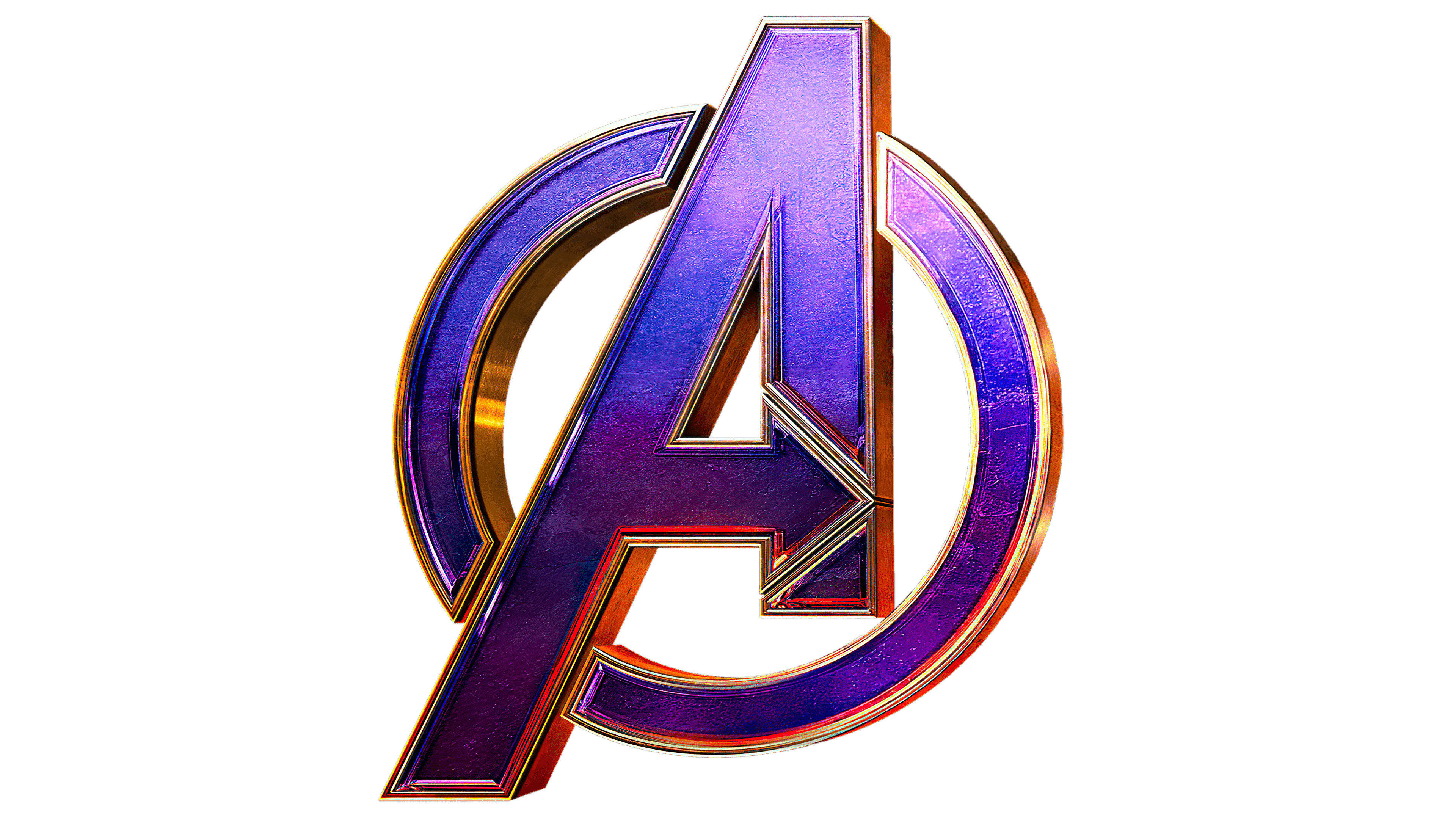
There are several versions of the franchise from different years, each a continuation of the other. The legendary emblem was used in each, based on an earlier version when “The Avengers” was still a book. The large letter “A” with a right-pointing arrow is widely recognized as a logo. This style was emphasized and deepened. Although Marvel Studios has repeatedly changed it, it has survived all transformations, becoming the hallmark of fantasy action movies.
What is Avengers?
The Avengers is an American media franchise that includes comics and movies from the Marvel Universe. The series of famous action films started in 2012. The last superhero movie of this theme was released in 2019. There are four films in the cycle, directed by Joss Whedon, Joe Russo, and Anthony Russo.
2012
![]()
The film from this period is called “The Avengers.” The movie features the basic version of the logo, reproduced in all subsequent series. Its distinctive element is the large capital letter “A”. The letter has an elongated front leg and a horizontal crossbar shaped like an arrow pointing forward. This technique signifies uncompromising, direct, and purposeful movement, which characterizes the main heroes well.
The word “THE” is written in thin and small uppercase letters on the crossbar. In addition, the first letter of the word “Avengers” is placed in an open circle – more accurately, a semicircle, adding dynamism to the logo.
Another feature is the distinctive “G,” whose lower end has a sharp protrusion. The next design element is the middle bars of the letter “E.” Both are slightly cut off and end with a sharp tip. The film company’s name is written in white on a red background and located at the top. All letters are slightly tilted to the right.
2015
![]()
The action film released the previous year, “Avengers: Age of Ultron,” retained its emblem with minor changes. For example, the letter “THE” was removed, and the metallic color was changed to maroon-red to match the background of the word “Marvel.” A reflection appeared in the capital letter “A” at the top as if the sun was rising in the distance. This symbolizes faith in the good and offers hope of a favorable ending.
2018
![]()
In 2018, the fantastic action film Avengers: Infinity War was released. This time, the developers sacrificed part of the ring around the letter “A” and removed the lower segment. This move made the movie title more readable, but the phrase’s font remained slanted. However, “Marvel” was specified as the prefix “Studios,” placed in an open white rectangle with black lines above and below.
2019
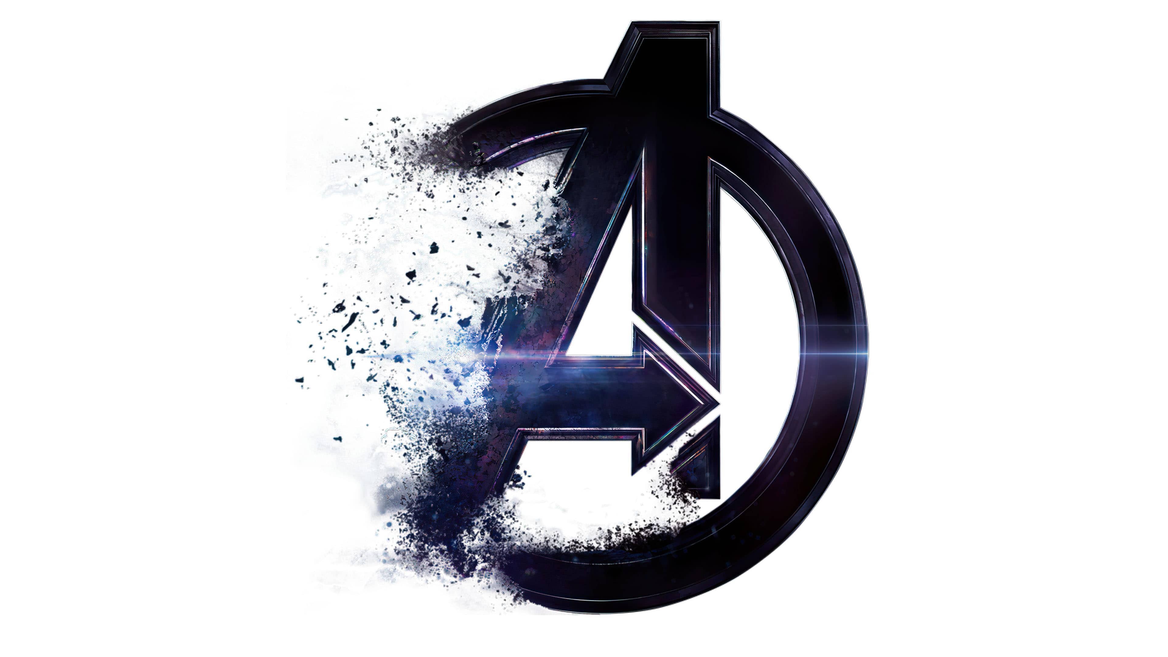
![]()
The logo from this time is timed to the release of the movie “Avengers: Endgame.” Designers returned the lower part of the ring, inscribed with the letter “A”. The word “Endgame” is highlighted in italics but is not very noticeable due to the gradient and color.
Other superhero logos
In parallel with the main logo, so-called internal symbolism exists: individual signs of the main heroes. They appeared simultaneously with the main logo.
Iron man
![]()
There are two variants. One is the mask, characterized by a complex shape consisting of three elements: rectangular eyes, a white face, and a black head. The other symbol is a double triangle taken in a ring.
Hulk
![]()
His signature mark is a tightly clenched green fist. It is located inside a circle with a dark background.
Capitan America
![]()
The logo of this character is distinguished by a patriotic mood, emphasized by the colors of the American flag and a blue star in the center. The number of rings varies by film, but it does not affect the logo’s heroic spirit.
Thor
![]()
The classic version is a massive hammer in a circle. The central element may have rays and a three-leaf flower. The handle is made of diagonal stripes: a narrow white stripe and a wide gray stripe.
Black widow
![]()
This logo consists of red hourglasses, sometimes depicting a spider. The main part is set against a black background, surrounded by a caustic yellow stripe.
Hawkeye
![]()
His emblem has a bow, replacing the crossbar in the capital letter “H.” The main color is dark purple, with white and black as additional colors.
Font and Colors
The name of the film series is set in a unique font, with the first letter emphasized. The letter “A” is outlined and features an arrow that replaces the connecting bar. The word is typed in uppercase and written slightly to the right. The letter “G” has an additional notch extending beyond the lower border.
The logo’s color palette can be simple or gradient. It is black and gray with a metallic sheen, as well as dark blue, red, maroon, beige, and brown.