The Avianca logo represents a company that never settles for less. Always in motion, it embodies new ideas, creates new routes, and forms new alliances. The emblem radiates energy, infusing optimism and vigor.
Avianca: Brand overview
Colombia’s leading airline and one of the oldest in the world, SCADTA, began operations on December 5, 1919. It was the first commercial company in Latin America, founded by Colombian and German businessmen. Their vision connected remote areas of Colombia with new air routes despite the challenges of flying over rugged terrain with limited infrastructure.
In the 1920s and 1930s, SCADTA grew, adding larger, modern planes like the Junkers F13 and Ford Trimotor and starting flights to the United States and the Caribbean. This growth helped link different cultures and boost trade.
On June 14, 1940, the Colombian government took over SCADTA, renaming it the airline. This change brought modernization and growth. From the 1940s to the 1950s, the company began using jets such as the Boeing 707 and 720 and expanded its routes across the Western Hemisphere, helping boost Colombia’s tourism.
The 1960s and 1970s were difficult years, with political and economic problems in Colombia and competition from other Latin American companies. However, it has adapted, updating its aircraft and improving its operations.
The new millennium it brought growth opportunities and challenges, like competition from budget airlines after the 2008 financial crisis.
The company operates out of Bogotá, is registered in Barranquilla, and has headquarters in the capital. It has a modern fleet and a wide network, ready to meet future challenges and opportunities.
Meaning and History
What is Avianca?
It is a major Colombian airline and the country’s national flagship carrier. It operates domestic and international flights connecting destinations in the Americas, Europe, and other regions. The company offers various classes of service, including economy, business, and sometimes first class. It offers modern airplanes, in-flight entertainment, and quality meals. The airline is a member of Star Alliance and is expanding its global reach through partnerships with other international airlines.
1919 – 1928
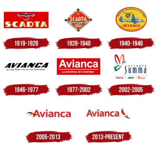
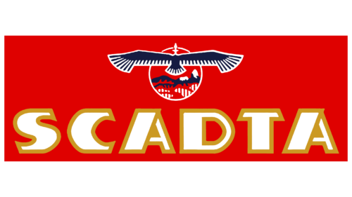
Founded in 1919, Avianca began its journey as SCADTA, an acronym for Sociedad Colombo-Alemana de Transportes Aéreos. During this initial period until 1928, the company’s logo featured a red field representing the passionate pursuit and splendor of flight. This field was adorned with a rising sun at the top edge, beautifully highlighting the land of Colombia in its center.
The image of the Andean condor, a national symbol of Colombia, added visual power to the design. The condor is depicted soaring high above the earth; its wings spread wide as if embracing the mountain peaks, symbolically linked to protection and majesty. This element emphasizes that the airline and its aircraft can traverse any distance and connect different corners of the world.
At the bottom of the logo, the company’s name, SCADTA, is displayed in large capital letters with a golden border, giving it a distinctive importance and highlighting the company’s ambitions as a leading carrier aiming for new heights in air transport. This bold and elegant inscription makes a statement about the seriousness and scale of the company’s operations.
1928 – 1940
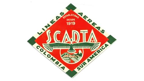
The company’s emblem is a visually rich element that acquires a dynamic appearance thanks to its unique design with an upward sharp angle. Green rectangles at the corners resemble the navigation lights on airplane wings, enhancing the emblem’s functionality and recognizability.
Along the edges of the emblem, lines run as if on an airport display, informing that the company represents Colombian airlines based in South America. This aspect strengthens the brand’s association with its regional origin and international status.
The central part of the logo retains stable and recognizable elements, including the image of a soaring condor rising above the vast expanses of Colombia. This adds symbolism and depth to the company’s image, emphasizing its connection to national pride and the country’s natural beauty.
The SCADTA inscription’s size has been visually reduced, and it is now enhanced with neon lights centered in each letter, creating the impression that they glow in the dark. This gives the logo a modern and technological look.
Finally, the airline’s founding date is placed above the visual center, reminding the viewer of the company’s rich history and heritage. Despite its many elements making it crowded and visually compact, the emblem successfully conveys the key aspects of the company’s identity and mission.
1940 – 1946
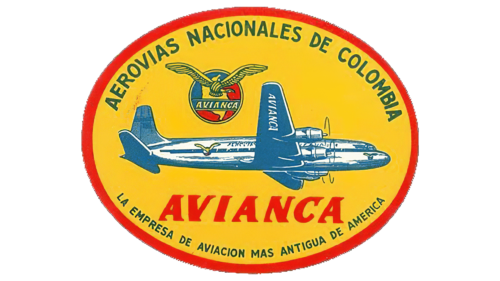
With the company’s renaming, a new emblem was introduced. Its design actively incorporates elements reflecting the country’s cultural and economic features. The oval logo, reminiscent of the shape of a banana sticker, clearly associates with Colombia’s most famous export product. The yellow logo further strengthens this connection, making the image bright and memorable.
The bold red border on the emblem stands out, highlighting the idea of flight safety and reliability, a key message for the airline. At the logo’s center is an image of a large airplane, immediately clarifying the company’s main focus—air transport.
Changes in the symbolism reflect recent shifts in the company’s structure, including the reacquisition of control over the brand in Colombia after selling shares to American investors from Pan Am. The new image of the condor, previously a symbol of the land, is now depicted flying forward against a backdrop of a map of Colombia instead of mountains, symbolizing rebirth and a new direction in the company’s development.
The new company name, Avianca, is prominently and visually appealingly placed at the very center of the emblem. The red letters of the name are enhanced with serifs reminiscent of an airplane’s keel, symbolizing speed, movement, and forward direction. This visual technique adds dynamism to the entire image, implying that the inscription and the airplane aim for new heights.
1946 – 1977
The company’s symbolism from 1946 reflects the austerity and pragmatism essential in the post-war period. The black, prominently featured letters in the company name emphasize its leading market position and enhance the visual perception of the brand as a dominant player. That year, the company significantly expanded its routes to include territories in North and South America and Europe. This geographic expansion is reinforced by adding the word “international” to the emblem, highlighting the scale and global nature of the company’s activities.
1977 – 2002
In the 1970s, the brand significantly changed its logo, reintroducing dynamism and reflecting the Colombian temperament inherent in the local culture and national character. The bright red canvas symbolizes an explosion of emotions, a festive mood, and the speed associated with fast flight. This color was chosen deliberately as it traditionally represents passion and energy, aligning perfectly with the image of a rapidly developing airline.
The white letters of the company name against the red canvas symbolize the beginning of a new stage in the brand’s history. This design highlights the name against the vivid background and emphasizes the company’s commitment to renewal and development. Introducing new airplanes during this period emphasizes a focus on technical equipment and service quality improvement. Confirming this innovation, the focus on route safety ensures reliability and comfort for passengers.
2002 – 2005
At the start of the new millennium, the Summa Alliance brand introduced its emblem as a multicolored butterfly, symbolizing the merger of three major competing airlines into one organizational system. This creative visual approach emphasized unity and simplified the coordination and organization of flights across various destinations.
The choice of a butterfly symbol was deliberate, as it represents transformation and new beginnings. This image embodies beauty and ease in flight and symbolizes the alliance’s ability to adapt and evolve. The name of the new coalition, Summa Alliance, is positioned to the right of the butterfly image, adding balance and structure to the design.
The logo’s color palette reflects the alliance members’ historical affiliation: red represents Avianca, green represents SAM, and orange represents ACES. This use of colors helps recognize each member within the alliance and highlights their contributions to creating a new, powerful union.
At the bottom of the logo, the names of all participating airlines are displayed, serving as additional confirmation of their involvement and equal status in the alliance.
2005 – 2013
The new logo introduced after the bankruptcy announcement symbolizes a new era for Avianca, now fully named Aerovías del Continente Americano. Synergy Group, the brand Owner, chose to keep the well-known and recognizable name Avianca on the logo. This decision highlights the company’s effort to maintain its identity and customer trust despite financial challenges.
The logo design features red letters in a simple font, projecting an image of a reliable and stable carrier moving confidently into the future. An element of wavy fabric strips replacing the crossbar in the letter “A” adds a sense of lightness and buoyancy, symbolizing safe and comfortable flights. The gradient in which colors transition smoothly enhances the logo and visually conveys the idea of transformation and renewal occurring within the company’s structure and strategy.
2013 – today
The airline’s new logo combines respect for its historical roots with a modern design. It uses vector graphics for a clean, sleek look. The central figure is a condor with spread wings, symbolizing the power and freedom of flight. This bird is positioned to the right of the company name, creating a dynamic and harmonious image.
The condor consists of individual geometric shapes, giving it a schematic and stylized appearance. This abstract design emphasizes the company’s commitment to innovation and modern aviation technologies. The red color adds brightness, energy, and dynamism, reflecting the company’s pursuit of progress and service quality. This color also connects to Avianca’s traditional corporate colors, maintaining a link to its historical heritage.
Vector graphics ensure the logo is versatile and scalable, maintaining clarity and impact across various media and sizes. The geometric design of the condor, with its stylized and abstract look, represents a blend of tradition and forward-thinking, highlighting the airline’s progressive vision.
The choice of red energizes the logo and ties back to Avianca’s legacy, reinforcing the brand’s identity and continuity. The dynamic posture of the condor, with wings spread wide, conveys aspiration and expansive reach, aligning with the airline’s mission to connect people and places.
FAQ
Is Avianca still flying?
Yes, the airline is still flying. The company serves a wide network, offering 129 routes and operating approximately 3,800 flights weekly. This totals approximately 650,000 seats available weekly, connecting passengers to 67 destinations in 24 countries in the Americas and Europe. This network helps travelers explore new places or do business in different regions. Its wide network and busy flight schedule demonstrate its important role in the aviation industry in the Western Hemisphere.
What planes does Avianca fly?
The airline operates a modern and efficient fleet of Airbus aircraft that can fly on numerous routes. Here’s a simple breakdown of the planes they use:
- Airbus A319-100: 21 aircraft are great for short and medium routes. There used to be 14 prized for their fuel efficiency and used primarily for regional flights.
- Airbus A320: The main aircraft for medium routes, the company currently operates 117 such aircraft. They are popular and reliable; historically, the company has had 11.
- Airbus A320-200: This is an upgraded version of the A320 with improved technology and fuel efficiency. The company has 77 of these aircraft, which are used for both domestic and international flights. They started with 10 of these aircraft.
What was Avianca’s old name?
Avianca, Colombia’s flag carrier and the second oldest company in the world, was originally founded as SCADTA. It stands for Sociedad Colombo-Alemana de Transportes Aéreos, which translates to Colombo-German Air Transport Society. It was founded in 1919 by a group of Colombian and German investors. The name SCADTA reflects the origins of its founders. In 1940, following the nationalization of the airline, it was renamed Avianca to emphasize its status as Colombia’s national airline.
Is Taca and Avianca the same?
The companies merged in 2013, making them now one company. Before the merger, they were separate organizations. Following the merger, Avianca took over all of TACA’s operations, meaning that all routes previously operated by TACA are now operated under the airline’s brand. Now, any flight previously on a TACA route is sold and operated by the airline. This merger helped expand its network, increasing its role in the aviation market and strengthening its operations in the Americas.
