The car rental service around the world has chosen a bright logo because it should not only represent the service but also actively sell it, attracting the attention of potential customers. So the Avis logo is moderately serious and dynamic. The massive sign stands for reliability and safety.
Avis: Brand overview
| Founded: | 1946 |
| Founder: | Warren Avis |
| Headquarters: | Parsippany, New Jersey, United States |
| Website: | avis.com |
Meaning and History
The work of the company Avis (it is named after the name of the founder) began with three cars. That is how many passenger cars were included in its fleet at first. Their owner opened an office at Willow Run Airport in Ypsilanti, Michigan. He rented out vehicles to those arriving from other countries and was the first to start doing this at the airport. Now the number of cars, of course, has increased. Among them are many popular brands whose products are guaranteed to be in high demand: General Motors, Cadillac, Chevrolet, Toyota, and Ford.
And until that time, the company was actively developing, opening branches in other places in the United States. By 1953, it had become the second largest American car rental company. Ten years after its inception, Avis established its first overseas offices in Mexico, Canada, and Europe. In 1972, she was the first to introduce a computerized information and reservation system, and in 1981, a network to track the location of her cars.
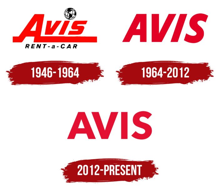
The brand’s ownership frequently changed, so it repeatedly rebranded with a change in the motto and logo. In general, he has three emblems. Each new version is, in fact, a continuation of the previous one because they are almost identical in style. The difference is in the smallest details.
What is Avis?
Avis is a car rental company located in the US, in Parsippany, New Jersey. It also has branches abroad, as the car rental service has become world famous. In total, it owns 5,500 offices in 165 countries. The service’s founder is Warren Avis, who opened it in 1946.
1946 – 1964
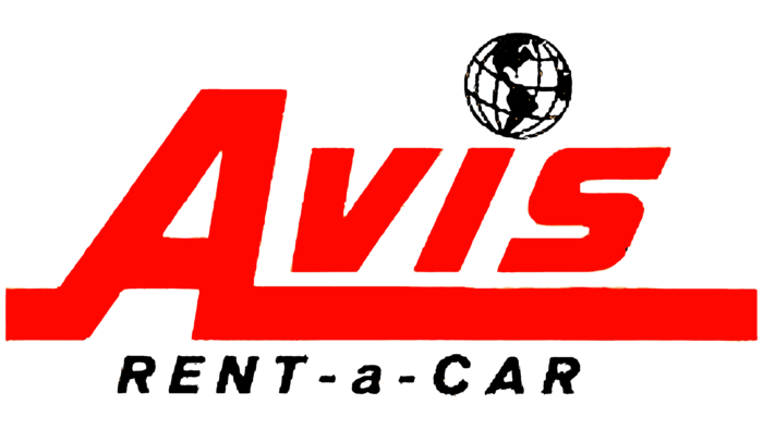
The debut logo is the quintessence of the company’s aspirations, which started the business with three machines but dreamed of global coverage of other countries and continents with its service. The globe evidence this above the “i” instead of the classic dot. And to make the concept stand out clearly, the designers painted it in black and white monochrome while making other elements red. In particular, this is the top inscription conveying the abbreviated name of the company. The characters in it are large, bold, and wide. “A” looks especially massive, complemented by serifs of different lengths: the left one is short, and the right one is long. It stretches down along the entire word and looks like an underline. Even lower is the phrase “Rent a Car,” which is typed in small print – a thin grotesque with hyphens between words.
1964 – 2012
By that time, a simple logo with an oblique inscription dates back. All letters are in uppercase and are minimalistic, without unnecessary design – there are only wide lines. Since the car rental company got a shortened name, the emblem has become simpler: the long serifs, the globe, and the bottom text have disappeared.
2012 – today
In 2012, the largest rebranding in the history of Avis took place: it changed everything, including the logo. But at the same time, the company did not abandon the visual heritage and corrected the previous version. As a result, she got a text emblem with straightened letters, while in the past, they were italic. Although the red color has changed its hue, it is still preserved.
Font and Colors
By changing the visual identity style, the car rental company has maintained its heritage. Therefore, experts tried to create a version that would be minimally different from the previous one. And it came out for them. The only thing that has changed is the number of elements. The debut logo and the modern one have a radically different number of details: if there were a lot of them before, now they are completely absent.
The emblem is made with a typeface that has become very popular in corporate America. This is a font from the Helvetica family. But each logo still has an individual feature. In the first case, the inscription is made in the Oceanic Drift Bold Italic style: it is slanted and slightly curved, with wide characters. In the second version, the letters in the name resemble the elements of the Hussar BdConOblThree font; in the third version, they look like Xyngia Bold. But the color palette is stable and differs only in shades of red: scarlet, tomato, raspberry.
Avis color codes
| Medium Candy Apple Redd | Hex color: | #e31031 |
|---|---|---|
| RGB: | 227 16 49 | |
| CMYK: | 0 93 78 11 | |
| Pantone: | PMS 185 C |
