Like the singer’s work, the Avril Lavigne logo is unique and provocative. The symbol revolves around the theme of love, which is central to the star’s songs. The emblem conveys the artist’s positive attitude towards life and ability to speak candidly about important matters.
Avril Lavigne: Brand overview
Avril Ramona Lavigne, who appeared on the music scene in the early 2000s, immediately created a sensation with her debut album Let Go, quickly cementing her status as one of the key figures in the musical history of her generation. Born on September 27, 1984, this Canadian artist, who created a unique fusion of punk rock, pop, and alternative music, captured the ears and hearts of fans worldwide.
Music has been integral to Lavigne’s life since early childhood. Born in Belleville, Ontario, Canada, she began harmonizing melodies before learning to speak. Her parents favored her musical passion, giving unwavering support to her aspirations.
At 16, Lavigne caught the attention of renowned music producer L.A. Reid, leading to a quick signing with Arista Records. Her debut album, Let Go, released in 2002, rocketed to international fame and commercial success.
The Let Go album sold 20 million copies worldwide and was certified platinum six times in the United States, a testament to Lavigne’s meteoric rise to fame. Her distinctive blend of punk rock and pop resonated with young listeners, taking her to the top of the charts and making her a musical sensation.
Lavigne’s subsequent albums, Under My Skin and The Best Damn Thing, cemented her status as one of the leading pop figures of the 2000s. She continued to maintain that momentum over the next decade, with the release of her eponymous album in 2013 and her highly anticipated sixth studio album, Head Above Water, in 2019.
Lavigne’s music gives insight into her distinctive personality and upbringing. Her sound, combining punk rock and pop elements, features influences from bands such as Nirvana, Green Day, and Alanis Morissette. Her lyrics often touch on themes of love, relationships, and self-determination, making her music both accessible and motivating to listeners around the world.
Although Lavigne’s music career has been extremely successful, her personal life has been just as fulfilling. In 2013, she married musician Chad Kroeger, but their relationship ended in divorce in 2015.
Lavigne has spoken openly about her struggle with Lyme disease, which has significantly affected her physical and emotional well-being over the years.
Lavigne’s influence on the music world is undeniable. With 40 million albums sold, she has left an indelible mark on the pop-punk genre. Her unique style and attitude towards life and music continue to inspire more than one generation of young performers and music lovers.
Meaning and History
What is Avril Lavigne?
Avril Lavigne, born on September 27, 1984, has become the face of a brand that represents more than just music; she symbolizes individuality and rebelliousness in the pop-rock genre. The Canadian singer and songwriter has captivated fans with her talent and her authentic, non-apologetic personality, which has been an important part of her journey in the music industry. Since her debut in the early 2000s, she quickly rose to the top of the charts with hits such as “Complicated” and “Sk8er Boi,” capturing the attention of millions worldwide. With her distinct style and pop music with a dash of punk, she stood out among her contemporaries, challenging the traditional image of a pop star.
2002 – 2004
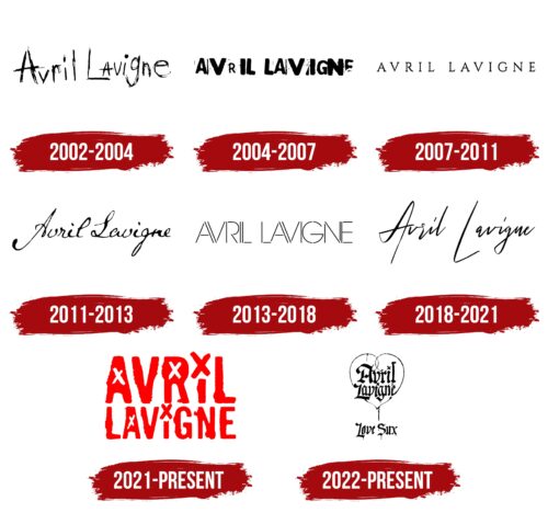
The first emblem used by Avril Lavigne from 2002 to 2004 looks like a charcoal drawing on a wall. The thin and uneven letters in the logo appear bold and rebellious, mirroring the singer’s persona on the “Let Go” album cover. This emblem captures a tomboyish spirit and a love for unique activities like skateboarding, which is reflected well in the logo.
The emblem highlights Avril Lavigne’s early efforts in the pop-punk style. The texture and chaos of the letters symbolize her carefree and daring personality, which quickly won over fans. The emblem became a visual representation of her energetic music and style, establishing her as an icon of her time.
2004 – 2007
In 2004, with the release of the album “Under My Skin,” Avril Lavigne’s logo underwent significant changes. The thin letters of previous emblems were replaced with bold and massive ones, symbolizing a new phase in her career. This album offered a glimpse into the singer’s world as Avril Lavigne emerged as a performer and songwriter, sharing her perspective through music.
The emblem for “Under My Skin” reflected the strength and confidence of the artist, showcasing her growth as a creative individual. The bold letters emphasize the power and maturity of her new sound. Some thin elements in the logo hint at the adolescent inconsistencies, representing the process of personal development. This contrast shows that, despite her progress, the singer is still on her journey toward full maturity and self-expression.
2007 – 2011
The third logo, introduced for the album “The Best Damn Thing,” shows the maturity and harmony achieved in Avril Lavigne’s work. This emblem represents the singer’s evolution, whose songs became hits, topping music charts worldwide and being translated into many languages. The logo reflects how Avril Lavigne has learned to touch the hearts of her fans, connecting with people of all ages and nationalities.
The album’s emblem conveys the singer’s musical and personal growth. The logo’s style demonstrates her ability to create songs that resonate with a broad audience. This highlights her talent for blending different cultural elements, making her music universal and accessible to everyone.
2011 – 2013
The emblem for the “Goodbye Lullaby” album expressed Avril Lavigne’s emerging individuality, focusing on her experiences and world views. The songs in this collection reflected the singer’s development, her attitude toward life, and the events that influenced her. Each track incorporated elements of personal experience, conveying the artist’s emotional state and thoughts during that period.
The logo’s style, continuous writing, soft lines, and beautiful swirls highlight the star’s unique character. These elements symbolize her individuality and creative self-expression, reflected in the album’s music. Co-writing and producing each single allowed Avril Lavigne to imprint her distinctive touch on every composition, adding depth and sincerity to the sound.
2013 – 2018
The emblem for the album “Avril Lavigne” reflects a modern and trendy style that matches the album’s musical direction. The capital letters in the logo are in a very thin font, giving them an almost continuous appearance. This design choice emphasizes the singer’s experimentation with electronic music and punk rock genres featured in this album.
The album “Avril Lavigne” revealed a new facet of her artistry, showing her willingness to explore different musical styles. Despite these experiments, the artist managed to maintain a carefree and lighthearted feel in her songs. The lines in the emblem’s lettering convey this ease and freedom present in her music.
2018 – 2021
The logo created for Avril Lavigne’s sixth album, “Head Above Water,” stands out with its unique cursive style. The distinct, slightly pointed letters resemble EKG peaks, highlighting the album’s individuality and emotional depth. The lines in the logo draw attention to the star’s unconventional approach to self-expression, reflecting her battle with Lyme disease.
“Head Above Water” is a deeply emotional experience, with each track telling a story of struggle and survival. The logo, with its rises and falls, visually conveys these feelings. The graphic design reflects the singer’s successes and new challenges.
2021 – today
The latest logo for Avril Lavigne is designed in a horror style. Crosses replace the eyes in the letters, and holes and dots are substituted, creating a dark and memorable image. This design was chosen as the symbol for the single “Bite Me” from the singer’s seventh album.
The symbolism of the crosses in the logo reflects the singer’s determination to end painful and destructive relationships. This design emphasizes the song’s main message—the importance of self-respect and the need to remove people who have caused harm. The logo vividly demonstrates the theme of liberation and strength in the song’s lyrics, highlighting Avril Lavigne’s commitment to protecting her emotional well-being.
2022 – today
The logo of Avril Lavigne’s seventh album features a heart that appears more tragic than romantic. This dramatic effect is achieved through uneven paint stripes, black color, and elegant ornamentation. At the bottom of the logo, the inscription “Love Sux” is the album title, reflecting the themes Lavigne explores in her songs. In the center of the design, her name is split into two lines, with “Avril” on the first line and “Lavigne” on the second, which are aligned in the center. The final letter, “e,” connects to the heart’s outline. A gothic font uses unique crosses over the “i” letters.
The heart on the album cover resembles scribbles in a teenager’s diary, full of emotion and slightly messy. The unusual crosses over the “i” letters suggest that Avril has a unique style that doesn’t follow typical pop conventions. The last “e” connecting to the heart’s outline gives the impression that she pours her entire self into her music, heart and all. The design is simple yet expressive, much like her songs.
Using black color and uneven paint stripes adds depth and intensity to the logo. This design choice aligns with the album’s themes of love and heartbreak. The elegant ornamentation around the heart adds a touch of sophistication, contrasting with the raw emotion conveyed by the uneven stripes and bold black color.
The gothic font enhances the logo’s dramatic feel. The unique crosses over the “i” letters make the text stand out, emphasizing Avril’s distinct style. The way the final “e” connects to the heart’s outline creates a cohesive design, symbolizing the connection between her identity and her music.


