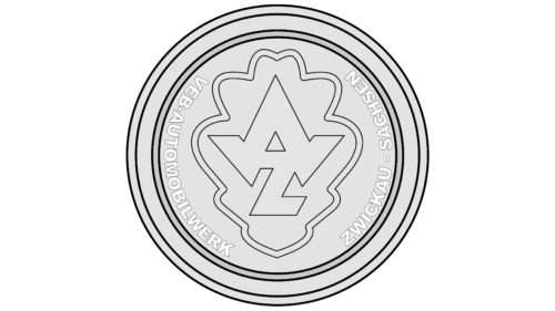
The AWZ logo is crisp, stylish, and mysterious. Full of the strength of metal and the strength of oak. He speaks of speed and predicts prosperity and a stable plant position in the German automotive industry.
AWZ: Brand overview
| Founded: | 1955 – 1958 |
| Headquarters: | Zwickau, Germany |
AWZ is a German national enterprise created when the Auto Union concern was nationalized during the formation of the GDR after World War II. Under the AWZ logo, the IFA F8 and 9, Zwikcau (Sachsenring) P70, and Trabant were produced.
The plant lasted only three years under the name AWZ, but the company has a rich history before and after the renaming. Since 1909, this has been August Horch’s private enterprise for Audi’s production, then DKW. After the nationalization of AWZ in 1958, it has had a joint venture with Sachsenring (formerly Horch). So, the two offspring of the famous designer again became one and were abolished in 1991.
Meaning and History
The logo is made in the spirit of the emblems of the automotive industry and, like most of them, has a round shape. The sign resembles a wheel, which is very symbolic. The circle is great for placing on the hood or trunk of a car.
The two wide lines separating the “tire” indicate the meticulous attention to detail, concern for safety, and strength of all components of the machines from AWZ. The design embodies a kind of buffer, protection. Despite multiple trials, resale, and war, the company survived.
What is AWZ?
A company founded by August Horch, the father of Horch and Audi, and nationalized after World War II. Famous for the release of an inexpensive subcompact Trabant.
In the inner circle, the inscription: VEB Automobilwerk Zwickau Zachsen.
- VEB indicates a socialist form of ownership and stands for Volkseigener Betrieb (People’s Enterprise).
- The combination Automobilwerk consists of two words: Automobil (car) and werk (business, enterprise).
- Zwickau is the city in the east of Germany where the plant is organized.
- Zachsen – the name of the production area – Saxony.
In the center is a fancy abbreviation from the first letters of the main part of the name: AWZ (Automobil Werk Zwickau). Placed one above the other, the letters resemble a high-speed spaceship. The symbol shows the progress and development of the automotive industry after the war. New cars were created from affordable and wear-resistant Duroplast material, the body’s shape was sporty, and the interior was trimmed with leather. The cars looked compact and fast.
The combination of letters is enclosed in a shell resembling an oak leaf. The shape embodies the durability, development, and rich experience that became the basis for creating the most popular European brand of the time, Trabant. The machine served for more than 30 years, which spoke of its high quality. And the queues for its receipt reached 15 years.
The curves of the sheet followed the contours of the letters and, in addition to the oak, resembled an unfolded and flattened car body, hinting at modern new materials.
Font and Colors
Gray and white are the main colors of the logo.
- Gray – a shade of steel and metal. It conveys the brilliance, strength, and strength of machines. Gray is the color of labor and constancy. Well-coordinated work of conveyors and assembly of machines stage by stage.
- White – shows a new period in the life of the old plant. Updating the manual, the line of cars. The body of the runabouts included many light shades.
The font of the inscription is simple, without serifs. Executed in capital letters, which conveyed impressive socialist plans, scope, five-year plans, and increased productivity.
AWZ color codes
| Platinum | Hex color: | #e3e3e3 |
|---|---|---|
| RGB: | 227 227 227 | |
| CMYK: | 0 0 0 11 | |
| Pantone: | PMS 663 C |
| Neon Silver | Hex color: | #cbc9ca |
|---|---|---|
| RGB: | 203 201 202 | |
| CMYK: | 0 1 0 20 | |
| Pantone: | PMS 420 C |
| Black | Hex color: | #000000 |
|---|---|---|
| RGB: | 0 0 0 | |
| CMYK: | 0 0 0 100 | |
| Pantone: | PMS Process Black C |


