The AXE logo is very masculine and strong. The emblem represents a company that stands firmly on its feet and produces products for real men. The brand’s fragrances are persistent and create an image of an attractive and brutal macho.
AXE: Brand overview
| Founded: | 6 June 1983 |
| Founder: | Unilever |
| Headquarters: | France |
| Website: | axe.com |
Meaning and History
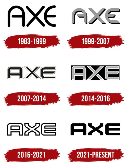
The brand had four logos with different designs. The only thing that unites them is the strict and minimalistic inscription “AXE.”
What is Axe?
The Axe is a French line of grooming products for men, known for its deodorants with various scents. It was launched in 1983 by the British company Unilever. In some countries, the brand exists under the names Lynx and EGO.
1983 – 1999
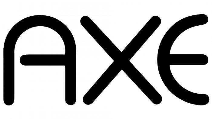
The first version of the emblem is elegant. “A” and “E” are formed by smooth semicircular lines. “X” consists of two diagonal stripes of equal length and thickness. The streamlined lettering emphasizes the absence of serifs and other decorative elements.
This logo is notable for the fact that the connecting stroke of “A” is too short. It “hangs in the air” because it doesn’t reach the left side of the letter. The color palette is standard: black is used as the main one, and white is used as the background.
1999 – 2007
The font remains the same – only small details have changed. The printed characters now have angles that were not on the emblem of 1983. The proportions have changed insignificantly: it seems that the inscription is compressed in a horizontal plane. The center stroke of the “E” is shortened. The color used for the decoration is gray with black outlines on the inside. Dark shadows give the image a subtle 3D effect.
2007 – 2014
In 2007, the designers redesigned the logo again. They abandoned the semicircular lines “A” and “E,” giving them a rectangular shape. Regardless, the letters remained streamlined thanks to the rounded corners. The developers also lengthened the horizontal strokes at the “A” and “E” to achieve harmonious proportions.
As for the design, it has become more original. Now the inscription is not just one-color – a double outline surrounds it. Each printable character is first outlined with a white stripe and then framed in black.
The company’s advertising motto was sometimes added to the existing logo: “The AXE Effect.” But the augmented version was rare and was used in exceptional cases.
2014 – 2016
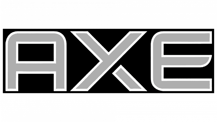
In 2014, the logo’s font did not change much, and on the products, the new company logo appeared more against a dark background. Moreover, the inscription itself was made in a strongly contrasting color. At the “X,” the lower right leg has been split to give the logo a modern, masculine feel.
2016 – 2021
The final redesign of the logo took place in 2016. This time, graphic artists paid attention to the letter “X.” They gave it a unique shape, slightly curving at the ends. Other changes were made to the color scheme. The word turned white, and the outline widened and black.
Around the same time, the Lynx brand’s current logo – the “twin” of AXE, appeared. Its name is written in a similar style: printed characters look original due to the rounded corners.
2021 – today
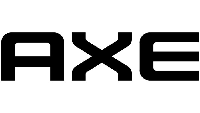
The designers used the previous logo and proposed a new version based on it – black. To do this, they took the color of the edging and made it a full fill of the letters so that there was no white void inside. The shape and style of the glyphs remained the same.
AXE: Interesting Facts
AXE, known as Lynx in some countries, is a popular brand of Unilever male grooming products. It includes deodorants, antiperspirants, body washes, and hair care items.
- Start and Growth: Launched in France in 1983, AXE quickly reached other parts of Europe and went global. It grew from offering body sprays to a full range of grooming products.
- Marketing Style: AXE is famous for its bold marketing aimed at young men. Their ads often focus on themes of masculinity and attraction, promoting the idea that AXE products make men more appealing to women.
- Name Variations: Due to trademark issues, AXE is called Lynx in the UK, Ireland, Australia, New Zealand, and China.
- Fragrances and Special Editions: AXE stands out for its variety of scents and limited-edition products, which often connect to cultural events or collaborations, keeping the brand fresh and interesting.
- Digital Campaigns: AXE has embraced digital marketing and social media to reach young people. They’ve used viral campaigns and influencer partnerships effectively.
- Ads Controversy: The brand’s advertisements have sparked discussions. Some think they support stereotypes and objectify women, while others find them funny and fitting AXE’s image.
- Social and Environmental Efforts: Despite the debates around its ads, AXE has participated in social and environmental projects, focusing on issues like self-esteem and mental health and making packaging more eco-friendly.
- Product for Women: In 2012, AXE launched ‘Anarchy For Her,’ its first product aimed at women, expanding its traditional male-focused range.
- Celebrity Partnerships: To broaden its appeal, AXE has worked with celebrities and artists in its promotions, enhancing its image.
AXE’s transformation from a single product in France to a worldwide male grooming success story shows its strong grasp of market trends, consumer interests, and the importance of branding in building a devoted following.
Font and Colors
Since the inception of the AXE logo, it has gone through several major redesigns. The first one touched an additional line – a shadow, which gradually turned into a stroke. The second touched on the letters’ shape: after many years of existence in the form of streamlined symbols, they became sharper and more geometric. Therefore, the modern version contains all the changes noted: the edging strip along the perimeter of the signs and strict angularity combined with smooth transitions. The developers have removed explicit rounding.
There is no standard typeface in the emblem – it is individual, designed specifically for this trademark. There are also some similarities with fonts from the Sans Serif category, particularly the grotesque and lack of serifs. Each letter is outlined around the perimeter with a thin line, so it looks hollow.
The color palette of the inscription is monochrome. The common version contains white characters on a white background; the commercial version contains black characters on a black background. They look like the original and its negative print. Simultaneously, the edging of the letters is also mirror-opposite: light on a dark substrate and vice versa.
AXE color codes
| Black | Hex color: | #000000 |
|---|---|---|
| RGB: | 0 0 0 | |
| CMYK: | 0 0 0 100 | |
| Pantone: | PMS Process Black C |

