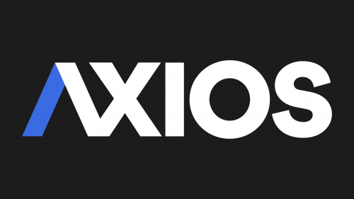
The Axios logo is as concise as the articles published on this news website. Its minimalist design aligns with the company’s overall style, whose content is both restrained and sharp. The emblem symbolizes a commitment to creative experimentation.
Axios: Brand overview
Meaning and History
The Axios brand is named after the Greek word meaning “worthy.” That’s how the news site wants to appear to its readers, as it covers serious topics, including politics, healthcare, and technology. The style of its articles is nuanced: they combine caution with sharpness – perhaps because Axios was conceived as something between Twitter and The Economist. This characteristic is also reflected in the company’s logo: it’s both strict and creative.
What is Axios?
Axios is a website that posts short news articles, daily podcasts, and weekly newsletters. It generates revenue from native advertising and is popular among centrists and occasionally left-centrists. The company has been in existence since 2016 and has belonged to Cox Enterprises since 2022. Its headquarters are located in Arlington County.
2017 – 2020
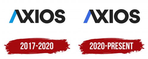
The brand name is stylized as “ΛXIOS.” The “A” not only lacks a horizontal bar but its two diagonals are colored differently: the left in light blue and the right in black. All other letters are entirely black, making the inscription minimalist despite the design experimentation with the “A.” The bold, sans-serif font also looks very simple. It enhances the clarity and legibility of the word, even considering that “Λ” and “X” are connected.
2020 – today
In 2020, the website slightly altered its logo, recoloring the left half of the first letter in a darker shade of blue. This change made the inscription more expressive without losing the recognizable features of the design.
Font and Colors
The company name is executed in a bold, grotesque font, resembling something between Touche Bold by Indian Type Foundry and Cera Black by TypeMates. It’s a geometric, round-shaped font. However, the creators of the emblem added an authorial detail, removing the bar from the “A” and connecting what remained of the letter to the following “X.” The colors are also creatively chosen: in the black wordmark, a small blue detail unobtrusively stands out, demonstrating the creative potential of the news site.
