


![]() Baby Einstein Logo PNG
Baby Einstein Logo PNG
Multimedia products to support children’s all-around development- that’s what the Baby Einstein logo stands for. It reflects the target audience and emphasizes simplicity, comfort, and practicality. The logo conveys the positive energy of using the products and the fact that babies become smarter with them.
Meaning and History
![]()
The iconic children’s franchise began with a video program developed by housewife and former teacher Julie Aigner-Clark. She loved introducing children to the arts, so she recorded unobtrusive didactic material, called I Think I Can Productions, in her home in the suburb of Alpharetta, Georgia. It was an educational program that introduced the kids to classical music, household items, colors, poems, shapes, and other objects and phenomena.
The original video featured visuals and toys, complete with phrases, numbers, stories, melodies, and words in multiple languages. Subsequent commercials featured two of the Clark family’s daughters. Julie’s husband invested $18,000 in her project, which went to equipment to produce the info product and record video cassettes sold in the US, Australia, Asia, and Europe. In 1997, the startup was awarded Parenting Magazine’s Video of the Year.
As production costs rose and the product required a site expansion, the family firm accepted The Walt Disney Company’s offer and sold the business to them. This happened at the end of 2001. In 2002, the new owner renamed the brand Baby Einstein and gradually built it into a multi-million-dollar franchise. As a result, programs, series, books, and toys appeared within its framework. But the project’s founder was not relegated to the background: she was named the year’s entrepreneur, interviewed, and invited to appear on television. The Kids II corporation then acquired the product.
Since the program’s development was ongoing and very active, it accumulated several logos. They are made in a childlike style to show the work’s content, themes, and focus, and to attract the target audience. A well-built identity led to a grandiose result: every third American family with children has at least one Baby Einstein product. His logos really cannot help but attract because they are bright, unusual, and extraordinary. There are six in total.
What is Baby Einstein?
Baby Einstein is an American educational and entertainment project created in 1996 by former teacher Julie Aigner-Clark. Over time, it has grown into a multimedia franchise and now offers a variety of products for children, including toys, books, CDs, interactive activity materials, and more. Widespread popularity followed the brand’s acquisition by Disney. Kids II, Inc now owns it. The head office is located in Atlanta, Georgia.
1996 – 1998
![]()
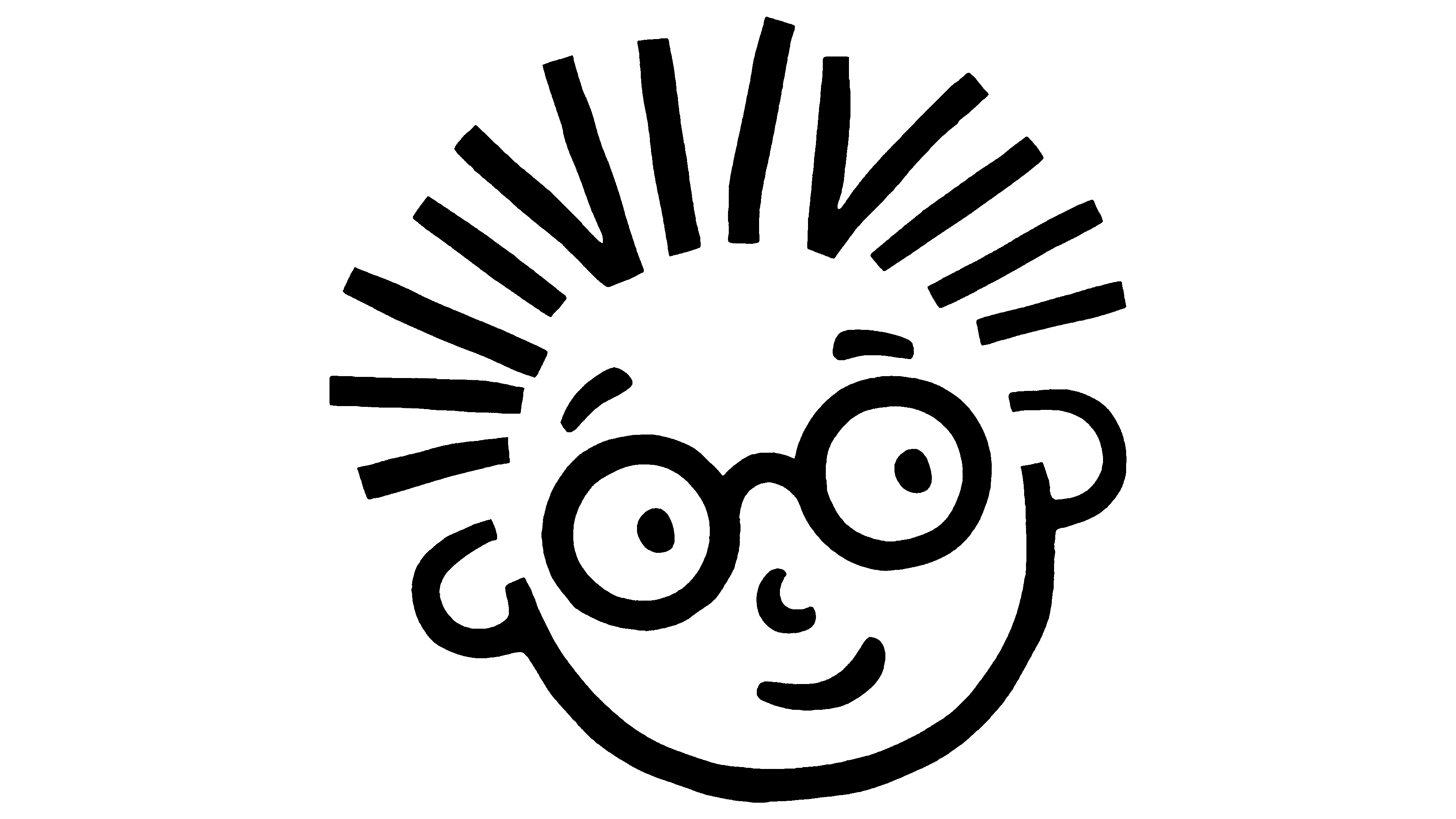
The first logo set the stylistic tone for all others. He served as the basis, and the designers were guided by him when modernizing the visual identity. This is a playful symbol featuring a child in round glasses, looking attentive. The boy’s eyebrows are raised in surprise, and the right tip of the closed lips is slightly extended to the right. The hair is drawn as short vertical lines arranged chaotically to evoke the analogy with the famous photograph of the physicist Einstein, in which he has a similar hairstyle. The character’s face was created using an inverted arch, at the ends of which two open mini-circles represent the ears.
Because the picture consists of simple stripes, it seems as if children drew the logo. However, this is not the case because everything is well thought out and each element serves a marketing purpose. The brand name is also located here, decorated in a similar design. The characters are lowercase, jump, vary in height, but are confident and the same thickness. They also imitate children’s styles. The letters add color to the emblem: red, blue, yellow, green, pink, and purple.
1998 – 2007
![]()
In 1998, two inscriptions were added to the Baby Einstein logo in small lowercase. The first is the “the” particle. She took the top position, fitting between the vertical lines “b” and “b” in the word “baby.” The second is “company.” This part is located at the bottom, covering the space between the “t” and “n” in the word “einstein.” The rest of the elements were kept: the multi-colored letters in the name, the smirk on the face, and the upraised hair on the child’s head.
2007 – 2013
![]()
Based on what we have, the designers introduced a new logo. After Baby Einstein became part of The Walt Disney Company, the company decided to rebrand. The result was a combination: the authors added a trapezoidal screen and placed the owner’s emblem at the top of it. In addition, they made the font bold, increasing the letter color and width. The additional inscriptions “the” and “company” disappeared, but the face of a smiling boy with glasses and raven hair remained unchanged. The designers added translucent, light-gray shadows to it, just like the word “Disney.” A triple three-dimensional frame surrounds all elements.
2013 – 2015
![]()
In 2013, Baby Einstein was acquired by Kids 2, Inc., and as a result, the iconic Disney logo was removed from the brand’s logo. The removal of the large element allowed the text to be moved up slightly and the baby’s head to be enlarged, with the silver shadows being removed. New layers were added to the frame, making its contours more defined. The shades of the letters also changed slightly.
2015 – 2018
![]()
In 2013, Baby Einstein adopted a logo that is still in use today. It has a completely redesigned concept: the smiling child’s face has been moved to the left, the font has been changed, and the trapezoidal frame has been removed. The inscription is written in lowercase letters, but in a different, more readable, classic design. The title still occupies two rows but has an interesting typographic feature. The fact is that the thickening at the end of the tail “y” from the word “baby” is also the dot of the “i” in the word “einstein” located below. And one more thing: the artists redrew the boy’s face, which is why it took on other features. They retained the emblem’s colorfulness.
2018 – today
![]()
In 2018, a monochrome logo was adopted. It consists of the child’s face and the name of the children’s entertainment company. For the inscription, the developers chose a standard sans-serif typeface from the grotesque category.
Font and Colors
The Baby Einstein logo is designed in a childlike style because the brand is aimed specifically at this consumer segment. A key role is played by a multi-colored inscription that contains almost all the colors of the rainbow. At least that was the case until 2013, when the designers simplified the color scheme by removing pink and blue, which were hard to see. The modern version of the logo is the most minimalistic because its text is monochrome and more compact.
In early versions of the visual identity, the text is set in a typeface that resembles children’s scribbles. Firstly, it built trust among the target consumer group. Secondly, it emphasized the brand’s entertainment and gaming focus. It was a one-of-a-kind custom typeface created by Kimberly Geswein. Her name is Baby Einstein Regular. Then a systematized version appeared, but it was also drawn. The inscription in the modern emblem is made in standard printed grotesque.