


![]() Baidu Logo PNG
Baidu Logo PNG
The Baidu logo speaks of Internet-friendly programs. The company is engaged in developing digital technologies and creating network products. As seen on the emblem, artificial intelligence occupies a special place.
Robin Li was born in Yangquan, Shanxi, on November 17, 1968. After studying information management at Peking University, he moved to the U.S. to pursue a degree in computer science at the University at Buffalo. In 1994, he joined IDD Information Services, a Dow Jones & Company unit, where he worked on software for The Wall Street Journal’s online edition.
In 1996, Li developed RankDex, an early hyperlink-based page-ranking system that appeared before Google PageRank. In 1998, Li and Eric Xu met Yahoo co-founder Jerry Yang, then returned to Beijing with $1.2 million from Integrity Partners and Peninsula Capital. Baidu was officially registered on January 18, 2000, starting in a small apartment near Peking University.
The name “Baidu” came from an 800-year-old Song dynasty poem and referred to a repeated search for an ideal. At the time, Yahoo! China and Sohu were already present, but Chinese-language search still had major gaps. Baidu first sold search technology to portals, then launched Baidu.com in 2001 with paid search advertising. In 2003, it added news search, image search, and Tieba.
Baidu was listed on NASDAQ on August 5, 2005, raising $109 million, and joined the NASDAQ-100 in 2007. After Google moved its China search operations to Hong Kong in 2010, Baidu’s share of search ad revenue reached 70 percent. It bought 91 Wireless in 2013, faced a major ad-verification scandal in 2016 after Wei Zexi’s death, launched the Apollo autonomous-driving platform in 2017, and raised $3.1 billion through a Hong Kong listing in 2021.
Meaning and History
![]()
The basis for this service’s appearance was an early search service called RankDex. Its developer was Robin Li, who at the time represented IDD. He had released the program long before Baidu came along, so we can confidently talk about its continuity. For example, the foundation was introduced in 1996. It is now the largest platform, offering 57 service types.
It all started with an algorithm for ranking sites, ranking the search pages offered by the systems. The programmer, first of all, patented his technology in the United States and only then proceeded to realize his idea. His novelty was that he was the first to use hyperlinks to determine the ranking of indexed sites.
The author called the search engine a “link analyzer” and ranked web resources by popularity, based on how many other sites linked to them. The technology was called PageRank. By the way, something similar appeared on Google only two years later (in 1998). The key advertising product is Baidu Tuiguang, which is similar to Google Ads. It pays for each click on the advertising line.
Despite its wide domestic popularity, this search engine has failed to go beyond its country’s borders. Therefore, the administration decided to translate all the site’s functionality and management tools into English. The original language is also present in the digital company’s modern identity, showing the service’s country of origin and the main coverage area. It has two very similar emblems.
What is Baidu?
Baidu is a Chinese holding company that includes a firm of the same name, engaged in artificial intelligence, Internet services, and various digital products. It is also the name of a search engine. The company’s place of incorporation is the Cayman Islands. Its emergence date is 2000. The founders are Robin Li and Eric Xu. Headquarters is located in Beijing (China).
2000 – 2004
![]()
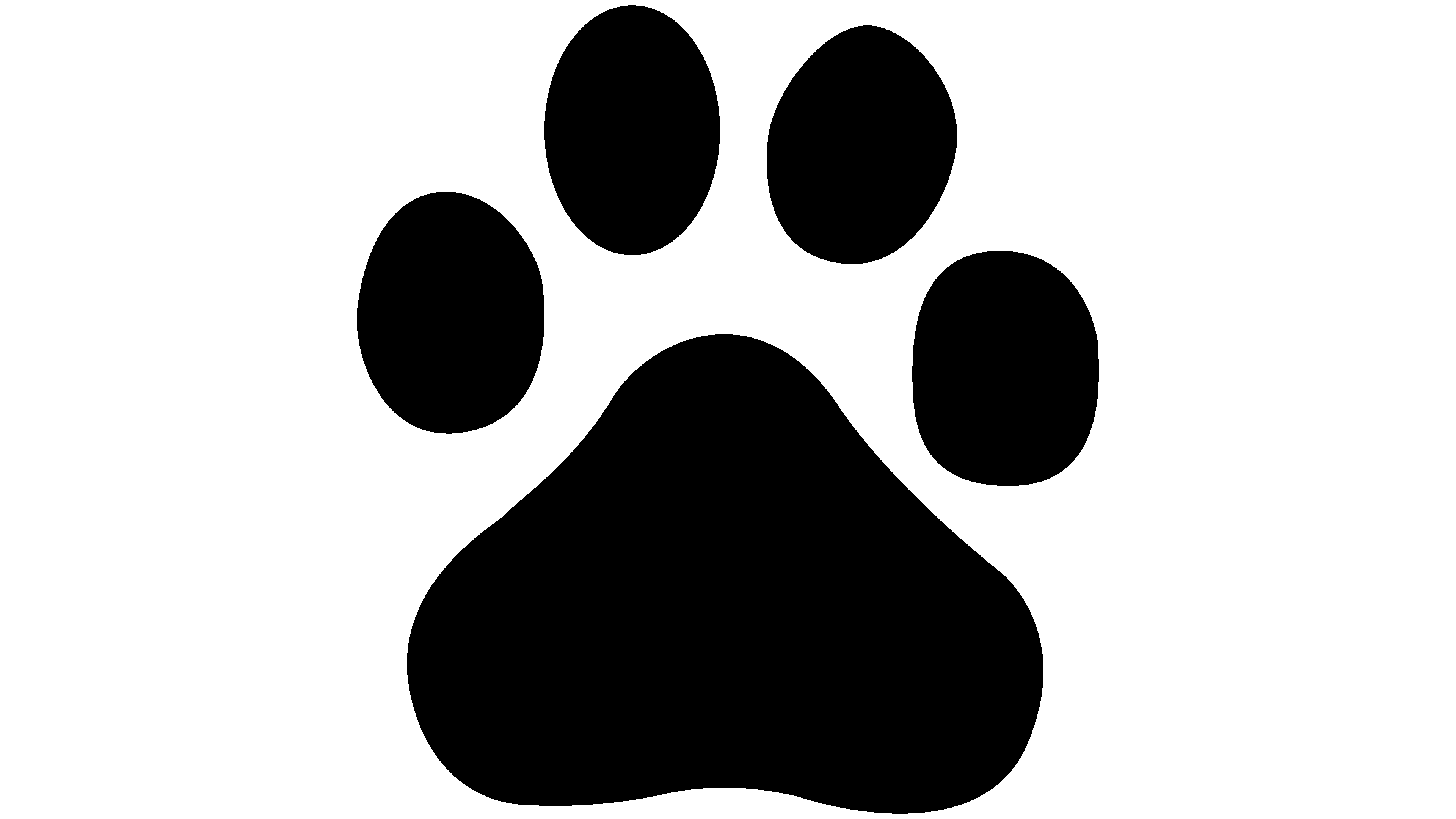
Baidu’s debut logo features a dog’s paw print, as a hint that the user has chosen the right search strategy and is on the right path to the goal. It is a graphic element of the Chinese company’s visual identity. The footprint is very large and oval-shaped, with oval elements and a white inscription inside. To its left is the first component of the Internet service name, “Bai.” And the second (“du”) is located in a paw print. The beginning of the text is in the grotesque red font; the end is in thin white lettering.
2004 – today
![]()
The current logo is, in fact, the previous version with minor changes to the text. Thus, the emblem has an inscription in Chinese – two complex characters in red, in tone with the English word “Bai.” Its designers also slightly transformed it: they reduced the width of the letters’ feet and generally replaced the font with a more compact one. The same happened with the second part of the service name, located in the center of the dog’s footprint – it now has a completely different style.
Font and Colors
At first, the text was only on the left side of the dog’s paw print, but in the second version, the developers added another inscription on the right. This visually balanced the Baidu logo and gave it the next high conceptual meaning: find everything you can, take the right direction, and find what you need. This thought occurred after the IT company’s most popular product among Chinese users turned out to be its search engine. It is worth noting that the name of the holding, which has passed into the emblem, means “a hundred times” or “many times” or “countless times. It was borrowed from the poem “Green Jade Table in The Lantern Festival” by Xin Qiji.
For the debut logo, the designers chose two fonts; the first, used for “Bai,” resembles Incite Regular. The second one, with the morpheme “du,” looks like the DelargoDTPro SemiBold typeface. The lettering is now typed in the analogous Encode Sans Wide Bold with some modifications.
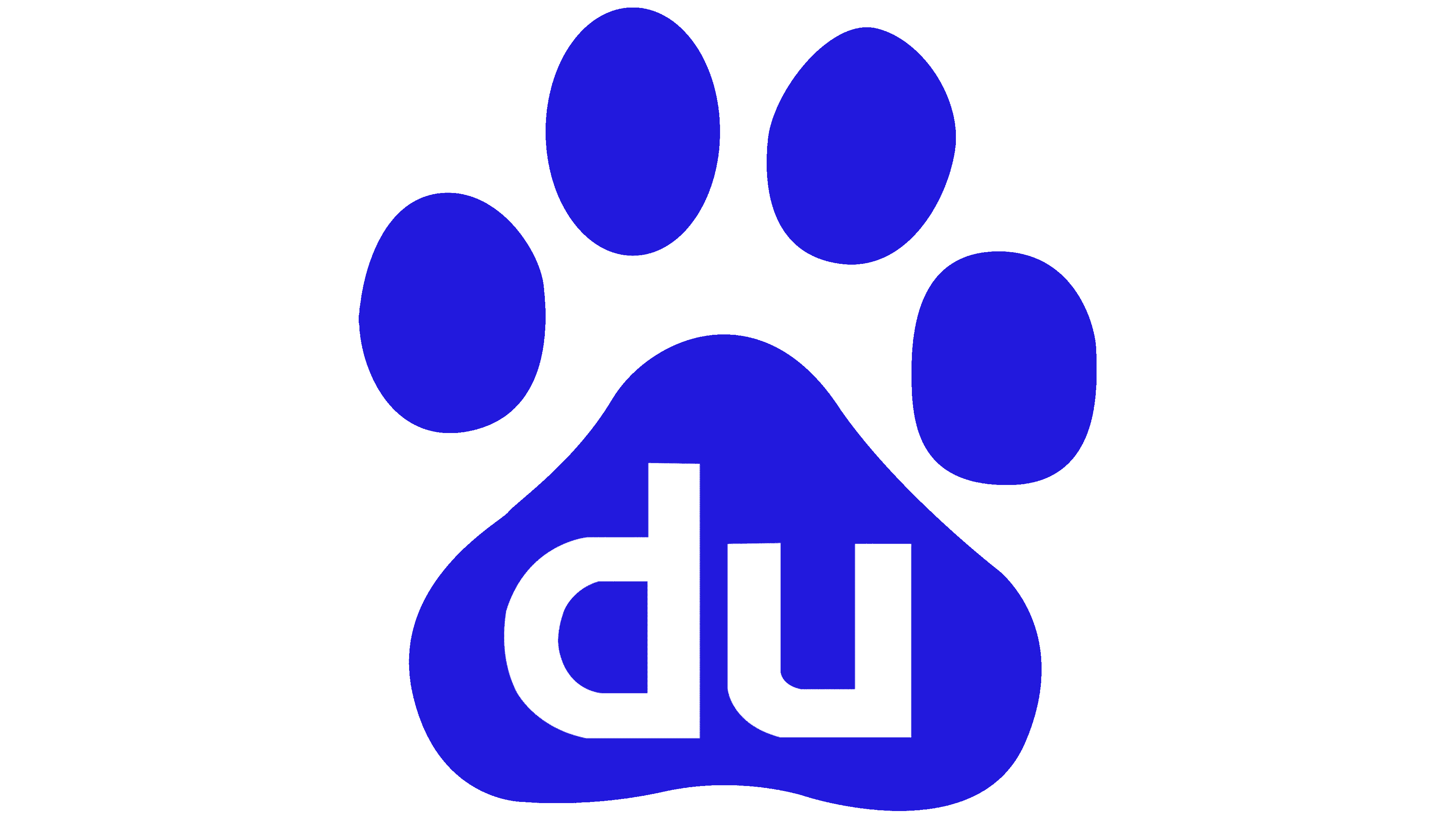
The accent color in the signature palette is red (code #DE0F17). It is considered the most popular shade in China and is used to adorn the national flag. According to Hex gradation, the second most important color is deep blue, which corresponds to shade #2529D8. White is used as the background.