The financial institution Bank of the Province of Buenos Aires (Spanish: Banco de la Provincia de Buenos Aires) was founded in 1822. As the state-owned bank Argentina, the second most important, it has assets and deposits of equality, which are not in the country. Today, the financial structure has demonstrated a powerful new form of identity. She acquired an unexpected impulse. The color palette is dominated by green – among the majority of financial structures globally; this color is the most characteristic. A small inclusion of blue – “celeste” represents the manufacturing sectors as an engine for developing the banking structure.
The logo is a two-row letter “P” – forming the first letter of the word “Provincia.” It indicates the geographical location of the province. The letter consists of two parts – a green upper segment and a small blue lower segment. In turn, it is read directly as a single whole – “R.” The synthesis of two elements, the use of a sans serif typeface creates a common unity of development and energy. At the same time, the perception of visualization, the new concept of the financial brand strategy, is increasing. The slogan created by the developers – “Acá se produce” (in English – Here we produce) – sounds spectacular. It synthesizes the message of power that is characteristic of the spirit of Buenos Aires. From here begins the starting point of everything – identity and business. However, the slogan looks far-fetched, very full of emotions, and attempts to attach many messages.
The monogram has no meaning in either English or Spanish. The logo is not part of the pie chart. At a stretch, you can see the semblance of the sawtooth shapes of factory roofs, which should convey a sense of the pushing impulse for the province’s development. Verbal transcription is rather heavy. The visualization is very difficult to perceive, even though the font lacks serifs. At the same time, the space of the monogram is used as an element of graphic performance, and it does not look very convenient.
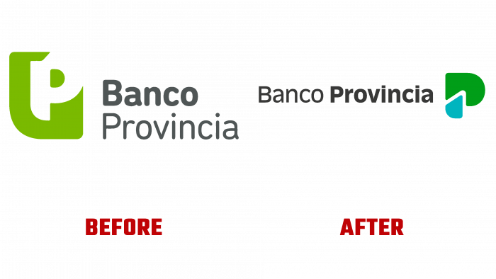
The rebranding did not result in a unique and attractive logo. It is difficult to say whether memorability and ease of visualization will be ensured. Only one thing can be said for sure – the logo has acquired conciseness with a color palette typical for many financial organizations in the world.


