The Band-Aid logo is known to many people because it is on every branded band-aid. It is a business emblem of an informational nature because it tells customers about the manufacturer and type of product. Such a marketing tool helps distribute products, actively expanding the consumer segment.
Band-Aid: Brand overview
| Founded: | June 1920 |
| Founder: | Johnson & Johnson |
| Headquarters: | United States |
| Website: | band-aid.com |
Meaning and History
The sticky patch was invented by Earle Dickson of Highland Park, New Jersey, who worked for Johnson & Johnson. While cooking, his wife Josephine often cut and burned her fingers, so he decided to make a dressing that could be quickly applied without the help of outsiders.
Then the inventor told the management about his idea, and it immediately launched a line of innovative products. Over time, the adhesive plaster gained wide popularity and its creator – career growth. Dickson rose very high, reaching the position of vice president. But the first products were made by hand and were not in demand until the corporation established machine production. The boom began in 1924.
In 1939, Johnson & Johnson updated its product range with a sterilized (antibacterial) sticky hemostatic material. A few years later (in 1951), she introduced decorative band-aids. They were decorated in different designs: with the image of Batman, Barbie, Elmo, Rugrats, Spider-Man, Donald Duck, Superman, Rocket Power, Mickey Mouse, and images of other famous characters. There were also smiling faces.
This medical product was especially popularized during World War II when millions of shipments were delivered abroad. During that period, the brand reached such wide popularity that today virtually no one can do without it. According to Johnson & Johnson, more than 100 billion pieces have been sold over the years of the Band-Aid’s existence. Therefore, now the design of a simple logo is recognizable in every corner of the world. The developer officially registered the Band-Aid emblem in the United States. Gradually, it became the model of a universal trademark in both American continents.
What is Band-Aid?
Band-Aid is a bandage brand founded in the United States in 1920. At first, it referred only to adhesive plasters, which were developed by Earle Dickson, an employee of the medical and pharmaceutical company Johnson & Johnson. He came up with them for his wife because she was often injured with a knife while cooking and could not always quickly provide herself with first aid.
the 1920s – 1930s
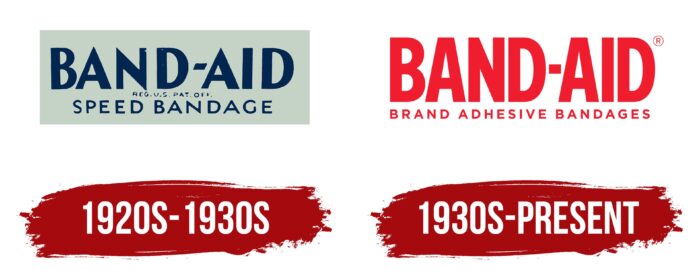
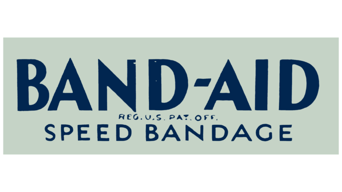
The original logo consisted of several parts, executed in a strict blue and white palette. It was a horizontal rectangle; the ratio of length and width resembled a strip of adhesive tape. Inscriptions were placed inside and ungrouped into three lines. At the top was the brand name. It was set in a sleek, geometric font, a sans serif typeface with all-caps. Well-defined angles and straight lines distinguished the letters. Between the words “Band” and “Aid” was a miniature hyphen, the right and left sides cut diagonally.
The second row was occupied by a short and small inscription indicating the fact of trademark registration. The third line contained the phrase “Speed Bandage,” indicating the product type. The font of this inscription was thinner than the first but thicker than the second. It was simple and well read, made based on the grotesque. The main colors were dark turquoise and light gray.
1930s – today
The modern format of Band-Aid’s visual identity is more vibrant. It consists of red inscriptions, typed in large type in upper case. All letters are printed, bold, and even. They are formed from strips of the same width, which outwardly resemble a band-aid. There are no serifs, and between the first and second parts of the name, there is a miniature square that acts as a hyphen. The symbols have a geometric shape and are characterized by a harmonious combination of angles and smooth lines. Below is another inscription – “Brand Adhesive Bandages.” It is typed in a thin sans serif and aligned with the top line on both the left and right sides.
Font and Colors
The logo of one of the most famous band-aid brands is bright yet minimalist. From the very beginning, it was textual and did not contain any graphic elements. Therefore, its highlight is in the wide lines of letters, similar to plasters for applying to wounds. It has only slightly changed during the entire time of its existence, necessarily maintaining a trend towards simplicity and clarity.
The inscription in the debut logo is typed with a typeface that resembles the Penumbra Flare Std Semibold with certain changes. For example, the central gap at the letter “A” is shifted to the left, and the right leg is one and a half times wider than the left. The current version uses a font as close as possible to Neusa Bold by The Northern Block. This is a smooth inscription with lines of the same thickness.
In the original version, the color scheme was gray and dark turquoise. Now it consists of red and white, symbolizing the medical field, the classic sign of which is a red cross on a white background.
Band-Aid color codes
| Pigment Red | Hex color: | #ef1d2e |
|---|---|---|
| RGB: | 239 29 46 | |
| CMYK: | 0 88 81 6 | |
| Pantone: | PMS Bright Red C |


