


 Bandai Logo PNG
The Bandai name on the toymaker’s logo comes from the company’s original name, Bandaiya. For the founders, that name captured what they hoped to make. They wanted to create toys children would return to years later.
A remarkable shift in the toy industry occurred on July 5, 1950, when Naoharu Yamashina established Bandai, a brand that would eventually become synonymous with creativity and innovation. Headquartered in Taitō, Tokyo, Japan, the company set out to shape entertainment worldwide.
From its early days, the brand focused on making toys that sparked children’s imaginations. Early products included simple toys and models, but as the brand grew, it ventured into more complex creations, from action figures to elaborate model kits. Its innovative designs and high-quality products quickly earned it a reputation as a leading toy manufacturer.
As the company evolved, it recognized the immense potential of popular-culture tie-ins and launched a strategy that would become one of its defining characteristics. It began securing licenses to create toys based on popular television series and films, significantly expanding its product range. This astute strategy connected the brand to a broad audience, reinforcing its position in the global toy industry.
The digital era prompted the brand to adapt and enter the world of electronic toys and video games. Notable successes in this realm included the iconic Tamagotchi virtual pet and various video game franchises. The brand’s successful pivot to digital offerings underscored its ability to adapt and thrive amid shifting consumer preferences and technological advances.
Its influence expanded beyond toys and games. The brand made substantial inroads into entertainment, forming Bandai Visual to produce anime and movies and influencing pop culture on a grand scale. This diversification exemplified the brand’s versatility and helped cement its cultural influence.
Meaning and History
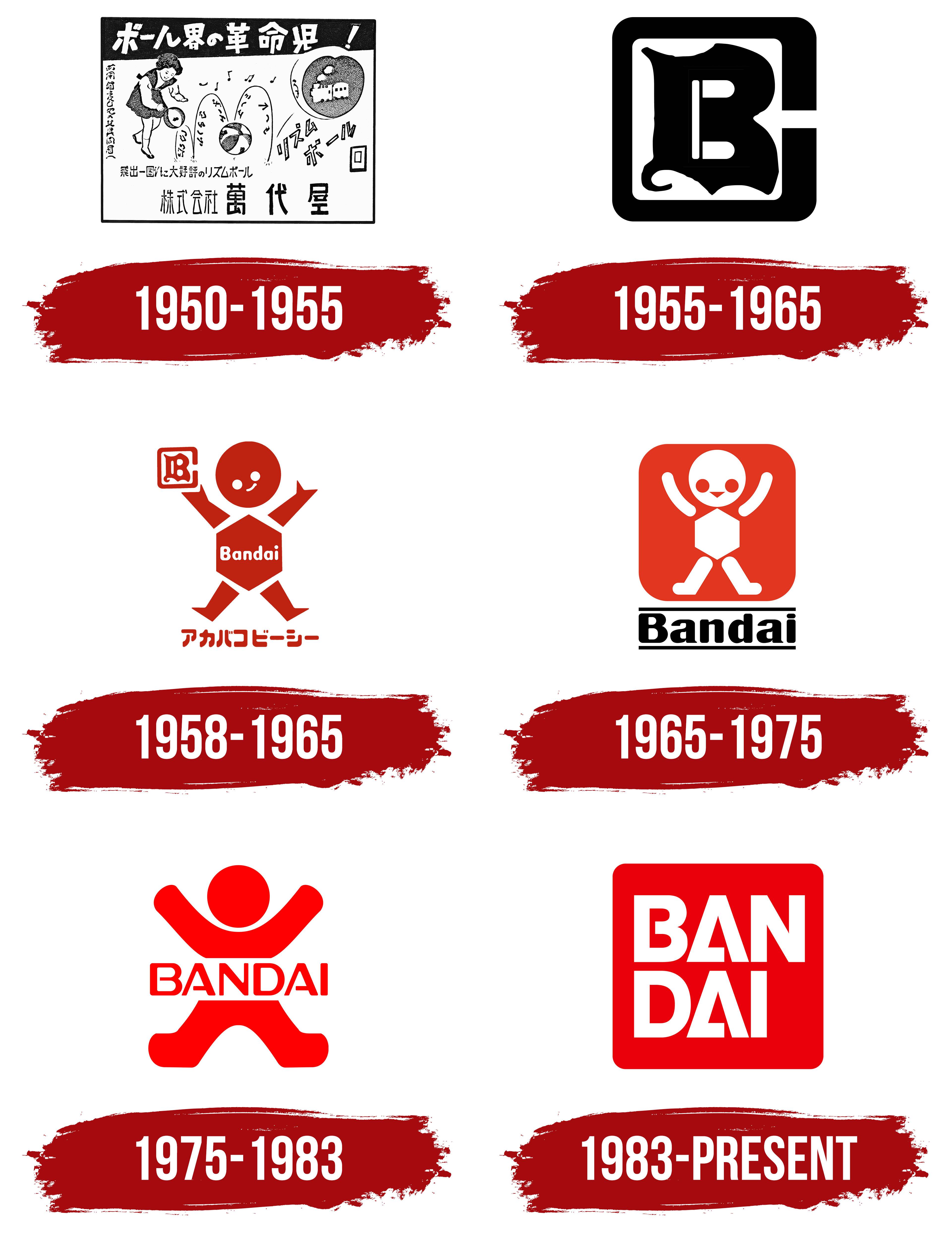
Bandai’s brand identity is anchored in creativity, innovation, and a deep understanding of fan culture. Operating at the intersection of various entertainment forms, Bandai embodies a unique blend of tradition and technology, continuously evolving to stay relevant while retaining its distinctive character.
The Bandai logo, a simple red square with the company name in bold white letters, reflects this identity. The square shape suggests unity and continuity, indicative of Bandai’s longstanding presence in the industry and its commitment to delivering unified entertainment experiences. The bold white typography emphasizes the company’s confident and pioneering spirit. At the same time, the vibrant red conveys energy, passion, and adventure, resonating with Bandai’s youthful, dynamic audience.
Bandai’s brand identity blends tradition, innovation, and deep fan engagement. Bandai continues to shape the global entertainment landscape, bringing joy and wonder to people of all ages.
What is Bandai?
Founded in 1950 and based in Tokyo, Japan, Bandai is a global entertainment leader known for a diverse portfolio of toys, video games, anime, and films. Bandai’s innovations have shaped many facets of entertainment and reached millions of fans across generations. Bandai has played a significant role in popularizing Japanese pop culture globally through franchises like Gundam, Dragon Ball, and Power Rangers. These franchises have become part of a broader cultural narrative, demonstrating Bandai’s understanding of fandom and its ability to create immersive worlds that resonate with audiences.
1950 – 1955
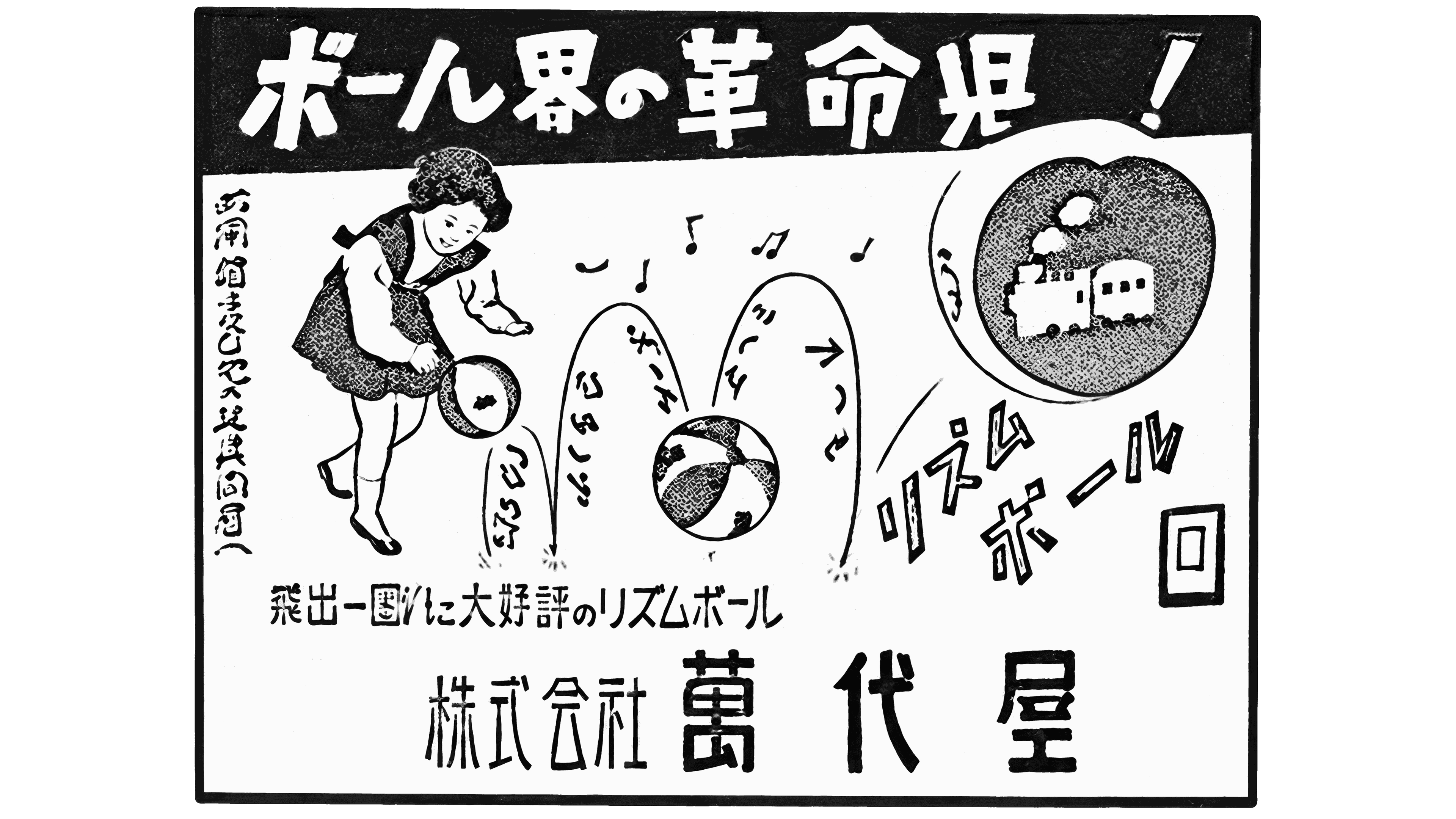
Naoharu Yamashina used the name Bandai-ya to express his vision for the business. It came from the Japanese phrase 萬代不易, “bandai fueki,” which conveys the idea of remaining unchanged across generations. The founder wanted to create products that would bring people joy in any era and help the company grow. The company was established in Tokyo in 1950 as 萬代屋 (Bandai-ya).
Newspaper publications from 1950 featured a logo with the full Japanese company name, 株式会社萬代屋. The final three characters, 萬代屋, spelled Bandai-ya. At the same time, the preceding 株式会社 identified it as a joint-stock company. The name appeared in larger type than the legal-structure designation. The black-and-white lettering combined vertical strokes of varying thickness with generous spacing between the characters. This design preceded the Latin-letter monogram.
1955 – 1965

In 1955, Bandai began linking its product branding to quality guarantees. The Toyopet Crown model became the company’s first toy sold with a guarantee, and a BC monogram, formed from the initials of Bandai Company, appeared in its branding.
The outer “C” took the form of a square frame with rounded corners and an opening on the right side. Inside it sat a decorative “B” with heavy, rounded sections, irregular flares, and a curl at the lower left. The letter’s flowing contours contrasted with the frame’s strict geometry. Printed in a single color, the monogram could fit into small areas on toys and packaging.
By the end of the decade, the BC mark was being used alongside a red box to promise customers tested product quality. Red thus became part of Bandai’s branding long before the introduction of the square with white lettering.
1958 – 1965
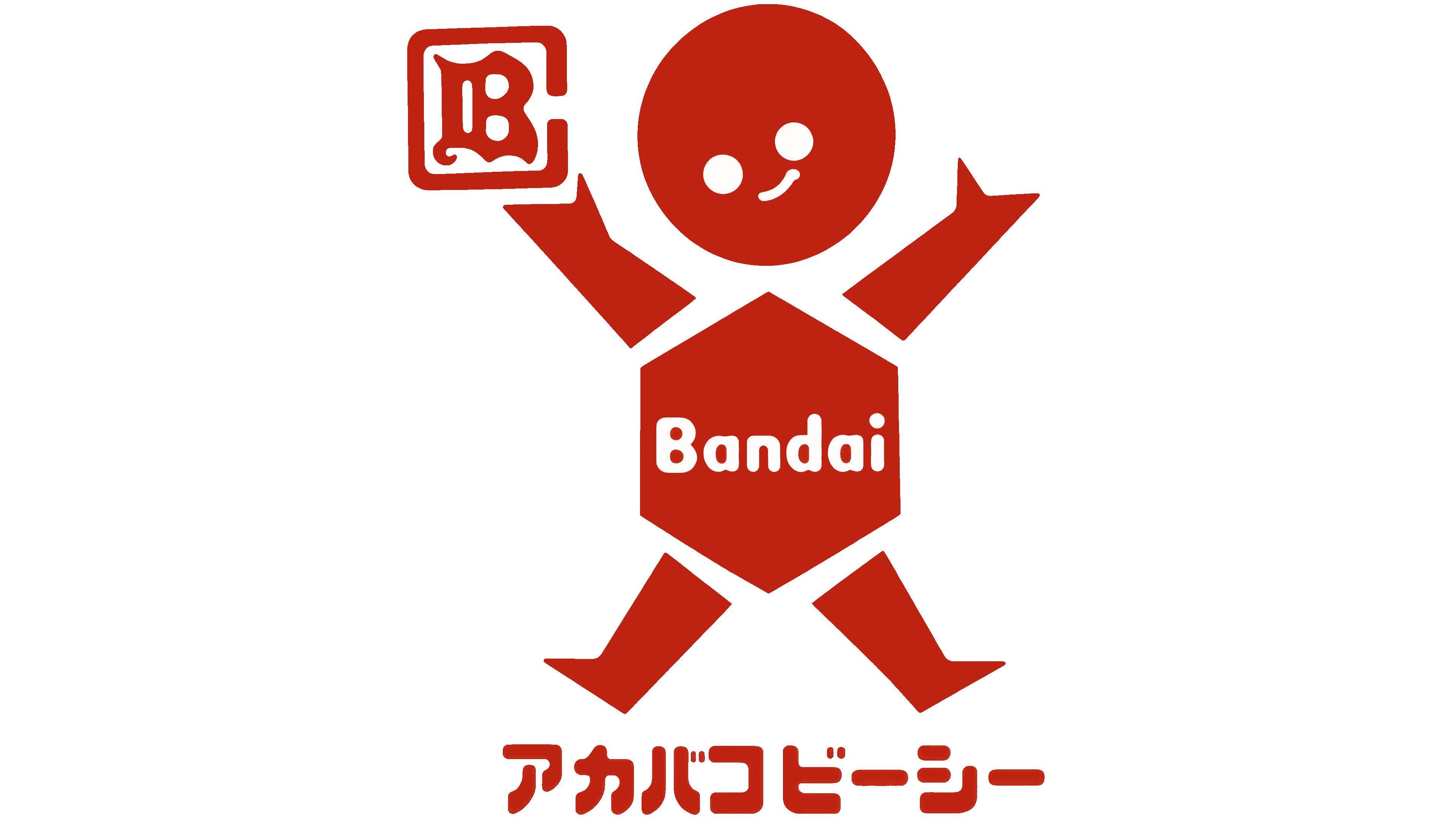
In 1959, Bandai expressed its commitment to putting quality first through a cheerful child with raised arms. The character was named Banzai. The emblem combined the smiling figure with the manufacturer’s existing monogram. A smaller BC mark remained beside one raised hand, while the Japanese inscription アカバコビーシー appeared beneath the figure, referring to the red box and the BC brand.
Bandai appeared in white across Banzai’s polygonal torso. Separate, angular arms and legs extended from the body, with a round head above it. Two light-colored circles formed the eyes, and a short curve formed the smile.
In July 1961, Bandai-ya was shortened to Bandai. The Japanese spelling changed as well. The kanji 萬代屋 were replaced with バンダイ, written in katakana.
1965 – 1975

The Bandai name was later removed from the figure and placed beneath a red square with rounded corners. The wordmark sat between two horizontal lines. It paired an uppercase “B” with lowercase letters, all large and black with thick, rounded serifs.
Inside the square, the figure was rendered in white. Its arms had smoother contours, and its legs ended in rounded feet. Red circular eyes and a triangular mouth appeared on the white face. The torso retained its hexagonal shape. In 1966, the company introduced the new Bandai Baby brand.
1975 – 1983

The nine companies in the Bandai group needed a shared identity to support their joint expansion into international markets. In January 1975, Banzai was redesigned for the group, retaining its raised-arm pose. Large geometric shapes replaced the childlike face and small decorative details. The red square was removed, and the figure itself became red against a light background.
A solid circle formed the head. The raised arms formed a continuous arc with rounded ends, while the lower section resembled spread-apart legs. A white band bearing the red BANDAI name separated the upper and lower halves. Uppercase sans-serif lettering replaced the previous rounded wordmark.
1983 – today

As Bandai expanded beyond toy manufacturing, it needed an emblem that could unite its different businesses while maintaining a connection to entertainment. In March 1983, the company integrated seven businesses into the parent organization and introduced the motto “Dreams and Creation.” The identity update accompanied changes to the group’s structure and operations. PAOS led the project, and Japanese designer Shin Matsunaga created the emblem. The committee considered his proposal alongside work by two other designers.
Matsunaga replaced the human figure with the company name in white inside a red square with rounded corners. The lettering was split into two lines of three letters each, BAN above DAI. The upper row filled nearly the entire interior width, while the lower row left open space on the right. The large, heavy sans-serif letters combined the rounded forms of “B” and “D” with the diagonal strokes of “A” and “N.” Both “A” s had a small gap between the crossbar and the right diagonal stroke.
The red square connected the emblem to Bandai’s earlier branding, while the two-line name suited its various entertainment businesses. The rounded corners softened the lettering’s strict geometry. After Matsunaga’s design was approved, PAOS developed different logo applications. Outline and multicolor versions joined the primary design of white letters on a solid red field, and an animation featuring dissolving dots was created for screen use.
In 2005, Bandai and Namco merged to form Bandai Namco Holdings. In 2006, their video game divisions merged to form Namco Bandai Games, later renamed Bandai Namco Entertainment. Bandai retained the red emblem, which continued to appear on its official website, toy packaging, and in audiovisual credits. The group used a separate identity featuring the Bandai Namco name inside a frame resembling a comic book speech bubble.
In 2018, BANDAI SPIRITS was established to serve adult audiences, including model kits and collectibles. The company received a blue version of the square emblem with the existing BANDAI letter arrangement. Color helped distinguish the brands within the group. Red remained associated with Bandai, while blue identified BANDAI SPIRITS.
In June 2024, both versions became collectibles in the Acrylic Logo Display EX series. The red and blue emblems were released as acrylic display pieces reproducing the square shape and two-line BANDAI lettering. A transparent base about 10 mm thick let them stand alongside models, figures, and toys. The manufacturer’s logos became standalone decorative pieces for collectors’ displays.