


![]() Bang Logo PNG
Bang Logo PNG
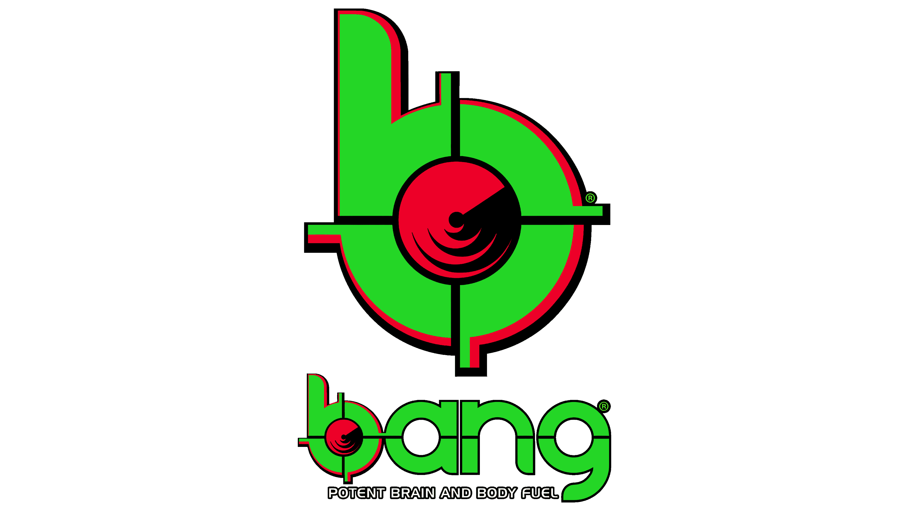
The Bang logo is modern and conceptual. It reflects the main idea of the energy drink brand: hitting the target so the consumer can quickly focus, concentrate, and never miss. The emblem perfectly conveys internal dynamism, encouraging active actions.
Bang Energy’s history began in 2012 when Jack Owocki’s company, Vital Pharmaceuticals (VPX), introduced a new energy drink. With prior experience in sports nutrition and supplements, the company decided to enter the fast-growing energy drink market.
From the start, the focus was on creating a unique formula that distinguished the product from traditional energy drinks. The team also prioritized expanding its flavor lineup to offer customers various options.
Between 2015 and 2017, the company experienced rapid growth. Its strong marketing efforts and active social media presence began attracting a larger audience, and introducing new flavors significantly boosted its popularity.
From 2018 to 2020, the brand solidified its market presence. Competing with established names like Monster and Red Bull, it became one of the top three energy drink producers in the United States. By this time, the lineup included over 40 flavors.
In 2023, Bang Energy was acquired by Monster Beverage Corporation, marking a major milestone and ushering in a new chapter. This acquisition reshaped the competitive dynamics of the energy drink market.
The brand has built its reputation on innovative formulas and bold marketing strategies, which have driven its rapid growth and established it as a prominent leader in the industry.
Meaning and History
![]()
In 2012, Vital, founded in 1993 by Jack Ovock, created the Bang brand to produce a low-sugar carbonated energy drink. The brand was given a colorful logo and a distinctive label that quickly caught consumers’ attention while displaying the bottle’s contents. Over time, the product range expanded to include more than forty flavors. The brand’s visual identity accurately characterizes the type of beverage, suggesting a quick recovery of mental and physical abilities.
What is Bang?
Bang is an American energy drink popular in the United States alongside similar products such as Monster and Red Bull. The line was launched in 2012 and was owned by Vital Pharmaceuticals, which produced it in over forty flavors. As of 2023, the brand is owned by Monster Beverage, which acquired its parent company.
2012 – today
![]()
The Bang logo represents the maximum concentration of internal energy, ensuring quick recovery and readiness for work. Its key element is the crosshair symbol harmoniously placed inside the letter “b.” Four thin lines, one of which passes through the entire name, converge in the center of the glyph and diverge in all cardinal directions. The composition is based on a blue circle with a shadow and several curved strokes. Against the white background, it looks unusually bright.
The inscription uses a lowercase font. All characters are strongly rounded; sharp elements are present only at their tips – one at the end of each letter. The printed characters are outlined, each enclosed in a separate pink frame. Below the brand name is another line with the corporate slogan “Fuel Your Destiny!” The slogan is written in capital block letters and highlighted in black. The second line is so short that it barely reaches the outline of the letter “g.”
Font and Colors
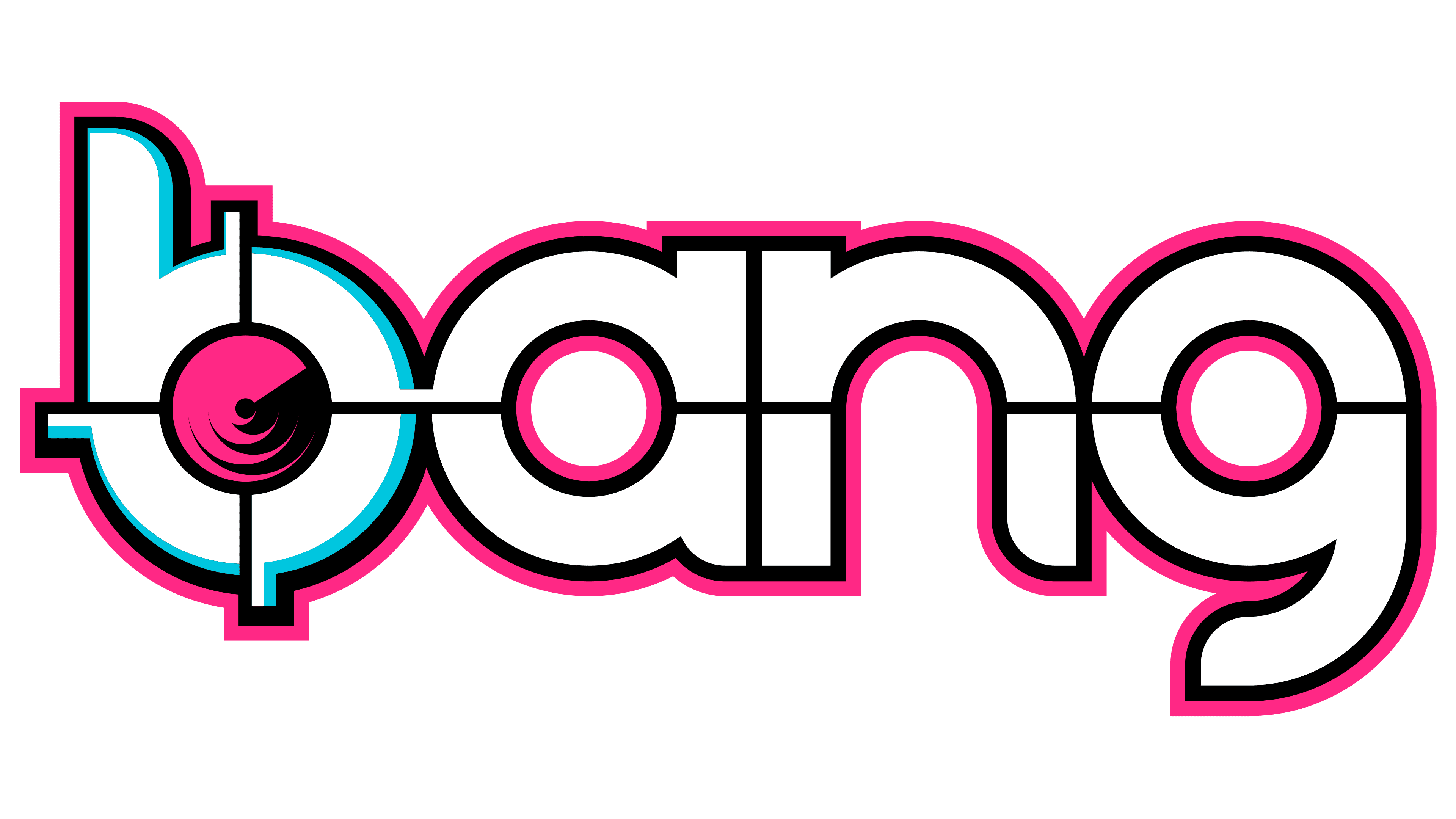
The font used for the energy drink’s name is unique. The font has no internal fill; it is hollow and outlined with a thin outline.
The colors in the emblem are muted so that the focus is on the content rather than the label. Thus, the designers chose soft pink (the rainbow unicorn’s color), blue, black, and white. This combination is balanced but far from boring.