Barracuda Networks’ logo is always watching the situation. The emblem evokes a sense of sharpness, extremity, and alertness. It represents an experienced information defender, ready to attack the enemy at any moment suddenly.
Barracuda Networks: Brand overview
| Founded: | 2003 |
| Founder: | Dean Drako, Michael Perone, Zach Levow |
| Headquarters: | Campbell, California, U.S. |
| Website: | barracuda.com |
Barracuda Networks is an American IT technology developer specializing in information security, cybersecurity, storage, and data archiving. The company holds 200 patented solutions. Its products are distributed in 100 countries and generate a net profit of $85 million.
Meaning and History
The young company chose a successful analogy to present its activities and built a stylish identity around it. One rebranding for Barracuda Networks’ 10th anniversary significantly changed the image. However, the logo continues to match the chosen theme. Each visual element of the logo creates a sense of suddenness, the ability to stand up for oneself and protect the client.
What is Barracuda Networks?
A Californian IT company founded in 2003, focusing on network security. It has helped 200,000 clients worldwide. The developer’s arsenal includes 20 algorithms and programs for detecting viruses, preventing intrusion, and protecting information from theft through the network. Its headquarters are in Campbell.
2003 – 2013
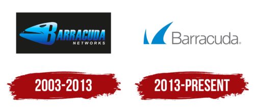
The emblem consists of a black rectangle with the name inside on two levels. A large blue “Barracuda” and a smaller white “Networks.” The first capital, B, is transformed into a fish head. The other characters resemble its skeletal structure.
The predatory fish Barracuda was chosen as an analogy for the company’s name. These powerful attackers can reach up to 2 meters in length. Escaping from the jaws of an attacking fish is impossible. It acts swiftly, and once its jaws close, it never releases its prey. Such “fish” in the form of powerful protective programs and algorithms guard the client’s network. No virus or spy can penetrate inside. Information and data are completely secure.
The black rectangle symbolizes enclosure, a safe, and information storage. The dark background conveys concealment and secrecy. The attacker doesn’t even suspect that under the cover of darkness, in these dark waters, a “guard dog” is waiting for them.
The analogy with a fish was chosen because of the association of the Internet with the sea or the boundless ocean of information. The company protects only a small portion of it belonging to the client.
The difference in size between the developer’s name and the inscription “Networks” demonstrates the complete control of the security system over the object.
The play of colors is also not accidental. White represents important new information – everything that is in the client’s email or website. The shade speaks of freedom, openness, and safety. The owner can use it, and clients can visit, read, and correspond. Beyond visibility, the enormous guard, Barracuda, watches over it all. Blue is the color of technology, computerization, and software. They are the ones guarding the network.
2013 – today
In 2012, the company’s president and CEO changed, which led to a rebranding.
The fish in the logo hid its face, but the two sharp fins sticking out of the water serve as a reminder that it’s always on guard. The emblem consists of an inscription and two elements rising in front of the name. In the new interpretation, the logo became simpler and more modern. It looks brighter and points to hidden possibilities.
The massive black rectangle made the emblem gloomy. It conveyed the idea of fighting evil, dark nights, and secrecy. In the new interpretation, the war goes on subtly in the light of day. The element of fear and concern associated with network protection has been removed. Everything is in order, under control.
The semi-transparency of the letters and the light color of the name present the developer as a business professional. Security through their software operates discreetly. It is present in the background and does not distract attention. However, it works continuously.
The element of sharpness and danger is evident in the spikes of the fins. The cyber protector is ready to hurt the thief painfully if they cross the line.
Font and Colors
Blue and light gray form the basis of the modern sign.
- Blue is the color of water, which corresponds to the fish theme. The shade of blue is used for the programming niche, the IT sphere, engineering developments, and technical software. The palette indicates the algorithms for detecting threats through clear, logical actions of the system.
- Gray is the shade of methodical, consistent work. Boring and monotonous. But only persistence and repetition of the same operations can reliably support protective barriers.
The font resembles Alergia Grotesk Normal Ul but with a more concise writing of “a.” Thin, light letters with unusual bends resemble a web or traps, ready to catch a cybercriminal.
Barracuda Networks color codes
| Green Blue | Hex color: | #0088ce |
|---|---|---|
| RGB: | 0 136 206 | |
| CMYK: | 100 34 0 19 | |
| Pantone: | PMS Process Blue C |
| Dim Gra | Hex color: | #6e6e73 |
|---|---|---|
| RGB: | 110 110 115 | |
| CMYK: | 4 4 0 55 | |
| Pantone: | PMS 424 C |


