 Bay Area Rapid Transit Logo PNG
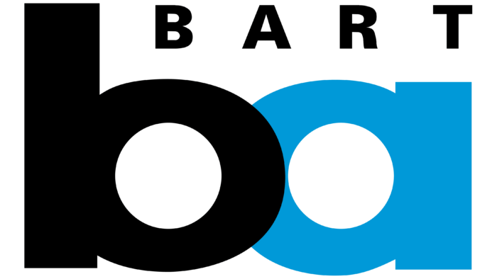
The Bay Area Rapid Transit logo expresses determination and directness relating to a transportation network where these qualities are very important. The balanced combination of wide and narrow elements accurately describes the company’s work. And the balanced colors speak of the company’s confidence and safety.
Bay Area Rapid Transit: Brand overview
| Founded: | September 11, 1972 |
| Headquarters: | Oakland, California, U.S. |
| Website: | bart.gov |
Bay Area Rapid Transit (BART) is a high-speed transportation network that includes electric trains running in California’s San Francisco Bay Area. It connects the largest settlements of the region and two international airports, being a subway within the city. The system includes six lines with 50 stations (their total length is 211 km) and one branch line with diesel trains (its length is 16 km). The final time of the company’s emergence is the autumn of 1972. It has become the fifth busiest railroad in the US, with an annual ridership of up to 118 million people. The head office is located in the city of Oakland.
This transportation system opened in stages and was based on the Key System commuter train network and an electric streetcar line. It operated in the first half of the 20th century and provided regular service across the bay to the San Francisco area. But in the 1950s, it was dismantled and replaced with a highway. However, after studying the road traffic problems in the region, the experts came to a conclusion. From an economic point of view, it is much more profitable to build a network of high-speed transport that would connect the city with the surrounding settlements and important infrastructure facilities.
Formal work on the project started in 1957. It consisted of creating a district authority for the future high-speed road. At first, it included five districts: Alameda, Contra Costa, San Francisco, Marin, and San Mateo. The alliance later partnered with the Valley Transportation Department in the Santa Clara area. As part of the Bay Area Rapid Transit expansion, Silicon Valley also joined it. It then expanded to include two local international airports.
Meaning and History
The BART rapid transit system uses emblems that have visual dynamics. This allows her to be associated with high-quality passenger services, with determination, accuracy, and punctuality. And the monogram of the combined letters “b” and “a,” created in the late 1960s, makes the brand recognizable.
The history of the Bay Area Rapid Transit logos has seen a shift from abstract imagery to concise lettering. Moreover, preference is given not to the system’s full name but to the abbreviated one because the minimalistic abbreviation symbolizes reliability and a responsible approach to business.
What is Bay Area Rapid Transit?
Bay Area Rapid Transit is an American high-speed transportation system. It covers six destinations, connecting San Francisco with suburban stations and two international airports. At the same time, BART is a combination of subway and rail with a control center in the city of Oakland. The company’s passenger traffic is very high and reaches 118 million people annually. Now it ranks fifth in the US in terms of load.
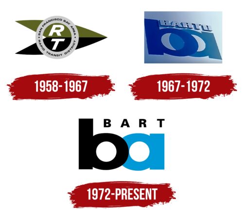
1958 – 1967
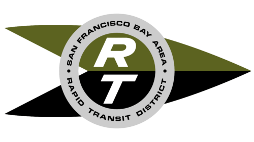
At the end of 1957, a meeting was held at which it was decided to found BART. A year later, a prototype logo appeared in the form of an arrowhead pointing to the right. It consisted of two black and olive-colored parallelograms folded together. This element represented the high speed of diesel trains.
Above the arrow was a gray ring encircling the large white letters “R” and “T” – short for “Rapid Transit.” Bold italics were used for the abbreviation. But the black inscription “SAN FRANCISCO BAY AREA RAPID TRANSIT DISTRICT,” placed inside the ring, was typed in a different font: a strict square grotesque. He gave the impression of authority and importance. This logo began to be officially used in 1964.
1967 – 1972
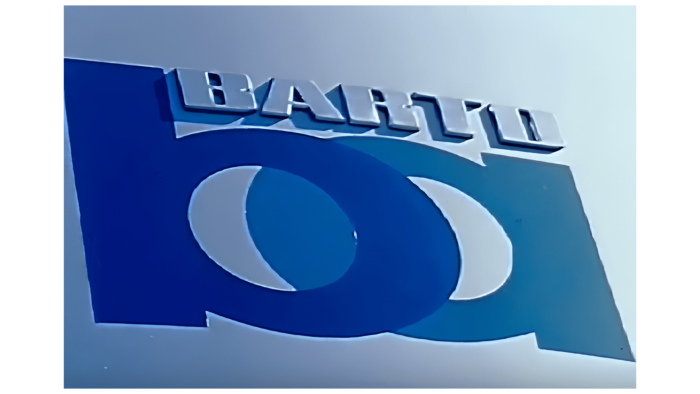
The debut Bay Area Rapid Transit logo featured a modernist touch and was designed in 3D. It consisted of two capital letters in lowercase – “b” and “a.” They were designed so that they externally resembled each other in a mirror image. The only difference between them was the elongated top of the “b.” Otherwise, these signs were identical. Round parts touched in the center. At the top was the inscription “Barto.” Her glyphs were small but distinct, capitalized, with shadows accentuated to the left and bottom, making them appear three-dimensional. The lower monogram consisted of wide stripes and was painted in two shades of blue: “b” in cobalt and “a” in pastel blue.
1972 – today
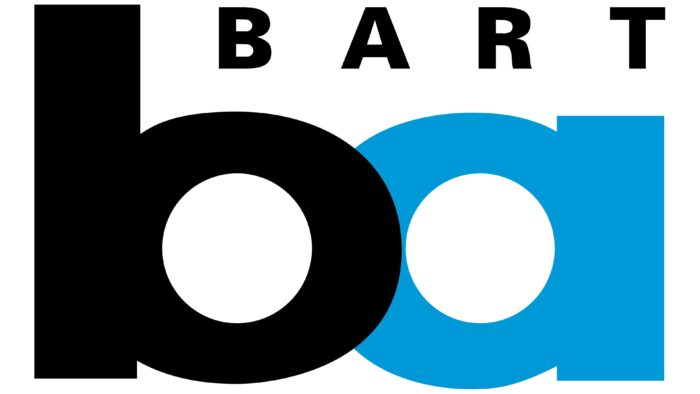
The current logo is much stricter and simpler than the previous one. It is characterized by clear lines, confident curves, and right angles. The designers have retained the massive “ba” abbreviation with a mirror image of the letters. Although the glyphs are still wide and squat, they are colored in different colors: black and blue. This allows them not to merge since “b” and “a,” as before, are superimposed on each other. The top lettering is now slightly shorter due to the missing “O” (it is no longer in the title). The word “Bart” is two-dimensional, with wide letter spacing and right alignment.
Font and Colors
Separately, it is worth considering the imposition of two letters in the monogram since it is different in both logos. In the debut version, “b” and “a” overlap more than in the modern version: they do not just intersect but are shifted beyond the circle’s boundaries and are visible in the central gaps. And now the symbols are superimposed one on the other: the first – on the second. Due to the low transparency, part of the “a” ring is completely invisible.
The shortened company name Bay Area Rapid Transit is a symbiosis of two typefaces in the modern logo. The first is Agane S Extra Bold (created by Danilo De Marco), and the second is Urbano Black (developed by FontSite Inc.). Sans-serif fonts, bold, with hard corners and smooth turns.
The main corporate palette includes several shades of blue. The debut emblem was dominated by cobalt and celestial. Now preference is given to light blue (“a”) and black (“b,” an abbreviation), which look advantageous on a white background.
Bay Area Rapid Transit color codes
| Rich Electric Blue | Hex color: | #009ad9 |
|---|---|---|
| RGB: | 0 154 217 | |
| CMYK: | 100 29 0 15 | |
| Pantone: | PMS 801 C |
| Black | Hex color: | #000000 |
|---|---|---|
| RGB: | 0 0 0 | |
| CMYK: | 0 0 0 100 | |
| Pantone: | PMS Process Black C |
