The expression that the designers put into the BCG logo underscores the importance of the consulting firm. Its confident and flowing lines convey the dynamism necessary for this business. Its style is distinctive, inviting, and memorable.
BCG: Brand overview
| Founded: | 1963 |
| Founder: | Bruce Henderson |
| Headquarters: | Boston, Massachusetts, United States |
| Website: | bcg.com |
Meaning and History
BCG was opened in 1963 through the efforts of the head of the consulting division of The Boston Safe Deposit and Trust Company. It became part of it and a subsidiary department, whose duties included advising the bank’s clients. By the end of the year, the company had a second consultant (the first was Bruce Henderson). In 1966, the Boston Consulting Group expanded beyond the US by opening an office in the capital of Japan.
The firm’s separation from the parent organization started in 1974 when the founder first presented a project to transfer BCG shares into the ownership of the employees themselves. This allowed her to gain independence. This process was completed in 1979. The company is in the top 3 largest consulting structures in the United States. Moreover, it adheres to a strict corporate policy, so there are only two logos in its history: debut and current.
What is BCG?
BCG (Boston Consulting Group) is a private consulting company in the USA. She promotes business development and deals with related issues. In particular, this service helps to create an effective management model and determines the best development strategies. The year of its creation is 1963. The founder is Bruce Doolin Henderson. The headquarters is located in Boston, Massachusetts. The company is international, as it owns 90 offices in 50 countries.
1963 – 2018
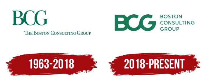
For a long time, the consulting company used the logo with the classic spelling: all the letters in the name were capital, thin, and printed. Their only distinguishing characteristic was the bond. The symbols in the abbreviation were located so close to each other that they were perceived as a single “construction.” They were decorated with sharp serifs, resembling straight needles. “C” and “G” overlapped in style and looked almost identical. The difference between them was only in the lower element, which is usually present in “G.” The extended version of the company’s name, “The Boston Consulting Group,” was typed in a similar font. The phrase went far to the right, so it was not aligned on either edge and began under the letter “C.”
2018 – today
In 2018, an updated logo was introduced with the same concept as the first, but with a completely different design. The only thing that unites them is the color: it is still emerald green. The labels are now rearranged, with the abbreviation “BCG” on the left and the phrase “Boston Consulting Group” on the right in three rows. Moreover, the article “The” disappeared from the name. The antiqua was replaced by the grotesque, so the readability of the text improved. At the same time, the letters “B,” “C,” and “G” became wider, getting a closer connection and a modern look.
Font and Colors
After the modernization, the debut logo became much more diverse, despite the presence of text in both parts. The fact is that the designers made a graphic element out of the abbreviation, tightly connecting the letters. The result is a multifaceted figure with smooth transitions between parts, which does not resemble a monogram.
The old BCG logo uses a sequin with sharp spikes. It is typographically similar to the Neuton Regular typeface or its free counterpart Neuton SC SC-Regular (both designed by Brian Zick). The lettering is done in a smooth sans serif in the new logo, reminiscent of Durotype’s Neutro Demi font. The corporate palette at all times remained unchanged – green. But it was not a classic color, but it’s an emerald shade.
BCG color codes
| Dark Spring Green | Hex color: | #177b57 |
|---|---|---|
| RGB: | 23 123 87 | |
| CMYK: | 23 123 87 | |
| Pantone: | PMS 7726 C |
