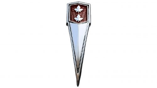
The Beaumont logo is as sharp as a sword blade. The element cuts through the air, facilitating movement toward the goal. The mark links the company to Canada, and its main focus is automobile manufacturing. The emblem reflects the strength of metal, reliability, and durability of the vehicles.
Beaumont: Brand overview
Beaumont is an automobile brand developed by General Motors Canada between 1964 and 1969 for the Canadian market. Beaumont models were based on the Chevrolet Chevelle platform. However, GM Canada ensured the brand retained a unique identity for the Canadian audience rather than being a rebadged Chevelle.
The first Beaumont models debuted in 1964 and offered buyers a 2-door coupe, a 4-door sedan, and a station wagon. Chevrolet engines powered these cars, including a 230 cubic-inch straight-six engine and 283- and 327-cubic-inch V8s.
Despite GM Canada’s efforts to create a distinct niche for Beaumont in the midsize car market, sales of the brand remained fairly low throughout the 1960s, especially against the backdrop of the Chevelle’s widespread popularity. In 1969, after producing just over 40,000 units during its six-year existence, GM discontinued the Beaumont.
Ultimately, although Beaumont was GM Canada’s attempt to create an automobile brand that would resonate with Canadian consumers, it did not receive the widespread acceptance the company had hoped for.
Meaning and History
What is Beaumont?
It is a Canadian automobile brand manufactured by General Motors (GM) through its Canadian division, General Motors of Canada. The brand was originally a division of the Acadian brand, based on Chevrolet models, but sold by Pontiac-Buick dealers in Canada. It later became a brand in its own right, offering a lineup of mid-size cars similar to the Chevrolet Chevelle but with different styling and features. The brand was eventually discontinued but remained a prominent part of Canadian automotive history.
1966 – 1969
The Beaumont car model by General Motors features a minimalistic yet striking logo. The design centers around a blade-like element with a distinct downward-pointing tip, adding a sense of dynamism and refinement. At the top of this structure, a lattice surface showcases two maple leaves, symbolizing Canadian heritage and pride.
The emblem has a three-dimensional style, enhancing its visual appeal and creating a tactile quality. An outlining stripe runs around the perimeter, providing a polished edge encapsulating the design. This stripe adds depth, making the logo stand out.
The color scheme is predominantly silver, displayed in various shades to highlight elements. This conveys modernity, precision, and high quality. Accents of burgundy red introduce a warm contrast, adding sophistication.
The maple leaves, detailed and lifelike, evoke images of Canada. The blade-like elements suggest elegance and high performance. The three-dimensional effect makes the logo visually compelling.
The combination of silver and burgundy red creates a balanced and stylish look, reinforcing the brand’s commitment to quality and style. This logo captures the essence of the Beaumont car model, reflecting its premium nature.


