Beck’s logo- the most renowned emblem of the legendary beer- reflects the unwavering quality, commitment to tradition, and history spanning over 145 years. Traditional symbolism and modern graphics embody the brand’s stability and its endeavor to keep pace with the times.
Beck’s: Brand overview
| Founded: | 1873 |
| Founder: | Brauerei Beck & GmbH |
| Headquarters: | Bremen, Germany |
| Website: | becks.de |
Meaning and History
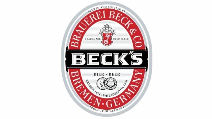
The iconic logo graces Beck’s bottles and aluminum cans, reflecting the brand’s history of over 145 years. It combines traditional symbols and modern graphic elements. The “Beck’s” inscription is at the center, rendered in large font. The letters are white and bold, with short serifs. Dark shadows make them appear engraved right on the label.
The brand name is situated on a black rectangular ribbon, wrapping around an oval heraldic shield. Above it is the company’s emblem: a white key inside a small ornate shield. This references the famous Bremen Key, the city’s coat of arms. Next to it is a warning inscription: “Trademark registered.”
What is Beck’s?
Beck’s is a beer brand owned by the German company Brauerei Beck & Co. It falls into the premium segment and is brewed in accordance with the ancient Reinheitsgebot traditions. The range includes various types of beer, but the most famous product is the pale lager, made from yeast, hops, malt, and water. All alcoholic beverages are sold in characteristic green bottles, the label of which depicts a key.
In the lower half are two round medals and inscriptions: “Bier,” “Beer,” “Bremen 1874”, and “Philadelphia 1876”. The oval is surrounded by a wide red ring with the manufacturer’s name (Brauerei Beck & Co) and place of manufacture (Bremen, Germany). All elements are outlined by a double gray contour with two phrases: “Brewed and bottled by” and “Product of Germany.”
The key feature in the brand’s visual identity is the key to the brand name. The main symbol of the city of Bremen is placed on a red base at the center of an improvised double-edged shield. It has a complex shape – narrows in the middle and has a small indentation at the top. In addition, the two top corners are truncated, and the three lower ones are pointed.
The central element is a white key with black stripes. Its antique design indicates the manufacturer’s antiquity and the beer’s maturity. Abbreviated inscriptions are placed on either side of the shield: on the right – “TM.”, and on the left – “REG.”. The entire lower horizontal space is occupied by the large word “Beck’s.” The designers decorated it using serifs, strokes, and shadows, creating a 3D effect and making the center appear recessed.
Beck’s: Interesting Facts
Beck’s Brewery, also known just as Beck’s, is a famous beer company from Germany.
- How It Started: In 1873, three guys named Lüder Rutenberg, Heinrich Beck, and Thomas May started Beck’s in Bremen, Germany. It’s grown a lot since then and is now known worldwide.
- Special Recipe: Beck’s follows an old German beer-making rule. This rule states that you can only use water, barley, hops (and yeast, which they figured out later). This ensures that their beer always tastes good.
- Green Bottles: They were among the first to use green glass bottles, which is how most people recognize Beck’s beer. The bottle also has a picture of a key, a symbol from the city where it’s made.
- Around the World: Beck’s isn’t just enjoyed in Germany; it’s sold in over 120 countries, making it popular far from home.
- Big Company Now: In 2002, a bigger beer company bought Beck’s, and now it’s part of Anheuser-Busch InBev, one of the biggest beer companies around. But Beck’s still keeps its special style.
- Different Kinds of Beer: While their main beer is the Pilsner, Beck’s also makes other kinds like Gold, Green Lemon, and non-alcoholic beer for people who want something different.
- Helping the Planet: Beck aims to be good to the environment by using less water and energy to make its beer, showing that it cares about the planet.
- Loves Art and Music: Beck’s has helped artists and musicians get noticed by putting art on their beer labels, supporting music events, and mixing beer with creativity.
So, Beck’s is not just about making beer; it’s about keeping traditions, trying new things, being friendly to the Earth, and being artsy.
Font and Colors
The developers chose the Serpentine Sans Serif font for the logo. Black contours on a white background make the letters seem hollow. This feeling is intensified by lines that underscore shadows, creating the impression that the edges of the signs are raised and the middle is recessed.
The logo’s palette is not multicolored – it’s limited to monochrome. The emblem uses only two colors, red and black, on a white background.
Beck’s color codes
| Red | Hex color: | #ff2d25 |
|---|---|---|
| RGB: | 255 45 37 | |
| CMYK: | 0 82 85 0 | |
| Pantone: | PMS Bright Red C |
| Black | Hex color: | #000000 |
|---|---|---|
| RGB: | 0 0 0 | |
| CMYK: | 0 0 0 100 | |
| Pantone: | PMS Process Black C |


