The elements of the company’s emblem resemble the smooth curves of a body. The Beiersdorf logo is an example of elegance and beauty. Smooth, clear skin is the result of using the cosmetic conglomerate’s products. The shades of the emblem demonstrate development and keeping pace with time.
Beiersdorf: Brand overview
| Founded: | 28 March 1882 |
| Founder: | Paul Beiersdorf |
| Headquarters: | Hamburg, Germany |
| Website: | beiersdorf.com |
Meaning and History
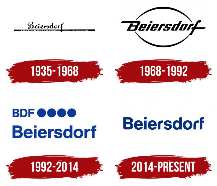
The company has several original logos used to represent its visual identity. The earliest of the debut logos (after the change of business) dates back to 1935. Then, there were three more versions. All of them have one thing in common – text without graphics.
What is Beiersdorf?
Beiersdorf is a German multinational company involved in network marketing. It manufactures and sells adhesives, skin care products, and personal hygiene products under brands like Nivea, Labello, Elastoplast, Coppertone, La Prairie, and others. The company was founded in 1882 by pharmacist Paul Beiersdorf.
1935 – 1968
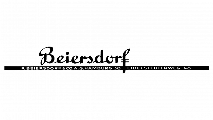
The emblem of this period consisted of the company’s name written in semi-lettering by hand. The word “Beiersdorf” was placed on a long black line extending beyond its limits. On a dark background, there were two white inscriptions: “P. BEIERSDORF & CO.A: G. HAMBURG 30” and “EIDELSTEDTE RWEG 48”.
1968 – 1992
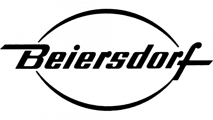
After the redesign, the textual part was reorganized: developers placed it in the center, surrounded by two arc-shaped lines above and below. The result was an oval with pointed ends. Its edges are at the uppercase “B” and lowercase “f,” which received extended elements.
1992 – 2014
In 1992, the management approved a new emblem. It consisted of the company’s full name, “Beiersdorf,” the abbreviation “BDF,” and four large dots. Designers changed the color of the letters from black to blue.
2014 – today
The modern version almost completely repeats the previous one, except for the abbreviated name and bold dots, which the designers removed. They also changed the font, choosing an almost identical font with rounded edges.
Beiersdorf: Interesting Facts
Beiersdorf AG is a big company from Germany that makes skin care products. They have many famous brands like NIVEA, Eucerin, La Prairie, and Hansaplast. They don’t sell their stuff by talking to people one-on-one but rather make and sell products to stores.
- How It Started: Paul Carl Beiersdorf opened the company in 1882 in Hamburg, Germany. Since then, they’ve been making new things to care for your skin and stay healthy.
- NIVEA Cream: In 1911, they made NIVEA cream. It’s called NIVEA because that means “snow” in Latin, which shows it’s super white. This cream was a big deal because it mixed water and oil in a new way that was good for your skin.
- Stick-On Bandages: In 1922, they made the first sticky bandages that we now know as Hansaplast. This was a big step in helping people cover up small cuts easily and cleanly.
- Buying La Prairie: In 1991, Beiersdorf bought La Prairie, known for its fancy skin care products that help you look younger. This allowed Beiersdorf to offer products for people who wanted to spend more on skincare.
- All Over the World: Beiersdorf’s products are sold in over 200 countries, and they have more than 160 places where they work. This makes them one of the biggest skin care companies.
- Making New Stuff: They love to invent new products and improve their current ones. They spend much money on this and have big labs, especially in Hamburg, where they develop these ideas.
- Helping Families: With its “NIVEA cares for family” program, Beiersdorf helps families in need worldwide. It focuses on ensuring families get the help and care they need.
- Eucerin: This is another Beiersdorf brand that’s good for your skin, based on science. It used to be sold only in pharmacies, but now you can find it in many stores, and skin doctors often recommend it.
- Protecting NIVEA Blue: Beiersdorf worked hard to keep their special NIVEA blue color protected by law because it’s a big part of what makes NIVEA easily recognized.
Beiersdorf is known for being inventive, making quality products, and caring about people. They make stuff that many people like to use for their skin.
Font and Colors
There are no graphic elements in the logo except for the arc-shaped stripes, a long black line, and four large dots. But they did not play a significant role and thus existed for a limited time.
The main emphasis of the emblem is on the inscription, so each version uses a new font. One of the latest is Helvetica Neue Heavy, a sans-serif font. It is a joint development of Eduard Hoffmann and Max Miedinger and is released on Linotype. The color palette of the logo is minimalist: the first two versions use black and white, and the last one uses blue and white.
Beiersdorf color codes
| Air Force Blue | Hex color: | #1e347b |
|---|---|---|
| RGB: | 30 52 123 | |
| CMYK: | 76 58 0 52 | |
| Pantone: | PMS 288 C |
