Only forward and up! This company motto reflects the Beko logo. The emblem shows the desire for continuous development and improvement of product quality. The main focus is on the convenience and comfort of customers.
Beko: Brand overview
| Founded: | 1955 |
| Founder: | Vehbi Koç, Leon Bejerano |
| Headquarters: | Istanbul, Turkey |
| Website: | beko.com |
Meaning and History
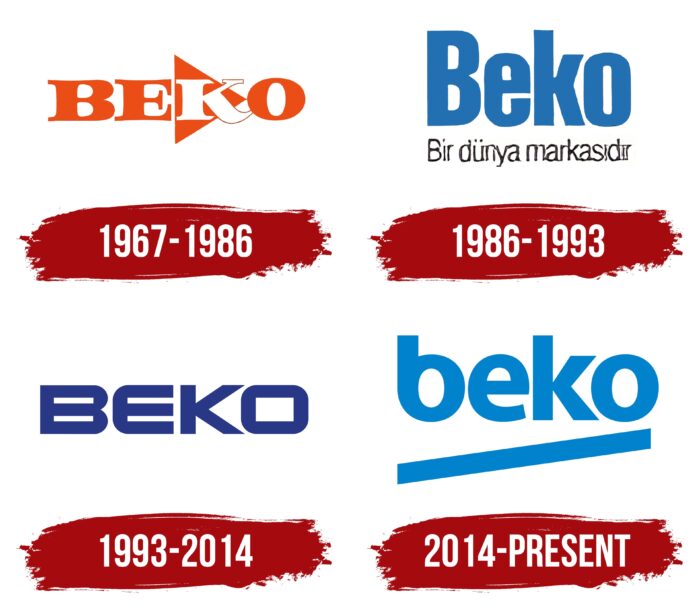
Visual brand identity is simple and recognizable. The blue “Beko” lettering has been adorning branded products for many years. But its design changed once when the company decided to balance the graphic composition.
What is Beko?
Beko is a Turkish company that produces electronic goods and household appliances. It was established in 1955 and is named after its founders, Leon Bejerano, and Vehbi Koç, as the first two letters of their surnames were used for naming. The brand’s headquarters are located in Istanbul.
1967 – 1986
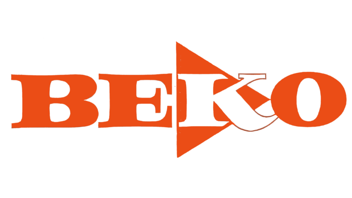
In 1967, Beko adopted the original logo with bold lettering in deep orange. The letters had wide legs and narrow connecting lines. They also had small elongated serifs and small inter-character spaces. For example, “K” was connected to “O.” In general, “K” was of great graphic interest: it was against the background of an isosceles triangle of orange color; therefore, unlike other signs, it was painted white.
1986 – 1993
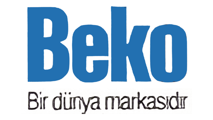
Changes that followed in 1986 allowed for a modern logo that launched the era of blue in the Beko identity. The name of the company was in tall bold type. All letters except the first were in lower case. The stem of the lowercase “k” corresponded to the height of the capital “B.” Under the bottom was another inscription – the motto of the company. It was aligned with the top row, both right and left. The background was empty white space.
1993 – 2014
The brand name on the debut emblem is written in capital letters. For decoration, a square chopped font was used. Despite this, the corners at “E” and “O” are rounded.
2014 – today
The current lottery was developed by the branding company Chermayeff & Geismar & Haviv. Preparation for the redesign took four months. As Sagi Haviv admitted, the specialists faced a difficult task: to make the brand name harmonious. The old version lacked balance because B and E were closed, and K and O were open.
To solve this problem, the designers replaced the uppercase letters with lowercase letters. The current typography resembles the Myriad font, but the shapes of the printed characters are slightly different – especially the “b,” the round part looks like an exact copy of the “o.”
The word “Beko” is underlined with a diagonal line. With its help, the developers tried to convey the dynamics and energy. The color is also symbolic. The bright shade of dark blue reflects the brand’s focus on consumers between 18 and 35.
Beko: Interesting Facts
Beko, a leading brand in home appliances and electronics from Turkey, is part of Koç Holding, one of the country’s biggest companies. It’s famous worldwide for its quality products, dedication to new ideas, and being eco-friendly.
- Start: Founded in 1955, Beko began as a partnership between Turkey’s Koç Group and a Spanish company, quickly gaining a top spot in Turkey’s electronics and appliance market.
- Worldwide Reach: Beko sells its products in over 140 countries, and it is especially popular in Europe as a top home appliance brand.
- Focus on Innovation: Beko leads with technology that makes products more efficient, easy to use, and eco-friendly. This includes energy-saving appliances, smart tech, and water conservation features.
- Health and Nutrition: Through partnerships with groups like FC Barcelona and UNICEF, Beko promotes healthy living and eating, showing its commitment to making a positive impact.
- Investment in R&D: Beko heavily invests in research to keep leading in appliance technology, holding many patents and awards for its innovative products.
- Design for Users: Beko’s products are designed with the user in mind, combining practicality with good looks, which has won them many design awards.
- Sports Sponsorships: Beko supports various sports teams and clubs, boosting its visibility and connecting with fans worldwide.
- Broad Range of Products: Beko’s lineup includes everything from fridges and ovens to vacuum cleaners and kitchen gadgets, catering to all household needs.
Beko’s rise from a local Turkish brand to a world-renowned name is a testament to its innovation, quality, environmental commitment, and social responsibility, making it a trusted leader in the home appliance field.
Font and Colors
The visual identity mark for this brand has always consisted of only a short text. The title is placed on a light background and is not supplemented by any figurative elements. Therefore, the Chermayeff & Geismar & Haviv studio designers played up the inscription in an original way, giving it a graphic expressiveness. The only detail is the wide oblique stripe at the bottom. It coincides with the lines of the letters, so it looks like a diagonal rectangle directed upwards at a slight angle.
The inscription in the new version of the logo is made with an individual typeface. The characters are in lower case. They are sleek and streamlined, except for the “k,” which has three sharp corners. The heights of the legs “b” and “k” are identical, so the first letter is perceived as shorter than it is. Sans Serif font is used for the inscription – chopped, grotesque.
The color of the emblem depends on where it is placed. On official labels, promotional materials, and documents, the letters are blue, and the label on the equipment is black or three-dimensional, with a chrome effect.
Beko color codes
| Blue | Hex color: | #0083be |
|---|---|---|
| RGB: | 0 131 190 | |
| CMYK: | 100 31 0 25 | |
| Pantone: | PMS 7461 C |
