The Bell logo is like a ringing phone call. Her high notes are heard everywhere and encourage you to pick up the phone. The emblem is large and noticeable, demonstrating the company’s size and the long distances over which calls are transmitted.
Bell: Brand overview
| Founded: | April 29, 1880 |
| Founder: | Alexander Graham Bell, Charles Fleetford Sise |
| Headquarters: | Verdun, Quebec, Canada |
| Website: | bell.ca |
Meaning and History
Bell is historically associated with the American telecommunications giant AT&T. They even had the same logos that reflected both organizations’ closeness. But that all changed in 1973 when the Canadian division acquired its own Bell-Northern Research laboratory. Two years later, it left AT&T and continued to serve customers independently. The restructuring affected the brand’s identity: it ditched the traditional bell symbol and started using a simple wordmark.
What is Bell?
Bell is a telecommunications company officially called Bell Canada. It provides radio, television, internet, and telephone services. Its history began in 1880. One of the company’s co-founders is telephone inventor Alexander Graham Bell. The brand is now actively developing new technologies such as IoT and 5G.
1880 – 1891
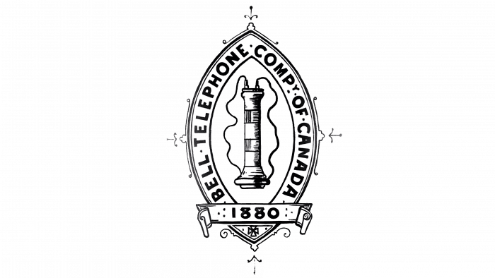
In 1880 Bell Canada was part of the newly formed Bell System and was named the Bell Telephone Company of Canada. The creators of the logo placed the full name in a frame around the elliptical shield. The middle was an image of the first telephone receiver – a vertically elongated structure with wires going to it. The bottom was decorated with a ribbon with the inscription “1880”, and along the edges were minimalist patterns.
1891 – 1895
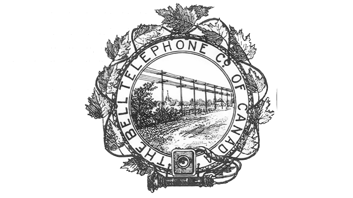
In 1891, artists changed the geometry of the drawing. They turned an ellipse with pointed edges into a circle and, accordingly, transferred the inscription “BELL TELEPHONE CO. OF CANADA “in the ring. The main decorative element was ivy: its leaves looked like a volumetric frame. And the stem was a long wire of the telephone receiver, which lay next to the old apparatus’s body. In the center was an industrial landscape: wire lines along the road.
1895 – 1902
In 1895, the Canadian division first used the bell emblem. It was located in the middle of the gray circle. The company name was written inside a ring frame and was separated by asterisks. There was another inscription on the bell: “LOCAL AND LONG DISTANCE TELEPHONE.”
1902 – 1922
The telecom operator entered the 20th century with a new logo. The designers changed the bell’s shape, modified the font, and added additional rings to the frame. Also, they removed the two five-pointed stars to regroup the inscription and add the abbreviation “LTD” with a period to it.
1922 – 1939
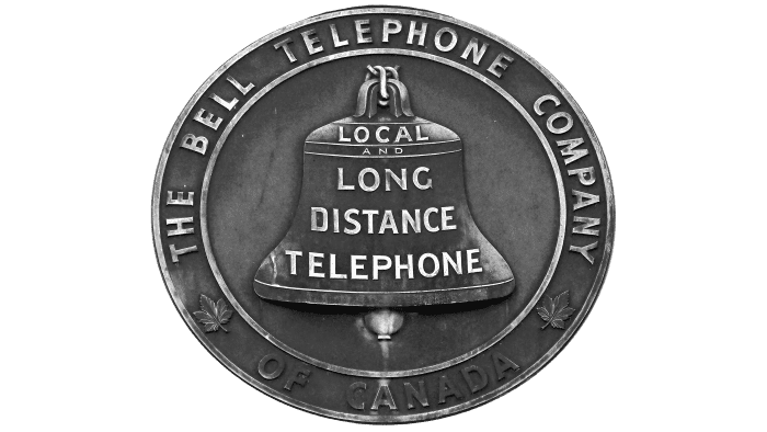
In 1922, the 1895 design returned, only the place of the stars was taken by maple leaves – a traditional symbol of Canada.
1939 – 1964
The bell pendant was changed in the middle of the 20th century. The text also acquired a new look: the word “SERVICE” appeared in the center, and the name of the company was written in a larger font.
1964 – 1972
When the regional division was renamed Bell Canada, the name predictably ended up inside the bell. All other phrases have disappeared. The ring turned black.
1972 – 1976
In 1968, Saul Bass & Associates was commissioned to design the Bell System corporate identity. Saul Bass himself, who was also a director, photographer, and typographer, took over the business. It was he who once created the legendary intros to the films of Alfred Joseph Hitchcock.
The designer noticed that the Bell logo became simpler and simpler every year, so he decided to make it minimalistic and removed the remaining inscriptions. The bell acquired a modern look, expressed in a clear geometric shape and the absence of dividing lines.
1977 – 1994
After the Bell Canada division split from Bell System and AT&T to become part of the BCE, its new executives abandoned a standardized corporate image. So the traditional bell disappeared – its place was taken by the blue inscription “BELL.” Don Black was the author of the wordmark.
1994 – 2009
In 1994, the font became italic. Graphic composition of several yellow lines appeared on top. One curved strip looked like the outline of a human face, while the other two formed an open ring. The drawing symbolized the prospects for the telecommunications industry.
2008 – today
In 2008, Don Black’s original design returned, only with new typography. In this version, the first three letters are connected. The lowercase “e” is circular, with its free end cut off at an angle of about 45 degrees. The top and bottom of the capital “B” differ in size, although the two sides were previously symmetrical.
Bell: Interesting Facts
Bell Canada, often called Bell, is a key player in telecommunications and has a significant history and contributions in Canada and globally.
- Early Beginnings: Founded in 1880, Bell is among the oldest telecom companies worldwide, with direct ties to Alexander Graham Bell, the telephone’s inventor.
- A Nod to History: Named after Alexander Graham Bell, the company honors the legacy of telephone invention and its ongoing commitment to telecom innovation.
- Telephone Service Pioneer: In 1877, Bell set up Canada’s first telephone exchange in Brantford, Ontario, laying the groundwork for North American telephone services.
- Growing and Adapting: Bell has grown to offer more than just phone services, including internet, digital TV, and mobile services, evolving with consumer and business needs.
- Internet Service Leader: Bell was a front-runner in bringing high-speed internet to Canada, changing how people communicate, get information, and do business.
- Beyond Telecom: Through Bell Media, Bell also owns significant parts of Canada’s broadcasting and entertainment sectors, showing its influence extends beyond traditional telecom.
- Pushing Forward with 5G: Bell is actively working on 5G technology, aiming for faster speeds, less lag, and more connections, promising a leap forward in Canada’s digital landscape.
- Innovating with IoT: Bell is a leader in the Internet of Things, offering solutions that could lead to smart cities, connected vehicles, and efficient energy use across Canada.
- Eco-Friendly Efforts: Bell is dedicated to reducing its environmental impact, lowering its carbon footprint, and promoting energy efficiency.
- Supporting Mental Health: Bell’s “Bell Let’s Talk” initiative focuses on awareness and support, representing one of Canada’s biggest corporate commitments to mental health.
Bell’s story highlights its central role in telecommunications, driving innovations and playing a crucial part in connecting people and businesses while emphasizing social responsibility and environmental sustainability.
Font and Colors
The early Bell Canada corporate identity was standardized, and based on the traditional image of a bell, it is different now. The old symbol disappeared, and the company began to use only a wordmark that emphasizes its individuality.
The telecom provider’s name is written in Century Gothic Bold. It is a geometric sans-serif created by typographers at the Monotype Type Drawing Office. The color of the last three logos only appears to be the same. It changed from True Blue (# 0065CE) to a darker Cobalt Blue (# 004EA4), and then the inscription took on a Medium Persian Blue (# 0067A5).
Bell color codes
| Medium Persian Blue | Hex color: | #0067a5 |
|---|---|---|
| RGB: | 0 103 165 | |
| CMYK: | 100 38 0 35 | |
| Pantone: | PMS 7691 C |

