Bell System: Brand overview
In 1877, Alexander Graham Bell created the Bell Telephone Company, which later evolved into the giant American Telephone and Telegraph Company, or AT&T. This company defined the development of telephone service in the United States and Canada for more than a century. By the beginning of World War II, its vertical monopoly covered most of the telephone services in these countries.
In its early years, the company focused on building its niche in telephone services, but its ambitions soon expanded. By 1885, AT&T was established as a separate entity within Bell to build long-distance telecommunications lines. Nearly three decades later, in 1913, under the Kingsbury Agreement, AT&T was authorized to take over smaller independent telephone operators, allowing it to expand its hegemony in the telecommunications sector further.
However, things began to change in the mid-twentieth century. In 1974, the U.S. Department of Justice brought an antitrust lawsuit against AT&T, which culminated in a 1982 agreement to liquidate the Bell System. Seismic changes occurred in 1984 when the legendary Bell System was split into seven separate companies, dubbed “Baby Bells,” that served different regions of the United States. The breakup marked the end of an era and the beginning of a new chapter in the telecommunications industry.
Meaning and History
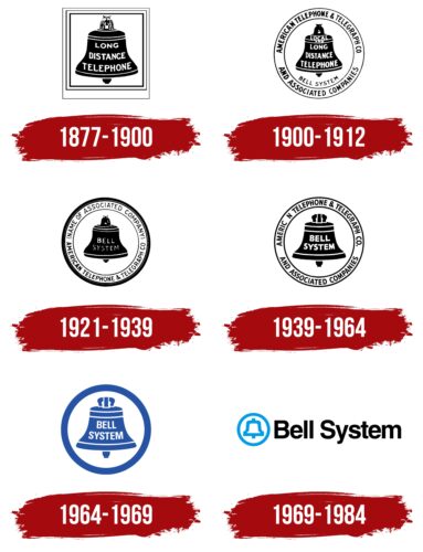
1877 – 1900
1900 – 1921
1921 – 1939
1939 – 1964
1964 – 1969
1969 – 1984
The logo consists of two equally important parts: text and graphics. First comes the image of a bell inside a circle. Both the ring and the bell are drawn with blue lines of equal thickness. The second element is the name of the telecommunications company. The text is black, smooth, even, with rounded glyphs and no serifs. The letters are so close together that they almost touch, as the space between them is minimal. The text is centered relative to the adjacent glyph.
The bell in the circle is as if to say, “Hey, listen, we have something to tell you.” The blue lines are reminiscent of a calm sky, not too flashy but still eye-catching. The company name is packed tightly together, like a group of friends huddled together for selfies. It’s straightforward and suggests that this company gets straight to the point without any fuss.
Bell System color codes
| Celestial Blue | Hex color: | #009de7 |
|---|---|---|
| RGB: | 0 157 231 | |
| CMYK: | 100 32 0 9 | |
| Pantone: | PMS 299 C |
| Black | Hex color: | #000000 |
|---|---|---|
| RGB: | 0 0 0 | |
| CMYK: | 0 0 0 100 | |
| Pantone: | PMS Process Black C |


