The Bertone logo is memorable, just like the work of the brand’s designers. The emblem encodes creativity, family talents, love for the motherland, and cars. The sign shows the chain of generations and the continuous movement forward.
Bertone: Brand overview
Bertone is an Italian company that transformed in 2014. It tuned a wide range of cars and created designer car accessories. The headquarters was located in Turin. The Bertone logo is on modified cars of more than 11 brands, from luxurious Ferrari and Lamborghini to representative and strict Mercedes Benz and Volvo.
Each of the representatives of the Bertone family was engaged in their line of work. But Nuccio is best known for his tuning. During its existence, its team has completed 104 transformations.
Meaning and History
The brand’s logo is rich and informative, as the group’s activities are extensive. Thoughtful images, a beautiful layout, and cryptic messages make the emblem a tuning example.
What is Bertone?
It is an Italian automobile design and manufacturing company. Giovanni Bertone founded the company with a rich history of creating stylish and cutting-edge car models for automakers, including Alfa Romeo, Lamborghini, Ferrari, and Fiat. The company is known for its automotive styling, engineering, and coachbuilding expertise. Some of its most famous models include the Lamborghini Miura, Lancia Stratos, and Alfa Romeo’s BAT series. Despite financial difficulties and changes in ownership over the years, the brand remains a respected name in the automotive industry.
1912 – 1998
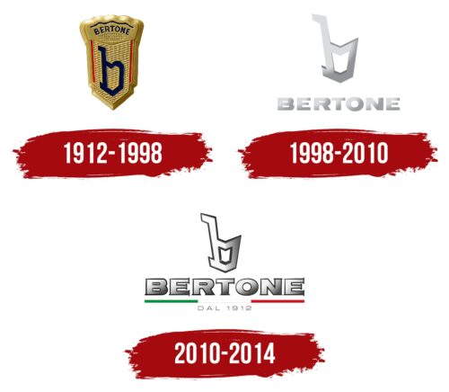
From 1912 to 1998, Bertone established itself as a manufacturer recognized for its cars’ high quality and unique style. The company’s logo, a golden antique symbol on the car hood, epitomized elegance and highlighted the exclusivity of its customized vehicles. This symbol represented the rarity and elite status associated with Bertone vehicles.
For the main design element of the logo, Nuccio Bertone chose the lowercase letter “b,” styled to resemble a musical note. This choice reflected the founder’s surname, Nuccio Bertone, and his passion for music, especially his early years playing the piano.
The musical note in the logo symbolizes creativity and harmony, which are fundamental to Bertone’s philosophy. This image of the note emphasized that each car produced by the company could be compared to a work of art, much like a beautiful musical melody composed by a talented musician. Bertone cars embody technical perfection and artistry, making them captivating in motion.
1998 – 2010
The Bertone logo, updated in memory of Nuccio Bertone after his passing in 1997, illustrates respect for his legacy and reflects the brand’s evolution into the modern era. The use of metallic sheen in the logo’s gradient creates a sense of depth and volume, making the musical note appear as if it has come to life, lifted from the page into a three-dimensional form. This design element highlights the innovative approach and sophistication for which Nuccio Bertone was renowned, giving each detail a unique visual impact.
The musical note symbol, inspired by Bertone’s love for music and his piano-playing skills, is connected to his surname, crafted from metal. This thoughtfully considered design choice is a metaphor: just as music creates a unique atmosphere, Bertone cars represent style and beauty. The logo update aims to honor Nuccio Bertone’s name and emphasize that his innovation and creativity will continue inspiring future generations.
The gleaming Bertone emblem combines strength, beauty, and the ability to transform ordinary technical solutions into true works of art. It symbolizes Bertone’s philosophy that each car should reflect beauty and innovation. The logo conveys, “The master is gone, but his creations will live on through the ages,” highlighting the immortality and visionary approach that Nuccio Bertone brought to the world of automobile design. This thought underscores the continuity and eternity of the great designer’s contribution to the art of car making.
2010 – 2014
The center of the visual identity features a large symbol resembling a solid sign or note. Below it is the brand’s name, underlined by a wide colored line of three segments: green, white, and red. The year of foundation is at the very bottom in thin letters.
The main part of the composition is made of metal, which indicates the durability and material of the car bodies that the manufacturers worked on, creating a special style.
The company’s name was given by the founder, Giovanni Bertone, who started with carriages. At the logo’s heart, the surname’s first letter is b. Like all the company’s products, the symbol is stylized but used in a lowercase version.
Multi-colored underlining is a tribute to the founding country—green, white, and red in miniature repeat the stripes of the Italian flag.
The two multi-colored parts show the two divisions of the company: the production of cars and the design, which father and son handled. The first, green, represents the father, and the red – is Nuccio Bertone, who joined the group after World War II and gradually took the lead. His last strip, the designer’s death, led the company to bankruptcy in 2014.
The chain of connected segments is like a relay race from one generation of the family to the next, and the inextricable connection of all family members is evident.
A message is encrypted in the sign, consisting of a note at the head of the image and the syllables of the name underlined in color: nota bene (pay attention).
Font and Colors
The logo uses Italy’s national colors and metallic gray for the main parts. Gray is a shade of blanks and raw metal bases, which the brand’s designers turned into a masterpiece. Metal is a symbol of strength and strength.
The lettering font resembles Copperplate New Black Extended but has a gradient and black stroke as style symbols.


