The Bestune logo is unique and authentic. It represents the brand as a high-tech manufacturer of modern cars and highlights the company’s Chinese roots by incorporating ancient hexagram symbols from the I Ching.
Bestune: Brand overview
2006, Bestune, a Chinese automobile manufacturer, was established as a subsidiary of First Automobile Works (FAW), China’s leading state-owned automaker.
The company, originally called Besturn, began its journey with the launch of its first car, the B50 sedan, in the same year. The B50 was an upgraded version of the previous generation Mazda6, produced under a licensing agreement with Mazda.
Besturn expanded its range in the following years with several more models, most built on Mazda technologies and platforms. These included the B70 sedan and the V2 compact SUV.
By 2010, Besturn began developing its models for the Chinese market, including the X80 SUV.
By 2013, the brand’s presence had expanded significantly, with more than 100,000 vehicles sold in China annually. Elegant sedans and SUVs were targeted at the growing Chinese middle class.
In 2019, brand modernization saw the company’s rebranding from Besturn to Bestune, marking the introduction of modern models such as the T77 SUV.
Bestune has consistently expanded its product range and market presence in China, aiming to establish its reputation as the leading domestic brand of the modern era.
Bestune continues to operate as a subsidiary of the FAW Group. The vehicles are manufactured in China at joint ventures between FAW and leading automakers such as Toyota and Volkswagen.
By 2020, Bestune has reached a significant milestone, having sold 500,000 vehicles. The company has set a goal of achieving sales of more than 1 million vehicles per year by 2025, signaling its ambitious plans for the future.
Meaning and History
What is Bestune?
It is a Chinese automobile brand owned by the FAW (First Automobile Works) group. The company specializes in manufacturing a range of passenger vehicles, including sedans, SUVs, and electric vehicles. Known for its modern design, advanced technology, and competitive pricing, the brand offers consumers high-quality and affordable vehicles in China and internationally.
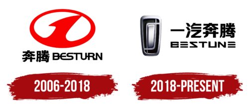
2006 – 2018
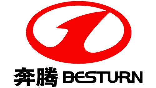
The manufacturer’s emblem harmonizes with the sign of the parent company, which incorporates a unit in its logo. This choice highlights the leadership and premium quality of the vehicles. The logo is designed in the form of:
- A steering wheel. The unit acts like the central bar. Its round shape emphasizes the perfection of the cars. It symbolizes movement. The company controls its future and confidently steers its journey toward destiny.
- A medal. The brand is a premium Chinese manufacturer targeting young, progressive, and ambitious buyers. The company is confident that its users are leaders in the global arena. The firm produces the best for the best. A combination of splendid design, innovation, and performance makes the brand worthy of the top spot.
The name in Chinese and English is placed below the image. The company used the name Besturn until 2018.
2018 – today
The Bestune car brand highlights its Chinese origin with its name and Chinese characters at the top of the logo. Below this, the English version of the brand name appears in a unique font that mimics Chinese characters with cut-off sections. The letter “E” stands out because of its horizontal line design. The text is black, adding to visual unity. On the left side of the logo is the brand’s symbol.
The logo blends Eastern and Western design elements. The Chinese characters show the brand’s origin, while the English letters, styled to resemble Chinese characters, highlight its unique identity. The design of the letter “E” draws attention. The use of black gives a sophisticated and elegant feel.
The Chinese characters at the top signify the brand’s heritage. With its stylized font, the English text below bridges Eastern tradition and Western modernity. This reflects the brand’s commitment to innovation and its origins. The black color scheme enhances the sleek and stylish look, ensuring it remains timeless and professional.
The brand’s symbol on the left adds recognition and identity. This symbol and the dual-language text capture the brand’s essence and appeal. The overall design of the Bestune logo reflects the fusion of cultures, innovation, and elegance that define the brand. This logo communicates the brand’s values and origins, creating a memorable and impactful visual identity.


