Betfair has its own identity and operates under a separate corporate logo despite this. This is a laconic and strict icon, consisting of a thematic element in the form of arrows and the name of the company. A feature of the visual concept is also the achromatic color palette, which adds solidity. Such a logo is fully consistent with the format of activities and brand values.
Betfair: Brand overview
| Founded: | June 2000 |
| Founder: | Andrew Black and Edward Wray |
| Headquarters: | Hammersmith, London, England |
| Website: | betfair.com |
Meaning and History
Modern Betfair results from the efforts of many leaders and outstanding personalities. It appeared on the market more than 20 years ago and has already managed to impress customers with its achievements. One of them was a collaboration with a well-known English football team that played in the form of Fulham. The company sponsored players who played in the 2002-2003 season.
In addition, Betfair has launched its radio service, Timeform Radio, which broadcasts race results and race commentary. Despite the variety of activities, the company operates under a simple, concise logo. It is quite clear, expressive, and stylish, accurately describing the brand.
The icon itself includes the name and a semantic graphic element in the form of two arrows. They are located toward each other. The designers wanted to show the cash flow that comes to customers through this element. The shape and color of the arrows have changed throughout the company’s existence, but the meaning has remained unchanged.
What is Betfair?
Betfair is a gambling entertainment company. It operates a large online betting exchange and provides access to an online casino platform. The company’s headquarters are in London, and the main office of the management company (Flutter Entertainment) is in Dublin.
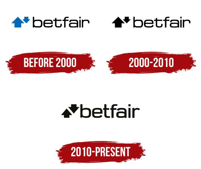
Before 2000
Betfair was founded by entrepreneurs Edward Ray and Andrew Black in 2000. In June of this year, they registered the brand and started working. The first corporate logo of the brand consisted of 2 parts – a picture of two arrows and a name. The font had rounded corners that showed friendliness and comfort.
Its additional characteristics were the absence of serifs and a high level of readability.
The letters were placed at some distance from each other, and the lines clearly defined their shapes. The letter t stood out against the general background, having a horizontal line and an elongated end. The graphic element consisted of two arrows directed towards each other. They had different sizes – the top one was slightly smaller than the bottom one.
This symbolized a high return to the client – he would receive more than he invested. The palette consisted of 3 colors. The background is based on the traditional white color, demonstrating the transparency of schemes and openness. Blue was used to decorate the arrows. He demonstrated trust, reliability, and strength, and the inscription was painted black. This emphasized the special load of an element directly associated with the company.
2000 – 2010
The development of the company continued. In 2006, it was acquired by the Japanese transnational holding Softbank, and a little later, the company began to expand its activities in horse racing. In subsequent years, she made deals with several firms working in this direction. Changes and innovations in the company’s policy have led to corporate identity renewal.
The new version had only one difference from its predecessor – the color of the arrows. It changed from blue to black. The reason for this decision was the desire to develop a universal logo that would be relevant regardless of brand design trends.
This was also the core message of the company. The owners of Betfair positioned their offspring as a reliable and independent company from various changes in the economy. The black name found a logical continuation in a strict black element, symbolizing the cash flow.
2010 – today
2010 was a landmark year for Betfair. The company went public and listed shares on the London Stock Exchange. The changes were reflected in the corporate design. The font has become more confident. The letters no longer consisted of thin lines but strips of moderate thickness without serifs. This symbolized the strengthening of the company’s position and its entry into a new level of development.
In addition, the size of the arrows has changed. If earlier one of them was larger than the other, then after the updates, they became the same. This made the logo more perfect and in line with brand design standards. The black color palette still symbolized the authority and elite status of the brand. This version is still in use today.
Font and Colors
Betfair can be recognized by its stylish logo, made in the best traditions of classic design. The font is nothing special. The letters are made in rounded lines with straight and diagonal cuts. This design characterizes the company as reliable and credible. In addition, soft and smooth lines are associated with the friendly attitude of the brand.
The color of the modern emblem includes only two colors – black and white. These shades are also classic and create an image of a solid company that occupies a leading position in the market. The white background color is also associated with openness and accessibility. For a company operating in the field of gambling entertainment, it is especially important to demonstrate an honest attitude towards customers.
Betfair color codes
| Black | Hex color: | #000000 |
|---|---|---|
| RGB: | 0 0 0 | |
| CMYK: | 0 0 0 100 | |
| Pantone: | PMS Process Black C |
