 Better Business Bureau Logo PNG
The modern Better Business Bureau logo combines traditional design features and an original graphic component. The emblem of BBB (Better Business Bureau), like the logo of many companies, has a name. But, along with him in the picture, you can see an extraordinary symbol in the form of a torch. It is associated with tolerance, a source of energy and hope.
Better Business Bureau: Brand overview
| Founded: | 1912 |
| Headquarters: | Arlington, Virginia U.S. |
| Website: | bbb.org |
Meaning and History
The main feature of the Better Business Bureau is the lack of regulation by government agencies. The only influence on the organization is the International Association of Business Improvement Bureaus. She coordinates the activities of the corporation and also makes some recommendations. The Better Business Bureau takes them into account and focuses on building trust in business units.
To do this, the organization has developed a special letter scale, by which you can determine the honesty and efficiency of a company. Moreover, each of them conducts a check independently, without the developer’s participation.
This regulation has been carried out for more than 100 years. During this time, not only the organization has changed, but also the corporate identity. The current version of the logo is a blue icon with a torch and a name. All elements were also used in previous versions of the emblem.
What is Better Business Bureau?
The Better Business Bureau is a private non-profit organization operating in America and Canada. Among its main achievements is a special letter scale that allows business units to self-regulate and monitor service delivery quality. Not subject to government regulation.
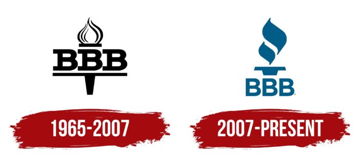
1965 – 2007
The Better Business Bureau has become a logical continuation of the emerging need for business regulation. In 1912, it was especially acute, which led to the formation of a non-profit structure, which government agencies did not influence. This is how the BBB was born. The organization’s first logo was designed in a restrained, laconic style.
This was evidenced by strict achromatic coloring, massive clear lines, and an elegant detail in the form of a torch. Unusual performance has a special meaning. In the generally accepted understanding, the sign of the torch symbolizes hope and vitality. In the Better Business Bureau context, it also meant the desire for improvement. After all, this was the main purpose of its creation.
Given the special semantic load, the torch was placed in the center and had an impressive size. The name of the company is placed inside it. It was an abbreviated version, which was the first three letters BBB. They are made in a massive simple font, favorably combined with a graphic element. The coloring included only two colors – white and black. This is a classic visual identity. It means durability, credibility, and elitism of the brand.
2007 – today
In 2007, the organization reached a new level, and already in 2008, it changed the scale from the format satisfactory/unsatisfactory to the letter system (from A to F). The change in concept prompted management to rebrand. The decision made became the basis for the appearance of an updated and more stylish version. It consisted of the old elements but in a new design.
In the sign of the torch, the images of the flame and the design itself have changed. Customers could now see a shortened base with two separate colored flames above it. In an earlier version, the flame was made in the form of an “onion,” which was not filled with color. The name of a private non-profit structure was placed on the stand of the torch. The stand has decreased in size in the new version, and the inscription is placed under it. The updated design made the logo more modern and fresh.
In addition, the changes affected the font. The letters remained the same massive, but without tails. This meant confidence and stability, while thick lines symbolized reliability. A single blue color scheme completed the harmonic emblem. Changes in the logo had a positive impact on the company’s image as a whole.
Font and Colors
The logo is a recognizable and striking work of experienced designers. It has absorbed all the elements that characterize the organization’s activities over the years and modern trends in brand design. It is based on the abbreviated name BBB and the already traditional torch.
The inscription is made in a neat, concise, sans-serif typeface. It perfectly balances spaces and lines, and the massive shape adds expressiveness. This design looks bold and confident. The color palette consists of 2 colors – light blue and white. Their combination symbolizes professionalism, loyalty, and reliability. In general, the chosen concept gives the impression of an influential and powerful corporation.
Better Business Bureau color codes
| Sea Blue | Hex color: | #005d87 |
|---|---|---|
| RGB: | 0 93 135 | |
| CMYK: | 100 31 0 47 | |
| Pantone: | PMS 7469 C |
