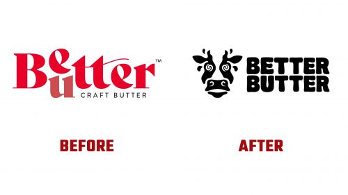
Better Butter, a brand recognized for its craft butter made with high-quality ingredients, has recently introduced a bold new identity. This rebrand reflects the company’s dedication to its roots while embracing a fresh, playful, and unique visual style. The transformation is evident in the new logo, which shifts from the previous design’s more serious tone to a vibrant and whimsical approach that better matches the brand’s personality.
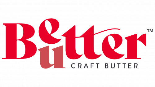
The old logo attempted to be creative by stacking the shared letters between “Better” and “Butter.” However, the execution fell short. The bold serif font was harsh and didn’t convey the butter’s smooth, creamy nature. Using gradients, an unusual swash across the “t” s, and a semi-transparent “u” added complexity, making the logo feel cluttered and disjointed.
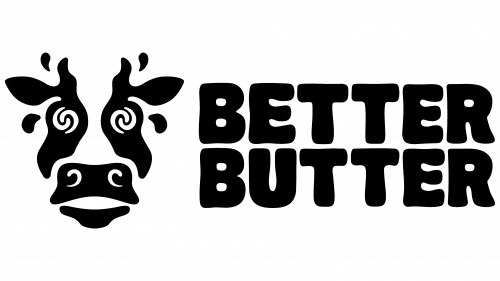
In contrast, the new logo introduces a lively and memorable icon—a quirky cow. With its psychedelic pupils, swirly nostrils, and butter-like beads of sweat, this cow stands out as a character full of personality. This choice moves away from conventional branding towards something far more distinctive. The cow captures attention and adds a fun, whimsical element to the brand, marking a significant shift from the previous design.
The new wordmark perfectly complements the cow icon. The chosen typeface is chunky and wobbly and visually conveys the richness and creaminess of Better Butter products. The letters are stacked evenly, giving the wordmark a balanced appearance. This typography is not just functional but a key part of the brand’s identity, reflecting the smooth and indulgent experience that Better Butter offers.
The color scheme has also transformed. The old logo’s gradient and subtle colors lacked impact. The new design opts for a bold yellow and black palette, which enhances visibility and versatility across various mediums, from packaging to digital platforms. The yellow symbolizes the richness of butter, while the black adds contrast and seriousness, grounding the playful design elements.
A standout feature of the rebrand is how Better Butter has incorporated the cow’s unique eyes into the broader visual identity. These eyes appear as a recurring motif across the brand’s materials, including type badges and photographs. This quirky element adds surprise and consistency, making the brand fun and instantly recognizable. It’s a bold move that sets Better Butter apart in a market where such creativity is rare.
The overall design maintains a relaxed, laid-back attitude. Ingredient illustrations are intentionally crude and choppy, contributing to the brand’s handmade, authentic feel. The typography, particularly the use of Midnight Sans Round, reinforces this approachable aesthetic with its rounded edges and thick strokes, mirroring the smoothness of butter.
In summary, Better Butter’s rebrand is a bold and successful shift towards a more character-driven identity. The new logo and visual elements create a memorable brand in a crowded market. The transformation highlights Better Butter’s commitment to fun, creativity, and quality, ensuring the brand remains at the top of consumers’ minds when looking for a high-quality and full-of-personality product. This rebrand showcases the brand’s evolution and readiness to delight customers with flavor and flair.


