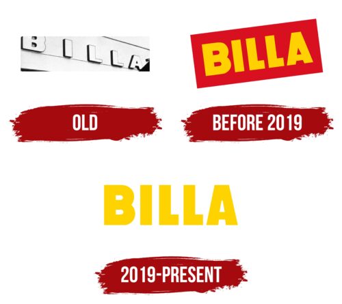
“Visiting the company’s supermarkets is pure joy and pleasure,” the Billa logo guarantees. A large number of offers at the most pleasant prices is the main advantage of retail. The emblem demonstrates the prevalence and accessibility of stores.
Billa: Brand overview
| Founded: | 1953 |
| Founder: | REWE International AG |
| Headquarters: | Wiener Neudorf, Lower Austria, Austria |
| Website: | billa.at |
Billa is a brand of grocery supermarkets. It belongs to REWE Group, the German leader in retail sales with a 100-year history. It has 1,200 stores in Austria and 919 stores in Bulgaria, the Czech Republic, and Slovakia. The company conducts its foreign business, including Bill’s brand, from its Austrian headquarters.
Self-service stores made Austrian Carl Vlashek a billionaire. Having opened his first one in 1953, he successfully developed an entire empire in Austria, which he sold at the age of 79 to the REWE Group (1996). At that time, the chain consisted of 1300 stores. The new owners attempted global expansion, but not very successfully. They managed to gain a foothold only in 3 countries. In 2020 the Ukrainian chain (35 stores) was sold to the Lithuanian company Novus. In 2021 the Russian stores (160) were sold to Lenta. The Polish, Romanian and Italian chains were sold even earlier.
Meaning and History
The Billa logo is always visible: it is used as a sign above the entrance to branded stores. Initially, the designers chose a massive bold sans-serif font for the inscription. This type of typeface is considered an effective means of communication with consumers because it attracts attention and looks good in any size.
The name of the grocery supermarket chain formed the basis of a short and concise wordmark. It has a hidden meaning because the word “Billa” is formed from the initial letters of the phrase “BILLiger LAden,” which is translated from German as “cheap store.” That is, the concept of the brand is encrypted in the emblem.
What is Billa?
A brand founded by Austrian businessman Karl Wlaschek in 1953. It is represented by 2119 supermarkets in Austria, Slovakia, the Czech Republic, and Bulgaria.
Old
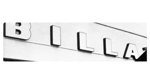
The old logo featured “BILLA” in capital letters with dark shadows, creating a three-dimensional effect. Even then, a bold sans-serif font was used, which passed into subsequent emblems of the supermarket chain. But the proportionality of some glyphs was violated by different thicknesses of the main and additional strokes.
before 2019
The supermarkets’ first logo was a yellow company name on a red background. The image was developed in 1961 when Vlashek used his experience selling perfumes to open grocery stores. The word Bill was born from the German Billiger Laden, meaning cheap. The name reflected the principle of work of the stores: in the trading halls, the products of different brands with discounts were sold.
The use of Billa on the logo indicated inexpensive goods available to any wallet. The bright yellow color lifted spirits and was associated with good luck and plenty of choices. The cool Austrian climate reinforced the positive associations from the warm sunny hue. It hinted at a pleasant pastime and suggested that customers would leave the store satisfied.
The rich red background reflected pressure and ambition. It showed that the brand always looks into the future, into the results it wants to achieve. And each time, it tries to exceed the initial expectations. This association was reinforced by the logo’s positioning at an angle. It seemed to rush upwards and forward. The background color and spatial orientation symbolize growth, expansion, and passionate striving for more. And the company has indeed followed this path. Over 43 years, the number of stores grew from 1 to 1,300. That’s 30 new stores each year!
2019 – today
The brand changed ownership in 1996. For the first few years, REWE Group kept the old visual identity of the supermarkets. The logo wasn’t updated until 2019. It became consistent with the store’s regular signage-the brand name in big, light yellow letters.
This helped bring the brand to a common denominator. And it fully reflected the main message and aspiration of the company – to create a happy, bright future.
The brand switched to environmentally friendly packaging and gave up plastic. Provides charitable assistance to children. Requires its employees to comply with the Code of Business Ethics with maximum loyalty and care for customers.
The straight lettering is a symbol of stability.
Font and Colors
The font in both logos is the same – Phosphate Pro Cond Solis. The company has chosen strict straight letters as a pointer to the simple, most essential products used in every home.
The primary color of the two logos is yellow. Initially a warm, rich one, and then a lemon color. It symbolizes goodwill, cheerfulness, and willingness to communicate with customers. A lighter shade than before represents the idea of uplift, improvement, striving for the good and bright.
Billa color codes
| Yellow | Hex color: | #ffd300 |
|---|---|---|
| RGB: | 255 211 0 | |
| CMYK: | 0 17 100 0 | |
| Pantone: | PMS 109 C |
