The Billabong logo rides on the waves. The emblem demonstrates a love for the water element and the creation of resources and accessories for conquering it. The symbol has harnessed the turbulent crests and is ready to assist those who strive to master the waves.
Billabong: Brand overview
| Founded: | 1973 |
| Founder: | Gordon Merchant |
| Headquarters: | Burleigh Heads, Queensland, Australia |
| Website: | billabong.com |
Meaning and History
Australian surfer Gordon Merchant and his wife turned their passion for the sport into a business and, in 1973, created a company to produce the best surfwear using triple-stitching technology. Expansion overseas and the acquisition of other brands allowed the company to reach the top of the global market by 2010. This was followed by a lengthy process of ups and downs, culminating in the acquisition of Billabong by its competitor.
From the very beginning, having chosen its direction, the company adheres to it to this day, just as the wave remains an integral part of the logo. The years have had little impact on the appearance of the visual symbol—only a slight difference in font, size, and shades.
What is Billabong?
This is a major Australian brand that creates clothing for surfers, snowboarders, and skateboarders, casual-style outfits, accessories, and backpacks. It employs 6,000 workers and is owned by the American corporation Boardriders.
1973 – 2008
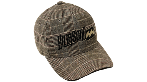
The company used to have its logo on items in the form of embroidered names and a black rectangular tag with two wave crests – white and black – running through the center.
The name of the company is in the Aboriginal dialect of Wiradjuri. Gordon Merchant was born in the west of the country. The surfing culture that prevailed there, the many beaches suitable for the sport, nurtured a passionate love for board riding in the future businessman, which later transformed into a business. By choosing a name for his company, the founder emphasized his love for his homeland and his work to promote the country.
Billabong corresponds to a word that refers to streams that appear only during the rainy season. They are turbulent and noisy, flowing with force. This accurately conveys the love for adrenaline and excitement that drives surfers.
The first and last letters of the inscription are of equally large size and symbolize waves. The other letters are smaller and underscored by a line that creates the impression of gliding on a surfboard. The characters are placed above and below one another as if they are rocking on the water.
The black and white wave on the visual mark indicates clothing designed for water sports. In Australia, there are suitable spots for both amateurs and professionals along almost every coast. The two oceans and their currents create high crests and turbulence, reflected in the emblem.
2008 – 2018
At the beginning of 2008, the company added several well-known brands and retail outlets to its assets, especially in America. The active expansion led to a logo change.
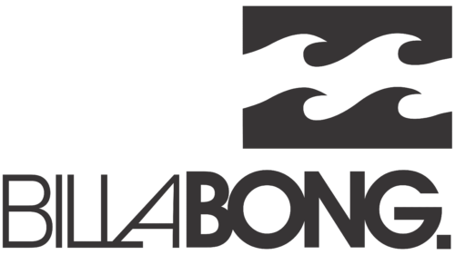
The image in the rectangle remained the same but more subdued. The name is visually divided into two parts: the thin “Billa” and the massive bold “Bong.” The unusual lettering of the two Ls and A in the thin part forms a vertical mountain-like shape, hinting at the addition of skateboarding products to the product lineup.
The picture is placed above the second part of the word. The transition from thin to massive suggests water crests.
2018 – today
In 2018, with a heavy heart, Gordon Merchant and the board of directors agreed to have the company acquired by its competitor, Boardriders. This was the third stage of the collapse. The company survived two major waves of significant sales losses in 2007 and 2014. However, it managed to avoid a complete sale, despite lengthy negotiations with investment funds.
The new owners took control of all related trademarks owned by Billabong and updated the sales system and the logo.
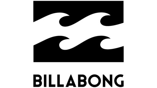
The mark became brighter and more compact. The saturated black and white colors in the rectangle emphasized the waves. The brand name is written in capital letters with a streamlined, straight font below the image, spanning the entire length of the rectangle. The emblem appears bright, concise, and understandable. It pays tribute to the origins and the main product line of the company.
The three stripes on the logo represent the three clothing lines developed since 2019: LifeStyle, Active, and Surf.
Font and Colors
The logo’s main colors are black and white, like the rocking of waves, ups and downs, products for snow, and riding on land. The unexpected contrast also tells the story of the brand’s development, which itself has experienced several bright ups and downs. The combination of black and white indicates life built from joys and hardships.
The colors also demonstrate the rise to heights that require constant, persistent effort.
The font is similar to Benn Beckman Black but with a modified letter G.
Billabong color codes
| Black | Hex color: | #000000 |
|---|---|---|
| RGB: | 0 0 0 | |
| CMYK: | 0 0 0 100 | |
| Pantone: | PMS Process Black C |

