


![]() Bing Logo PNG
Bing Logo PNG
With sharp turns, bends, nooks, and crannies, the search engine will overcome obstacles to obtain the necessary information for the user. The Bing logo conveys this meaning through intricate, cubic lines. At the same time, in the open space of the emblem, there is always room for discoveries.
Bing traces its origins to August 1998, when Microsoft launched MSN Search, which used external indexes such as Inktomi. Despite strong distribution through Internet Explorer, the service failed to gain traction as Google rapidly expanded.
In March 2006, Microsoft relaunched the product as Windows Live Search, which was renamed Live Search in 2007. Interface updates and new features did not change its position, with global share staying below 3 percent. In 2008, Microsoft shifted strategy and acquired Powerset, introducing semantic search technology that interprets user intent rather than keywords. This marked the foundation for a new standalone product.
On May 28, 2009, Steve Ballmer presented Bing at All Things Digital. The public launch followed on June 3, supported by a large advertising campaign. The service emphasized structured answers, related queries, and a redesigned homepage. On July 29, 2009, Microsoft and Yahoo! signed a ten-year deal. Yahoo’s search infrastructure moved to Bing, with the full migration completed by 2012, increasing its combined scale relative to Google.
In 2011, the Tiger indexing system improved speed and relevance. In 2014, Cortana launched using Bing data. With the release of Windows 10 in 2015, Bing became integrated into system search and the Edge browser.
In 2016, Microsoft open-sourced the BitFunnel indexing algorithm. The next major shift came in February 2023, when Bing integrated GPT-4 from OpenAI, adding conversational search through Bing Chat. The new interface enabled dialogue-based queries and source-linked responses. Early adoption reached tens of millions of interactions, with daily usage exceeding 100 million users. Bing also integrated image generation based on DALL-E models. By fiscal 2022, the advertising platform generated about $11.6 billion in revenue.
Meaning and History
![]()
The search engine received the logo well before its 1998 release, coinciding with the prototype’s launch. During this time, the visual identification icon has become well recognized among users. In total, he went through six modifications. To indicate its place in the Microsoft product family, the authors left the logo on four multicolored elements (mostly rectangular).
What is Bing?
Bing is a Microsoft search engine that has many language versions. Its use does not require registration.
1998 – 2006
![]()
The logo debuted with the search startup MSN Search. The sign consisted of three main elements: two words and one graphic symbol. The first part was the name of the service itself, while the second was a Microsoft butterfly icon with wings in four colors: blue, green, red, and yellow. The abbreviation “MSN” was in lower case, although it was in large print. The word “Search” had a classic spelling and included both uppercase and lowercase letters.
2006 – 2007
![]()
When Windows Live Search replaced MSN Search, the developers redesigned the logo. It began to look much simpler: a name with the familiar Microsoft logo. The text was on the right, the icon on the left. The breakdown between words was wide.
2007 – 2009
![]()
After testing the beta version, the designers simplified the text part, leaving only the phrase “Live Search.” They made the letters thinner and more graceful than in the opening version.
2009 – 2013
![]()
2009 was a turning point in the Bing logo’s history: it was then that the authors first used the search engine’s new name. As before, they placed the basic emphasis on the verbal designation. The emblem consisted of “bing” in lowercase, with large, rounded letters of the same height. There was an orange dot above the “I,” and the rest of the elements were colored blue. For “g,” the designers chose a curly crochet tail.
2013 – 2016
![]()
The new logo is a bold geometric emblem with straight edges and sharp corners, reminiscent of a boomerang. The icon was positioned to the left of the label and looked very innovative thanks to its sharpness. Lowercase letters became elongated and thin, and the inter-character spacing became wide. Both parts of the logo (graphics and text) were united by a single color: sandy yellow.
2016 – 2020
![]()
The next redesign of the personal sign marked the service’s transition to the next level. It turned green and got a capital letter at the beginning of the word “Bing.”
2020 – today
![]()
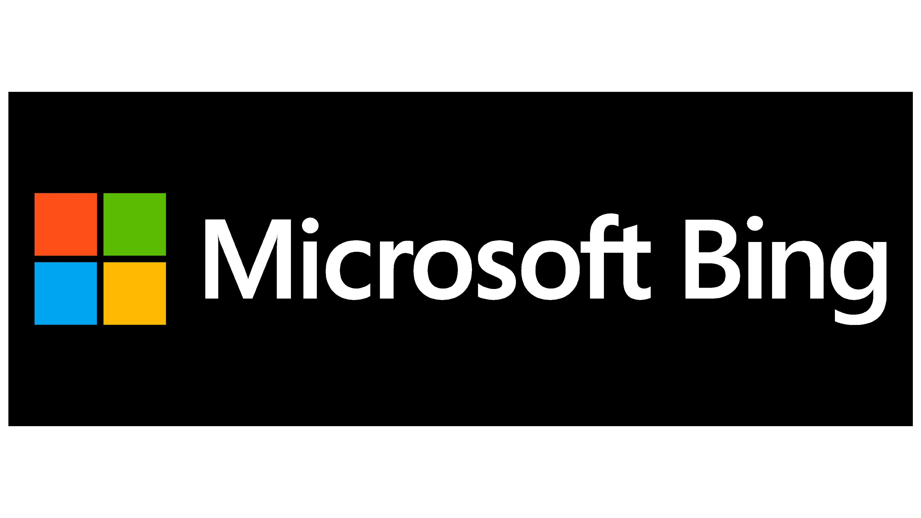
When the company’s management officially announced the service’s renaming to Microsoft Bing, the rebranding took effect immediately. A recognizable icon of the owner appeared in the logo, a large square divided into four identical sections of different colors. The developers have expanded the text by adding the corporation’s name. Both words are now in medium-width letters and are grayed out.
Font and Colors

The visual identity of a search engine has always evolved alongside the search engine itself. Renaming, testing, and revision – each transition to a higher level was reflected in the logo. The result is a corporate identity that is easily recognizable among other search engines. Essentially, Microsoft Bing’s symbology has evolved from multi-piece to minimalist. This movement had a tangible effect: after the service’s launch in a new status (in 2009), the current emblem is radically different from the previous one.
To emphasize that the search engine belongs to the Microsoft group, the designers chose a single spelling for the logo. Therefore, both words in the text are made with the Segoe proprietary typeface. The letters “n” and “i” are the same as in the Windows logo. The top “b” element is identical to the “t” form from Microsoft’s primary symbology.
The search engine’s color scheme is fully consistent with the parent company’s logo color. Both versions have blue, red, yellow, green (in the square icon), and gray (in the font).
FAQ
What color is the Bing logo?
The logo is now a calm and intense green, replacing the previous yellow. This new color gives the logo a fresh, modern look and adds a professional feel, enhancing its image as a reliable and confident search engine.
The wordmark’s first letter is capitalized, emphasizing the brand’s professionalism. The green color conveys trust and stability, aligning with Bing’s goal to be a dependable search engine.
What is Bing’s logo?
The logo has a simple and recognizable design. On the left are four multicolored squares in red, green, blue, and yellow that link Bing to the Microsoft brand.
On the right, the text “Microsoft Bing” appears in gray, set in two sans-serif fonts with different levels of boldness. This adds a modern and clean look to the logo.
Why is the Bing logo bad?
The logo was voted the worst because of its unattractive typography and color scheme. Critics felt the design lacked visual appeal and didn’t communicate the brand’s identity.
The typography was perceived as uninviting and unengaging, which is important for a brand trying to stand out in the competitive search engine market. The color scheme did not resonate well with users, making the logo dull and uninspired.
These design issues led to a negative perception of the brand, underscoring the importance of a well-crafted logo in creating a positive, memorable brand image.
What is the search engine for Microsoft?
Bing is Microsoft’s search engine. Microsoft Search in Bing combines Microsoft Search and Bing web search to provide a seamless experience. This integration helps users find relevant results from their organization and the web.
Using Bing, users can search the web and access internal information, such as documents, contacts, and other resources within their organization. This unified search approach boosts productivity and efficiency, making it easy to find needed information quickly. Bing’s familiar interface and powerful search capabilities make it a valuable tool for personal and professional use.
What happened, Bing?
Nothing significant happened to the company. It still exists but is now called Microsoft Bing. This rebranding reflects a closer integration with the broader Microsoft ecosystem, highlighting its connection to other Microsoft products and services. The name change unifies the brand and leverages Microsoft’s strong reputation in the tech industry. Despite the new name, the search engine still offers the same features users rely on.