


 Black Flag Logo PNG
The Black Flag logo symbolizes the company’s professional approach to insect control. Its minimalist style highlights the simplicity, effectiveness, and reliability of the insecticides produced by the American manufacturer.
Black Flag traces its history to 1833, when Green Mouland founded a small pesticide business in Baltimore, Maryland, under the name Mouland’s Insecticide Powder. The company first produced insect powder for household pests, including ants and cockroaches. By the 1850s, demand grew in Baltimore and nearby areas as pest-control products became more familiar to customers.
In 1866, Frederick Mouland took over the business and changed its marketing direction. He introduced the black flag symbol, which later became the brand name. During the 1870s, the company added liquid pesticides, and in 1880 it opened a plant in Chicago, expanding production beyond Baltimore. In the 1890s, national newspaper advertising helped make the flag symbol widely known.
Black Flag released its first aerosol insecticide in 1908. In the 1920s, it opened additional U.S. facilities, exported products to Canada and Mexico, and added rodent-control items. The Great Depression forced cuts, but demand for pest-control goods kept the business active. After World War II, suburban growth increased household use, and in the 1950s the line expanded into gardening and plant protection. In 1965, the company introduced a product using synthetic pyrethroids, while the 1970s brought stricter environmental rules and formula changes.
Boyle-Midway acquired Black Flag in 1985. In the 1990s, the brand expanded in Europe and Asia and, under American Home Products Corporation (later Wyeth), added roach baits in 1991 and ant traps in 1995. Mosquito products followed in 2000. Spectrum Brands Holdings, Inc. acquired the company in 2006. From 2010 to 2022, Black Flag added bed bug products, digital pest guides, long-lasting repellents, natural pesticides, an AI-based pest app, and professional pest-control products.
Meaning and History
What is Black Flag?
Black Flag is an insect and pest control brand offering various solutions to kill insects, such as ants, cockroaches, spiders, and mosquitoes. William B. Ginsburg laid the foundation of the company. Black Flag products help maintain a pest-free environment in homes and other spaces by providing effective pest control and prevention.
1833 – 1925
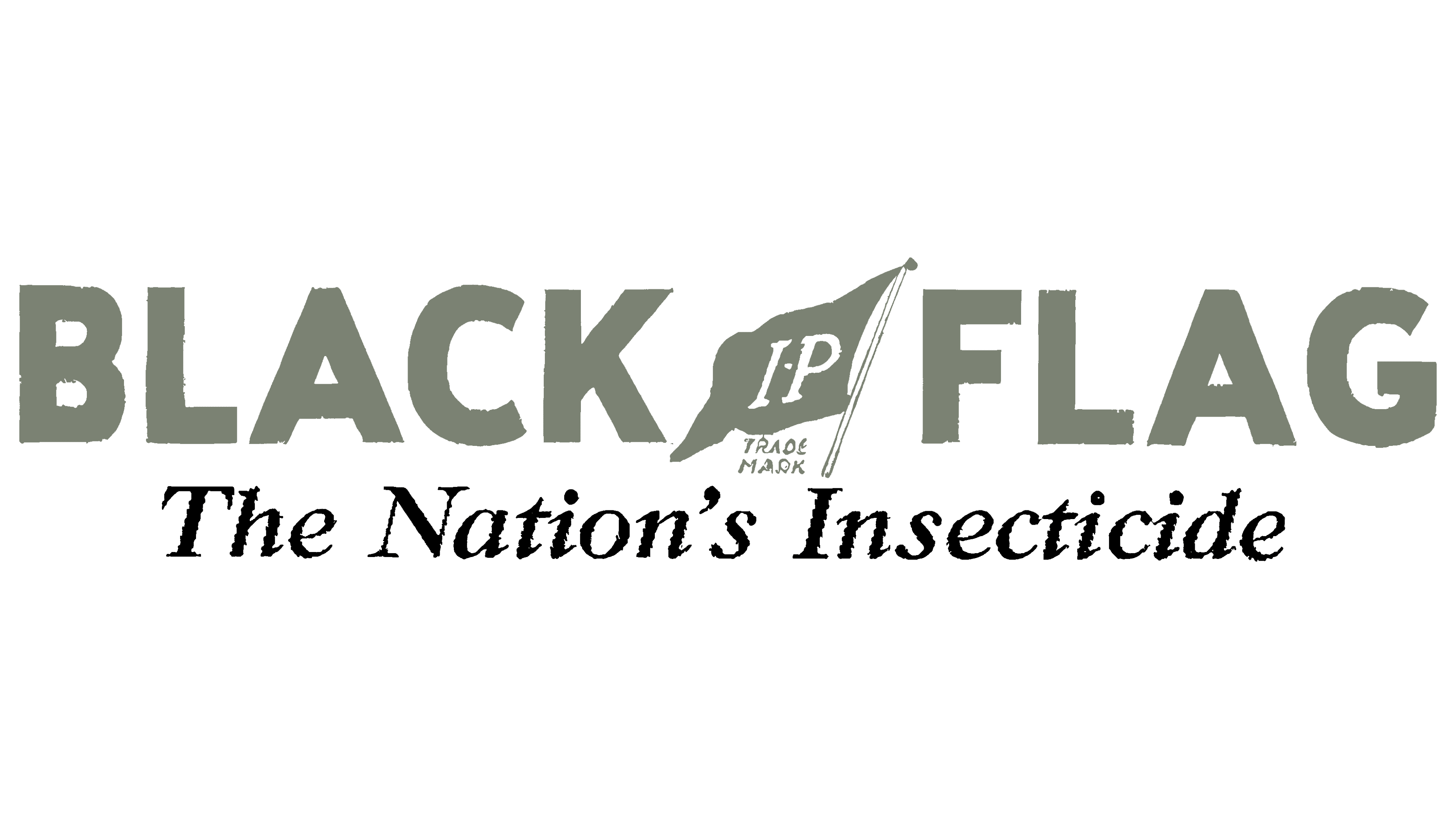
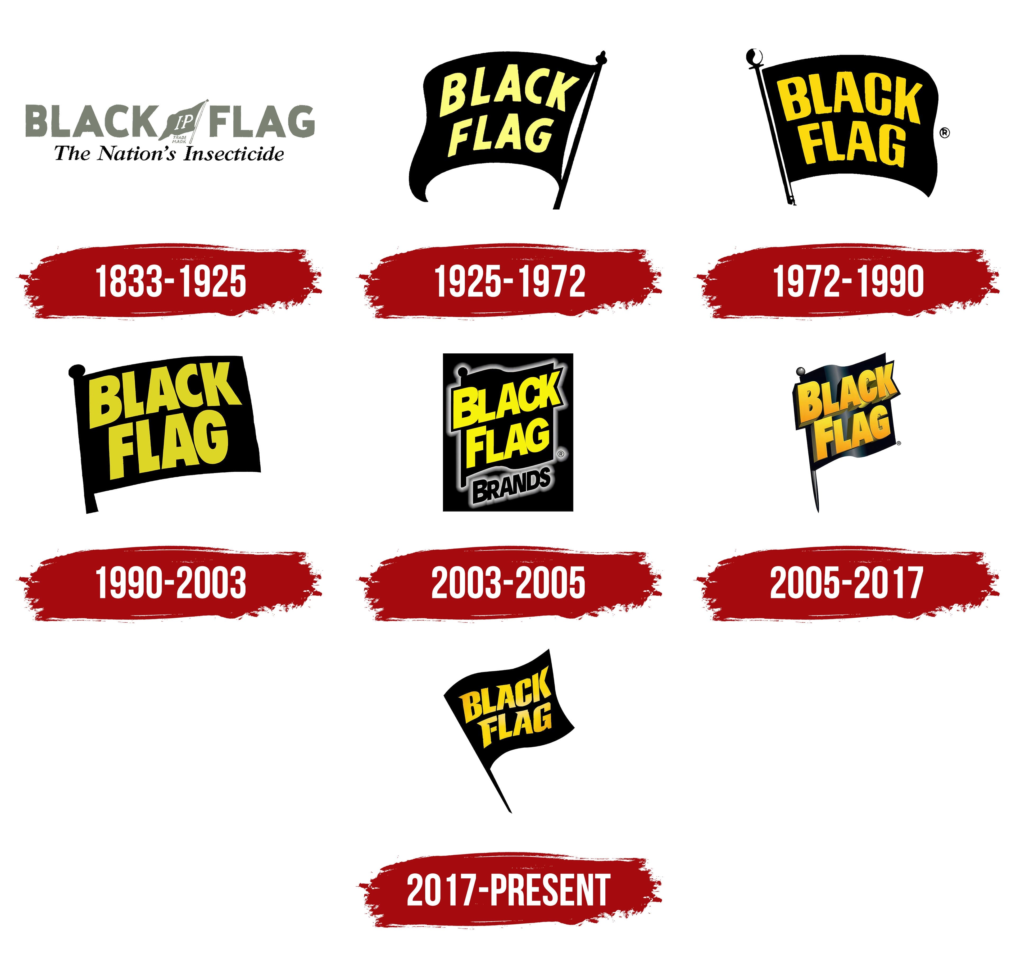
The historic brand Black Flag once featured a two-tiered logo with numerous inscriptions on its insecticide labels. At the top was its name, rendered in bold, sans-serif type. Despite its simplicity, the classic geometric grotesque font emphasized the company’s firm stance on quality and adherence to the standards of the time. The balanced combination of rounded and angular shapes was intended to draw attention, while the stable capital letters indicated the manufacturer’s reliability.
The inscription on the second line looked quite different. The inspiring slogan “The Nation’s Insecticide” was written in thin italics, somewhat similar to Times New Roman. This enhanced the logo’s dynamism and added a sense of solidity to earn customers’ trust.
Between the words “Black” and “Flag” was an illustration referencing the brand name: a dark flag waving on a light flagpole. The drawing appeared dynamic as if the flag were fluttering in the wind, drawing attention to the white letters “I” and “P.” Below it was the phrase “TRADE MARK,” indicating that the company was the sole owner of its name and logo.
The drawing and inscriptions were in dark colors: black and gray. This combination was used due to limited technological capabilities, as black-and-white printing was the only advanced technology in the early 20th century. Even in this form, the emblem looked attractive, thanks to the successful choice of fonts.
1925 – 1972
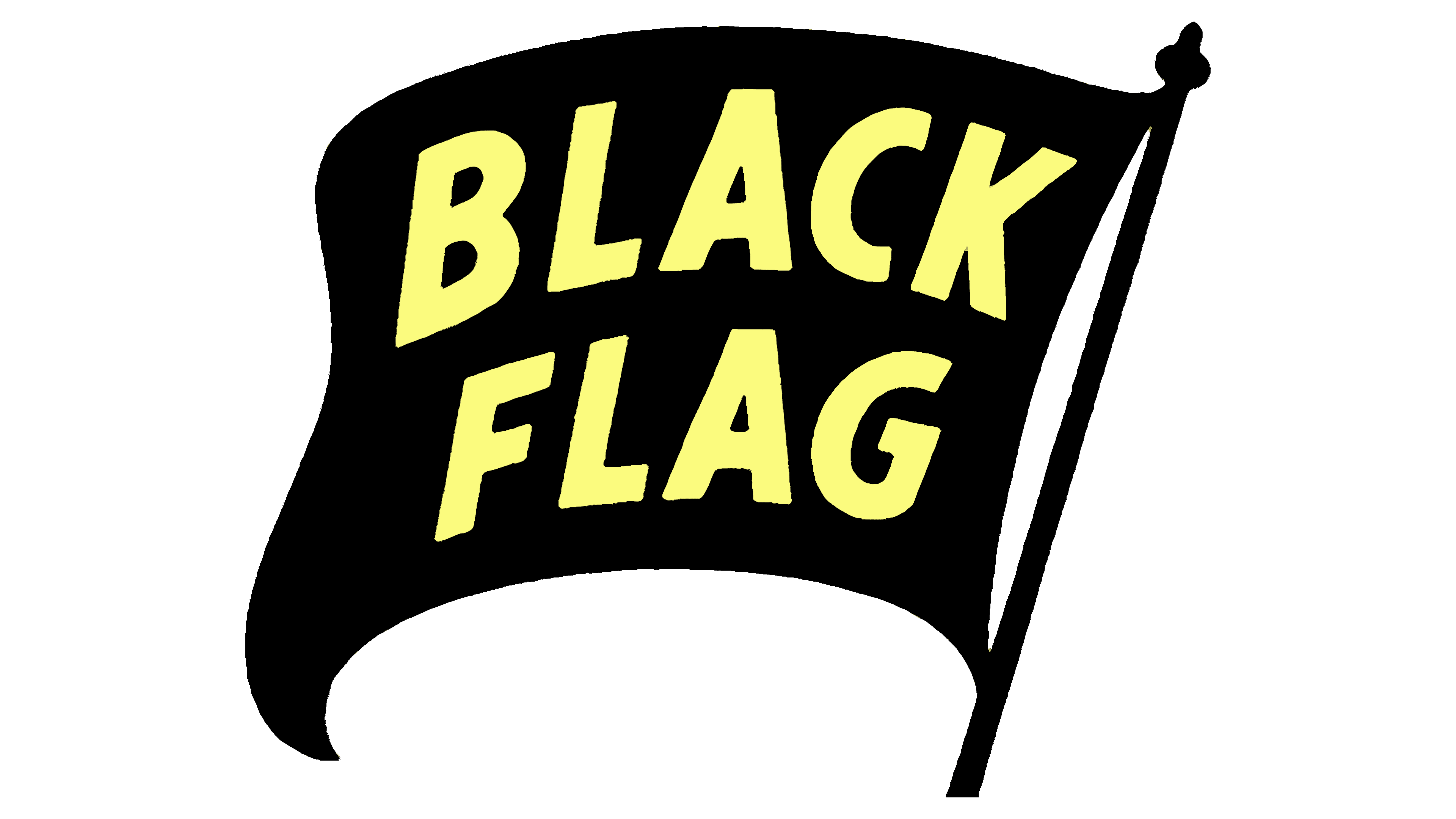
Cans and sprayers featuring this logo are now considered antiques: they are collected and displayed in museums as a tribute to the history of insecticides. The vintage Black Flag symbol, used in the mid-20th century on all company products, is remembered for its simple design. It was an excellent replacement for the older emblem, which had too many inscriptions that distracted from the central icon.
The brand name was placed on a large, waving flag in the new logo. The words curved along the banner’s shape to create the illusion of movement. The flag, as expected, was black, perfectly conveying the company’s concept: while a white flag signifies surrender, a black flag declares war on harmful insects that cause discomfort and spread dangerous diseases.
Due to the color contrast, the yellow text stood out well against the black background. The uneven, bouncy font further drew attention to the brand name, enhancing its recognizability. The emblem’s playful, informal style was meant to pique interest in the insecticide manufacturer. At the same time, the bold capital letters conveyed a sense of reliability despite the lack of visual order.
1972 – 1990
Designers mirrored the logo so that the free edge of the banner waved on the right, with the flagpole on the left. This significantly improved its perception, as it made more sense for the text to start from the side where the flag is attached to the pole. The shape of the banner itself remained almost unchanged, except for some softening of the curves and perfect alignment of one side, enhancing the sense of stability.
The emblem’s geometric precision was associated with reliability, confidence, and durability, while the flag’s freely waving edge created an illusion of movement. The visual dynamism continued to draw attention to the brand’s products.
The inscription’s pale yellow color was replaced with orange, making the logo’s colors reminiscent of wasps or Colorado beetles. Whether intentional or not, the company managed to evoke associations with the insects its insecticides combat. Designers also changed the font, increasing the letter spacing and creating contrast in the stroke thickness. Although the overall geometric style was preserved, the company name became clearer and more noticeable.
1990 – 2003
In 1990, the absurd, shapeless flag transformed into an almost straight rectangle, with its only imperfection being a slight dip at the bottom. Although there were fewer rounded lines, this did not affect the visual dynamism. On the contrary, the new shape gave the emblem energy and emphasized the insecticide manufacturer’s authority.
The right side of the flag was slightly raised to create at least a minimal illusion of movement. The left part completely merged with the flagpole, leaving no gap between them. This monolithic design symbolized unwavering confidence in Black Flag’s products. A small oval at the top added variety to the logo, breaking up the angular shapes.
The flag retained its deep black color, while the inscription became paler, taking on an unremarkable mustard-yellow shade. However, it was still clearly visible thanks to the bold font, which made the letters more distinct and gave them a rectangular shape. The words were still split into two lines but were now aligned diagonally rather than arched. This arrangement made the company name look powerful and impressive.
2003 – 2005
This logo belonged to Black Flag Brands, which owned and operated the main insecticide trademark. Designers depicted the company name inside a large vertical rectangle, visually dividing the inscription into two parts:
- The yellow phrase “BLACK FLAG.”
- The black word “BRANDS.”
The first part was placed on the flag’s banner, slightly extending beyond its edges. The second part was located at the bottom, separated from the dark background by a glowing silver halo. The same semi-transparent border surrounded the flag image and the registered trademark symbol. The misty texture created a shimmering effect, resembling a neon sign, which increased the logo’s recognizability and helped promote the company internationally.
The word “BRANDS” was part of the name and indicated the wide range of products the manufacturer offered under different trademarks. Numerous poisons for wasps, bees, flies, spiders, cockroaches, ants, and scorpions, along with electric fly swatters and disposable insect traps, provided maximum protection both outdoors and indoors.
To break up the gloom of the black rectangle, designers colored the first two words in bright yellow. The vivid shade served as a warning to the pests targeted by the insecticides. The inscription drew even more attention with its unusual, bold font, in which the letters varied in size and overlapped. The uneven spacing between the letters imbalanced the emblem, emphasizing the company’s high activity.
2005 – 2017
2,000 designers updated the logo, giving it a more realistic look. The logo still featured a black flag with the brand name written on it, but the style was completely changed. The use of gradients added new textures, creating a sense of depth.
- The light stripe down the middle made the flag appear glossy. The shine aligned with the folds, creating the illusion of smooth movement, as if the flag were truly waving in the wind.
- The flagpole had gray sections that emphasized its volume. The rounded finial contrasted with the pointed bottom, creating a visual balance of forms.
- The yellow-orange gradient gave the letters a matte texture. They also appeared three-dimensional because the broadsides stretched far back.
Thus, the brand name was separated from the flag and ceased to be a simple inscription. It seemed to hover above, transforming into a massive structure. Its visual weight was due not only to the three-dimensional letters but also to the bold geometric font, which looked impressive on its own. All this highlighted the modernity and progressiveness of the company Black Flag, which aimed for innovative solutions in insect protection.
2017 – today
The insecticide manufacturer continued to use the black flag logo as a warning and determination symbol. Designers enhanced its dynamism by increasing the flagpole’s angle and stretching the flag’s free corners. Now, it appears like an invisible hand is actively waving the flag to attract attention. The absence of a finial makes it ergonomic and highlights the elegant curves of the lines. Thanks to the new shape, it seems light and airy, even without a gradient.
The simple two-dimensional texture does not spoil the emblem. On the contrary, it fully aligns with the minimalist style, reflecting the company’s seriousness, confidence, and reliability. What does not look minimalist is the lettering, which now features several interesting details:
- The tops of the letters “B,” “A,” and “F” have triangular serifs, creating a sense of threat (symbolizing that Black Flag products effectively destroy insects).
- Some parts of the letters “A,” “F,” and “K” are separated by gaps, giving the font a stencil-like appearance.
- The lower end of the “L” is cut diagonally to match the angle of the “A.”
The lettering is now lemon-yellow but still has a gradient: the shade in the center is slightly lighter than at the edges. This gives the impression that the brand name is glowing from within, like one of the insect traps. This color scheme perfectly reflects the company’s concept, raising the black flag in defiance of cockroaches, ants, spiders, wasps, and other pests.