 Live Nation Logo PNG
The Live Nation logo emphasizes the concert promoter’s global reach and connects artists and audiences. The contrasting colors and sharp geometric shapes reflect the company’s creative approach to organizing musical events.
Live Nation’s roots go back to 1996, when Robert F.X. Sillerman founded SFX Entertainment to consolidate the fragmented U.S. concert promotion market. The company grew by buying regional promoters and music venues nationwide. In 2000, Clear Channel Communications acquired SFX Entertainment for $4.4 billion, combining radio broadcasting with live performance assets.
In 2005, Clear Channel separated its entertainment division, creating Live Nation as an independent company focused on concert promotion and venue management. In 2006 and 2007, it signed long-term 360-degree contracts with U2, Jay-Z, and Madonna. Those agreements covered concerts, merchandise, music rights, and related commercial activity. In 2008, the company introduced its own ticketing technology as competition in the ticket market intensified.
In 2009, Live Nation agreed to merge with Ticketmaster, its main rival in ticket sales. After an antitrust review, the U.S. Department of Justice approved the merger in January 2010. The new company, Live Nation Entertainment, united ticketing, venue operations, and event promotion. In 2011 and 2012, it reorganized operations, and in 2013 created Live Nation Labs to develop digital products and services.
From 2014 to 2019, expansion continued through acquisitions, including C3 Presents, Bonnaroo Music and Arts Festival, Music Management International, Luger, Insomniac Events, Upgraded, and OCESA Entretenimiento. The pandemic disrupted concerts in 2020 and 2021, but global festivals and tours returned in 2022. In 2023 and 2024, the company worked on Live Nation Launchpad, mobile app tools, cleaner event technologies, and blockchain-based ticketing.
Meaning and History
What is Live Nation?
It is an American entertainment company that is a global leader in live event promotion, ticketing, and venue management. The company organizes and promotes concerts, festivals, and other live entertainment events worldwide. It owns and operates numerous concert venues, providing artists and fans with first-class live performance venues. In addition, Live Nation’s ticketing platform, Ticketmaster, is one of the largest and most widely used ticketing services, offering tickets to a wide range of events, including concerts, sports, theater, and other live entertainment.
1996 – 1998

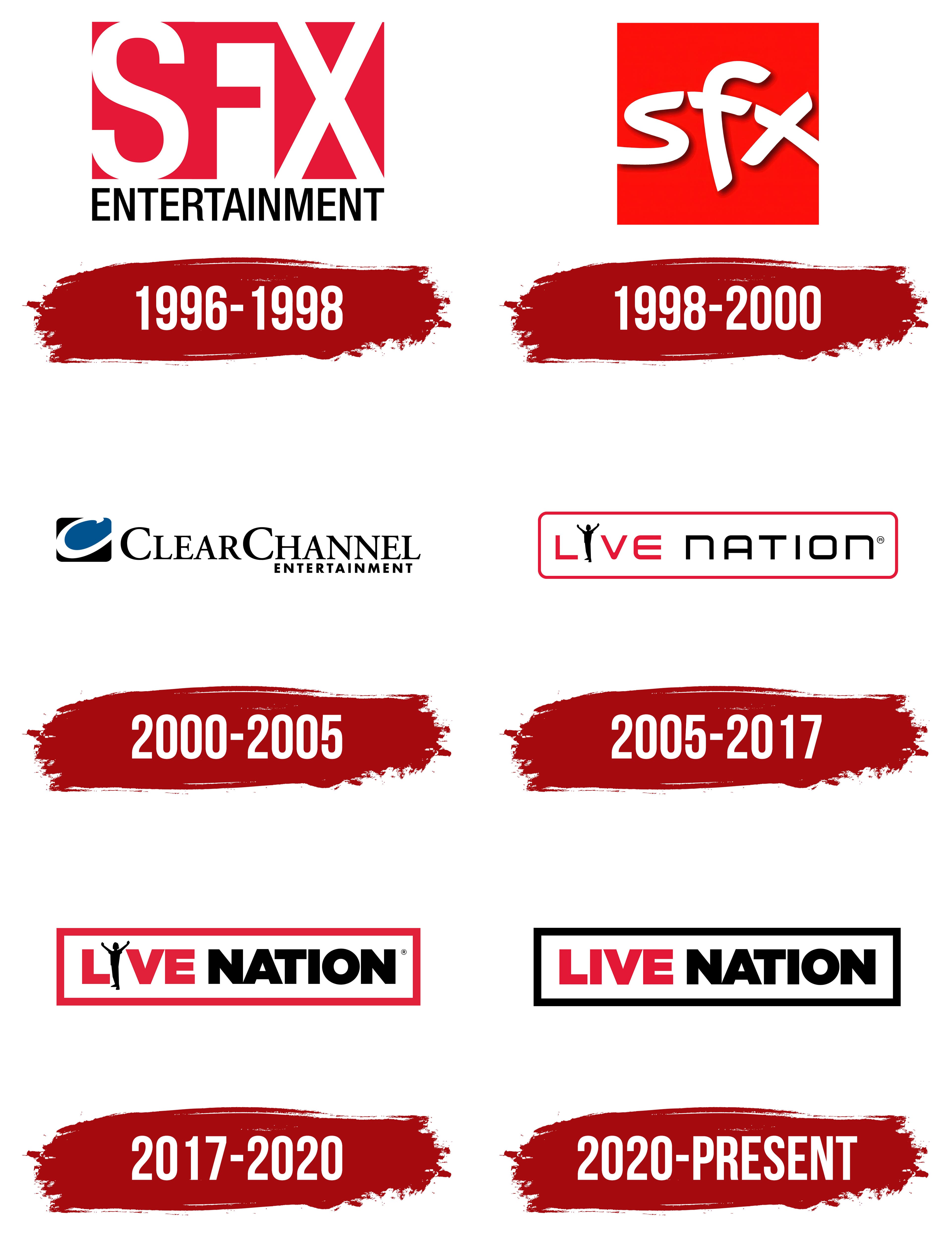
This emblem belongs to SFX Entertainment, a promoter of music events and electronic music festivals. While not a direct predecessor of Live Nation, it plays an important role in its history as the founder of Clear Channel Entertainment. Established in 1996, the company initially used an appealing three-color logo. Designers creatively played with the “SFX” abbreviation, depicting the glyphs in negative space.
The white “S” and “X” are formed by voids within a large dark red rectangle. The letters have no outlines, so on a white background, the parts that touch the rectangle’s edges blend seamlessly with the surrounding space. This creates the impression that the “S” and “X” flow outward. The lack of clear boundaries symbolizes the company’s openness and its aim to unite all concert promoters into one large national organization.
The letter “F” also has a unique shape. Its approximate contours are suggested in the negative space formed by the protrusions of a white polygon between the “S” and “X.” It appears as though the “F” is slowly emerging, creating a sense of mystery. The extravagant design reflects the company’s ambitions, as it intends not to stop at its current achievements but to become the largest music event promoter in the U.S.
The confident font used for the word “ENTERTAINMENT” conveys the brand’s seriousness and its unwavering determination to achieve its goals. This part of the text is in a thin, grotesque font with vertically elongated letters. The clean, straight lines create a sense of solidity, characteristic of a growing organization. Black serves the same purpose: it radiates strength and independence.
By making the logo three-colored, the designers aimed to give it visual dynamism. The combination of dark red, white, and black is timeless and classic, drawing attention and increasing the company’s recognition.
1998 – 2000

In 1998, SFX Entertainment updated its emblem to reflect its connection to the entertainment industry. The previous version seemed too formal, even with negative space. In the new logo, designers aimed to convey the lightness and informality of the company’s musical events. They achieved this through several visual techniques.
- The new foundation is a large, bright red square. This emotional color captures EDM’s energy and fans’ excitement. The new red shade appears bold and provocative, making it an ideal choice for a festival and concert organizer.
- The “sfx” abbreviation is now lowercase, as lowercase letters create a more approachable, friendly atmosphere. This symbolizes the company’s desire to be on the same level as those it serves.
- The new font looks informal because of its asymmetrical shape. The designers arranged the letters so the “s,” the horizontal stroke of the “f,” and one diagonal of the “x” form a long, broken line. This represents SFX Entertainment’s aim to become a large organization that unites many regional concert promoters.
- The letters now have semi-transparent black shadows, concentrated mostly at the bottom and right. This creates the illusion that the text is floating above the red square, not touching it. The brand’s modern 3D appearance reflects its focus on younger generations and its desire to remain in the spotlight.
As before, the ends of the “s” and “x” touch the background edge. With no outer outlines, the emblem on a white background creates the illusion that the letters blend into the surrounding space. This evokes openness and freedom. The logo conveys that all boundaries are erased, signaling it’s time for electronic music festivals.
2000 – 2005

In 2000, SFX Entertainment became part of Clear Channel Communications and operated as a division for five years. Its new name, Clear Channel Entertainment, formed the basis of a multi-component wordmark. The text is divided into two parts, each in a different font.
- The first line features elegant letters with long serifs. The strokes vary in thickness, giving them a visually dynamic appearance. All glyphs are uppercase, but the first “C”s are enlarged to prevent the words “CLEAR” and “CHANNEL” from merging due to the narrow space between them.
- The lower text is set in a bold, geometric sans-serif font. The letters are uniform in size, making the text easy to read despite the small font.
The designers varied the typography to reflect the brand’s multifaceted nature. On the one hand, it connects to the entertainment industry, helping organize music concerts. The sharp curves and dynamic serifs hint at the energetic vibe of these events. On the other hand, the concert promoter approaches their work with great responsibility, as evidenced by the text’s serious tone in the second line.
Clear Channel Entertainment’s graphic symbol is to the left of the wordmark: a white “C” formed by negative space between black and dark blue elements. It resembles a wave and is enclosed in a rectangle with rounded corners. This symbolizes the wave of emotions that overwhelms and sweeps away those attending live performances.
However, the emblem’s colors are not very emotional: black, white, and dark blue mute the design’s visual energy with their somber tones. These colors suggest that the event organizer must be calm, practical, and methodical to create the right conditions for hosting concerts.
2005 – 2017
In 2005, the Clear Channel Entertainment division was spun into an independent company and renamed Live Nation. Following the restructuring, the brand introduced a new logo, distinct from its previous versions. The name is now enclosed in a long red frame, creating a sense of balance and order. This symbolizes that the concert promoter controls everything and pays attention to every detail.
The outer border appears as a rectangle with rounded corners. The text follows a similar style: it is set in a rectangular font with rounded corners. Designers intentionally matched the frame’s shape and the letters to achieve visual harmony, making the emblem more appealing.
The glyphs use clean, straight lines of uniform thickness, conveying the promoter’s reliability, responsibility, and stability. The smooth curves slightly soften the text’s rigid appearance, creating a sense of dynamism. The wordmark embodies the energy of both fun musical events and the company that organizes them.
The words “LIVE” and “NATION” are colored differently: the first is red, and the second is black. The sharp contrast makes the brand name stand out, especially on a white background. The red, black, and white palette evokes contrasting emotions, from cold seriousness to explosive excitement.
Another emotional expression is the silhouette of a person replacing the letter “I” in the first word. The figure stands with arms raised as if celebrating something. This is a universal image, as it could represent either a performer on stage or a concertgoer. The small black silhouette reflects the company’s role as a leading player in the entertainment industry.
2017 – 2020
The 2017 logo appears more substantial, with sharper angles and thicker lines. The frame became a full rectangle and grew several times wider, evoking solidity, reliability, and longevity.
The typography style was also changed to match the new concept. The bold Gotham Ultra font replaced the thin geometric sans-serif, in which all strokes have equal thickness. This design inspires confidence in the company’s operations as Live Nation approaches large-scale events, artist promotion, and venue management responsibly.
Despite the typography’s strengths, the brand name is hard to read because the letter spacing is so narrow, which makes the logo less versatile. Designers changed the font but chose not to stretch the rectangular base, making the text feel squeezed to fit inside.
The silhouette of a cheering person still replaces the letter “I” in “LIVE.” It has become a recognizable company symbol, representing a collective image of everyone who attends festivals and other music shows. The human energy adds excitement, joy, and anticipation of thrilling experiences to the logo.
The color scheme also conveys dynamism, reflecting the concert promoter’s active engagement. The logo combines white, black, and a vibrant shade of red (#E21836). This timeless combination balances each color:
- Red symbolizes passion and energy.
- Black conveys seriousness and elegance.
- White creates a sense of order and confidence.
2020 – today
The person’s silhouette was replaced with a standard letter “I.” This change made the Live Nation logo more streamlined and modern, aligning with the current minimalist design trend. Removing the icon also improved text readability, especially in smaller versions. This simplification made the logo more versatile and easier to adapt across marketing materials.
The silhouette was distracting, so removing it shifted the focus to the brand name. The name is now at the center of the visual identity, literally with the phrase “LIVE NATION” positioned right in the middle of the logo within a large black frame.
The text is rendered in all caps, giving it a confident, strong appearance. The bold geometric font adds a modern touch, emphasizing the company’s commitment to balance, even in the smallest details. The absence of serifs conveys simplicity and directness, positioning Live Nation as a reliable concert promoter.
The space between the two words is very narrow, making the text appear unified. However, the words don’t blend because each is a different color: “LIVE” is red and “NATION” is black. This composition gives the emblem a dynamic, energetic feel that reflects its connection to the entertainment industry.
The bold wordmark sits within a black rectangular frame, reinforcing structure and clarity. The border draws attention to the central area, making the text more noticeable. The rectangle’s white interior creates sharp contrast, making the brand name stand out. The light background adds visual clarity; the red “LIVE” reflects the passion and activity of music events, and the black elements underscore the company’s solidity.