 Boston Children’s Hospital Logo PNG
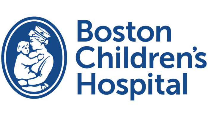
The Boston Children’s Hospital logo expresses care, love, and responsibility. It is a symbol of trust, safety, support for the younger generation’s health, and the desire to help sick children. These thoughts are conveyed in the logo through reverent artistic images. Although they are classic, they accurately express the feelings of representatives of the medical field.
Boston Children’s Hospital: Brand overview
| Founded: | 1869 |
| Headquarters: | United States |
| Website: | childrenshospital.org |
Meaning and History
This medical center was initiated by Francis Henry Brown, a surgeon during the Civil War. Before opening it, he studied innovative methods of treating children in Europe and, returning two years later, founded his pediatric hospital. This event is dated the summer of 1869. At first, the medical institution was designed for only 20 beds and was located in the Boston area of the South End. It employed Harvard Medical School graduates predominantly.
Americans liked the new level of patient care, and gradually the institution grew, becoming a large-scale organization of world significance. Now Boston Children’s Hospital can provide professional care to patients of younger ages and older ones. The doctors working there take on the most difficult cases, providing qualified treatment and examination in various programs.
What is Boston Children’s Hospital?
Boston Children’s Hospital is a US medical organization that provides pediatric services. According to US News & World Report, it is recognized as the best healthcare facility for children in the United States. The main contingent is patients aged 0 to 21 years. The location of the hospital in Boston, Massachusetts. Year of appearance – 1869. Creator – surgeon Francis Henry Brown.
The hospital also has several branches, one of which is a university where medical training is conducted, and various innovations are being developed. The main institution uses a professional logo. It directly reflects the type of activity of the center and its specialization. Therefore, the key elements of the emblem is a medical worker with a baby in her arms. Such a visual identity is based on attention, care, and reliability principles.
It depicts a nurse in a white coat and cap. The woman’s face is in profile as she gazes at the child she holds in her arms. The baby is also dressed in white clothes, indicating that he is a patient and is undergoing treatment. The figures are located on a cobalt background and seem to emerge from the negative space. The logo has a clear medallion shape in a double frame: the inner stripe is white, and the outer stripe is blue.
On the right side is the name of the medical institution, typed in a grotesque. The letters are simple and straight, without design frills, which indicates the wide availability of the pediatric center. The inscription “Boston Children’s Hospital” is stretched in one line and is located horizontally. According to English orthography, the characters in it are printed in bold, lowercase, and capital. Each new word in the name begins with a capital letter, while all the rest remain lowercase.
Font and Colors
For the Boston Children’s Hospital logo, the designers chose an average font modification that shares common features with three typefaces simultaneously. These include Carisma Gothic 600 DemiBold, Rutan DemiBold, and Rehn Medium. The difference with the original is insignificant: it consists of a small adjustment of some letters. For example, the ” o ” inner space is more elongated, and the bottom of the “t” curve is cut off a little. The corporate palette consists of only two colors: white and cobalt blue.
Boston Children’s Hospital color codes
| Safety Blue | Hex color: | #164989 |
|---|---|---|
| RGB: | 22 73 137 | |
| CMYK: | 84 47 0 46 | |
| Pantone: | PMS 7686 C |


