


![]() Black Flag Logo PNG
Black Flag Logo PNG
The Black Flag logo counterbalances the white flag raised upon surrender. So, the hardcore punk band members have no intention of surrendering. They want to act in their own interests, which is why they have been repeatedly revived “from the ashes.” Eventually, their purposefulness led them to a high level of international fame.
Black Flag began in 1976 in Hermosa Beach, near Los Angeles, when UCLA economics graduate Greg Ginn and singer Keith Morris formed a band after seeing The Ramones. At first, they called it Panic, then changed the name to Black Flag in late 1978. The four-bar logo was drawn by Ginn’s brother Raymond Pettibon, who also made the band’s record covers and flyers.
In 1978, Ginn and bassist Chuck Dukowski founded SST Records to release Black Flag’s music. The first release, Nervous Breakdown, came out in 1979 and became one of the early documents of West Coast hardcore punk. Morris left that year to form Circle Jerks, while Ron Reyes and Dez Cadena followed as vocalists.
In 1981, Henry Garfield, then working at Häagen-Dazs, joined after singing at an improvised New York show. He moved to California, took the name Henry Rollins, and played his first Black Flag concert on July 25, 1981. On December 5, 1981, the band released Damaged. MCA refused to distribute it, calling it “anti-parent,” so Ginn issued it through SST.
During the early 1980s, Black Flag built its reputation through constant touring, low budgets, and a do-it-yourself system that shaped American independent rock. SST grew with releases by Minutemen, Hüsker Dü, Sonic Youth, Meat Puppets, and Bad Brains. Ginn dissolved the band in August 1986. Rollins later formed the Rollins Band and won a Grammy for “Get in the Van”. Black Flag briefly reunited in 2003, returned in 2013 with What The…, faced a name dispute with Flag, and Ginn announced another reunion in 2019.
Meaning and History
![]()
This musical group was born thanks to the perseverance of Greg Ginn, who was inspired by the Ramones’ first album. His original atmosphere, interesting timbre, and repertoire orientation strongly influenced the guitarist. But even in 1977, the lineup was never fully completed. In addition to Greg, the band was represented by Brian Migdol (drummer) and Keith Morris (vocalist). But there was no bass player: different people took his place in turn. One of them later created a hard punk rock identity and did album covers. This is the brother of Greg Ginn, who adopted the pseudonym Raymond Pettibon. Often, the bass guitar part was handled by Black Flag’s founder, a role that contributed to the band’s signature low sound.
In 1986, the musicians dispersed, and the band broke up. But the collapse was not final: creative activity resumed in 2003. However, not for long, because the team broke up again a few years later. A second attempt at revival came in 2013. This time, the joint work lasted a little over a year. It was then that the musicians recorded their debut studio compilation, What The… (it was released for the first time in 20 years). The third reunion is dated January 2019, when newcomers appeared on the team.
What is a Black Flag?
Black Flag is an American band that started the hardcore punk genre. It was created in 1976 as Panic in Hermosa Beach, California. Its founder is Greg Ginn, guitarist, songwriter, and member of all lineups. The group broke up and rebuilt several times. The last reunion took place in 2019.
The key factor in the Black Flag style is minimalism. It is present in everything: short songs, uncomplicated melodies, and a simple logo. At the same time, it carries a powerful energy charge that had a huge impact on brutal forms of metal and the progress of punk rock. This alignment indicates that the group has only one visual identity marker: an extremely dark one devoid of flashy colors.
According to the hard punk rockers’ concept, the band’s logo is minimalist. It contains four simple geometric shapes placed vertically. These are long black rectangles that are slightly offset from one another: the first and third extend beyond the upper frames, and the second and fourth extend beyond the lower frames. However, they are identical in size. The distance between them is incredibly small and is represented by thin white stripes. Columnar elements occupy the remaining space.
The musical group’s name is set non-standardly: one word is at the top and the other at the bottom. They are characterized by dark, bold letters, with “L” and “A” closely connected. The characters located next to each other are single, separated from neighboring characters. The inscriptions are in capital letters with small sharp serifs.
Font and Colors
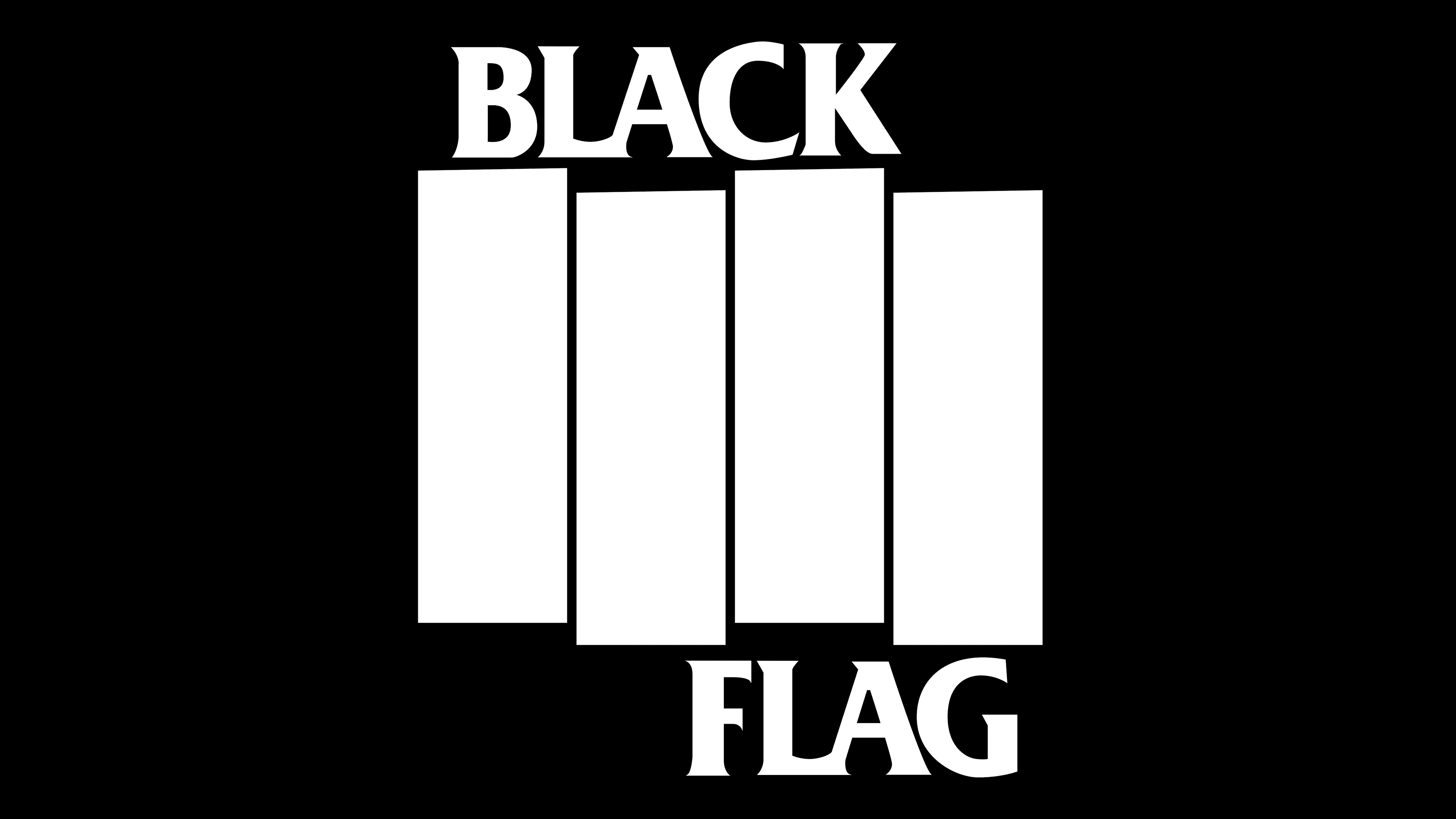
The musicians opted for a printed grotesque. It is clear and simple. In appearance, such glyphs are close to the Deadhead Rough Regular typeface from Twicolabs. Another suitable option for them is the Modesto Poster by Parkinson Type Design. Everything is very clear in the monochrome color palette. The combination of black and white helps the musicians achieve the desired effect – powerful hardcore punk.