


![]() Black Sabbath Logo PNG
Black Sabbath Logo PNG
The emblem emerges from the shadows like a ghost. The Black Sabbath logo conveys the frailty of earthly existence. The time will come, and the surrounding world will dissolve into non-existence. Until this happens, the sign calls for listening to the band’s music and getting ready.
Black Sabbath began in Aston, Birmingham, after Tony Iommi and Bill Ward had played together in The Rest and Mythology. In 1965, Iommi lost the tips of two fingers in a factory accident. He later used plastic caps, lighter strings, and a changed guitar technique, which helped form the band’s heavier sound.
In August 1968, Ozzy Osbourne and Geezer Butler joined Rare Breed. With Jimmy Phillips and Alan Clark, the group first performed as Polka Tulk Blues Band, a name Ozzy took from a shop sign. After a few shows, the lineup became a four-piece. The name was shortened to Polka Tulk, then changed to Earth in September 1968.
In 1969, Earth changed its name because another English band was already using it. A nearby cinema was showing the 1963 horror film Black Sabbath with Boris Karloff, and Butler suggested the name. He wrote the song Black Sabbath under the influence of Dennis Wheatley’s occult novels and a night vision. The first concert under the new name took place on 30 August 1969 in Workington.
In November 1969, the band signed with Philips Records and recorded its debut in two days. Black Sabbath came out on Vertigo on 13 February 1970 and reached number 8 in the UK. Paranoid followed in 1970, then Master of Reality in 1971. Later came Ronnie James Dio’s era, Reunion in 1998, Heaven & Hell in 2009, 13 in 2013, The End tour in 2017, the final original-lineup show in Birmingham on 5 July 2025, and Ozzy Osbourne’s death on 22 July 2025.
Meaning and History
![]()
In 2017, the band embarked on their final tour, The End, marking their departure from the stage. Thus ended an era of heavy metal, as Black Sabbath set new standards for the genre. Their rock style influenced the worldview of the 1970s, when the hippie and folk movements were in vogue. The satanic images of the songs invaded the public consciousness, built on the ideals of universal love, and at first scared away the listeners. But then the occult lyrics, gloomy performance, and ominous guitar riffs did their job: fans began buying millions of records and attending all the band’s concerts.
The band created a dark image, becoming the musical analog of horror films. This manifested itself not only in the lyrics but also in the iconic covers. In the early 1970s, English photographer and artist Keith Macmillan worked on them; however, only his pseudonym, Keef, was listed on the first four albums. During the release of his debut Black Sabbath compilation, he discovered surrealism and decided to use it as a basis. His friend Sandy Field did the typography and designed the lettering for the second Paranoid record.
The band had almost as many logos as albums because each cover featured its unique design. The evolution of the visual style ended in 2017, when Black Sabbath disbanded. The last character was featured in a compilation released in 2013.
1969 – 1970
![]()
Photographer Keith Macmillan was involved in creating the first logo, which was used in the cover concept. He asked a fellow student at the Royal College of Art to create a recognizable signature for the group. Sandy Field responded to the call for help and developed music-like typography. Each letter in the phrase “BLACK SABBATH” had twisted spiral elements, like a treble clef. Red curly symbols were arranged in two lines, outlined in white, and placed on a black background. The thickness of the lines varied to create a sense of dynamism.
1971 – 1972
![]()
IN 1971, the group’s third album, Master of Reality, was released. Macmillan also did the cover art, but he was assisted by the design company Bloomsbury Group this time. This is how the jagged black “BLACK SABBATH” lettering was born, waving like a flag in the wind. In the British version, it was embossed, whereas in the American version, it was made flat. The developers used bold geometric grotesque and rounded off some of the corners. The width of the strokes was the same everywhere. On the logo, the words were centered, one below the other.
1972 – 1973
![]()
The fourth disc, titled Vol. 4, was published in 1972. Cover artist Keith Macmillan again collaborated with the Bloomsbury Group on the typography. It was important for him that the typeface echoed the abstract Ozzy Osbourne image in the center. The result is a white inscription composed of individual glyphs. The letters were so bold that the intra-letter gaps turned into small dots, and adjacent lines merged. Another distinguishing feature of the logo was its disproportionate design: the strokes were cut at unusual angles.
1975 – 1976
![]()
After releasing their fourth album, Keith Macmillan and the Bloomsbury Group ended their partnership with Black Sabbath. However, this did not stop the musicians from experimenting with the logo design. The 1975 Sabotage LP featured a new red inscription. The letters looked typical of a bold, geometric sans-serif, except for the white “S” at the beginning of the second word, which resembled an inverted lightning-bolt zigzag. This logo was combined with an image designed by the Cream (Netherlands) design team on the cover.
1989 – 1990
![]()
The front side of the 14th studio album was adorned with the phrase “BLACK SABBATH,” written in an old English serif script. It echoed the Celtic cross that occupied most of the cover in style. A black version of the inscription was used for the logo. The words were split into two lines and centered.
1992 – 1994
![]()
In 1992, the band released Dehumanizer, considered one of the heaviest albums in their catalog. The new logo contained sharp-angled, vertically elongated letters. The protruding triangles at the ends of the first “B” and the last “h” resembled the electric shocks on the cover.
The phrase “Black Sabbath” occupied one line, while the interval between words was practically absent. Two parallel horizontal lines underlined the middle of the text. The “S” was exactly in the center and looked like it had fallen. The side parts of the inscription sagged, forming an arch.
2013 – 2017
![]()
The group’s latest album, the nineteenth, debuted in April 2013. The cover design was created by Zip Design staff, and the logo had to be combined. The developers have made the text white to stand out against a dark background. The letters were written in a font with short, sharp serifs at the ends of all letters. Gray shadows created the effect of three-dimensional volume.
Font and Colors
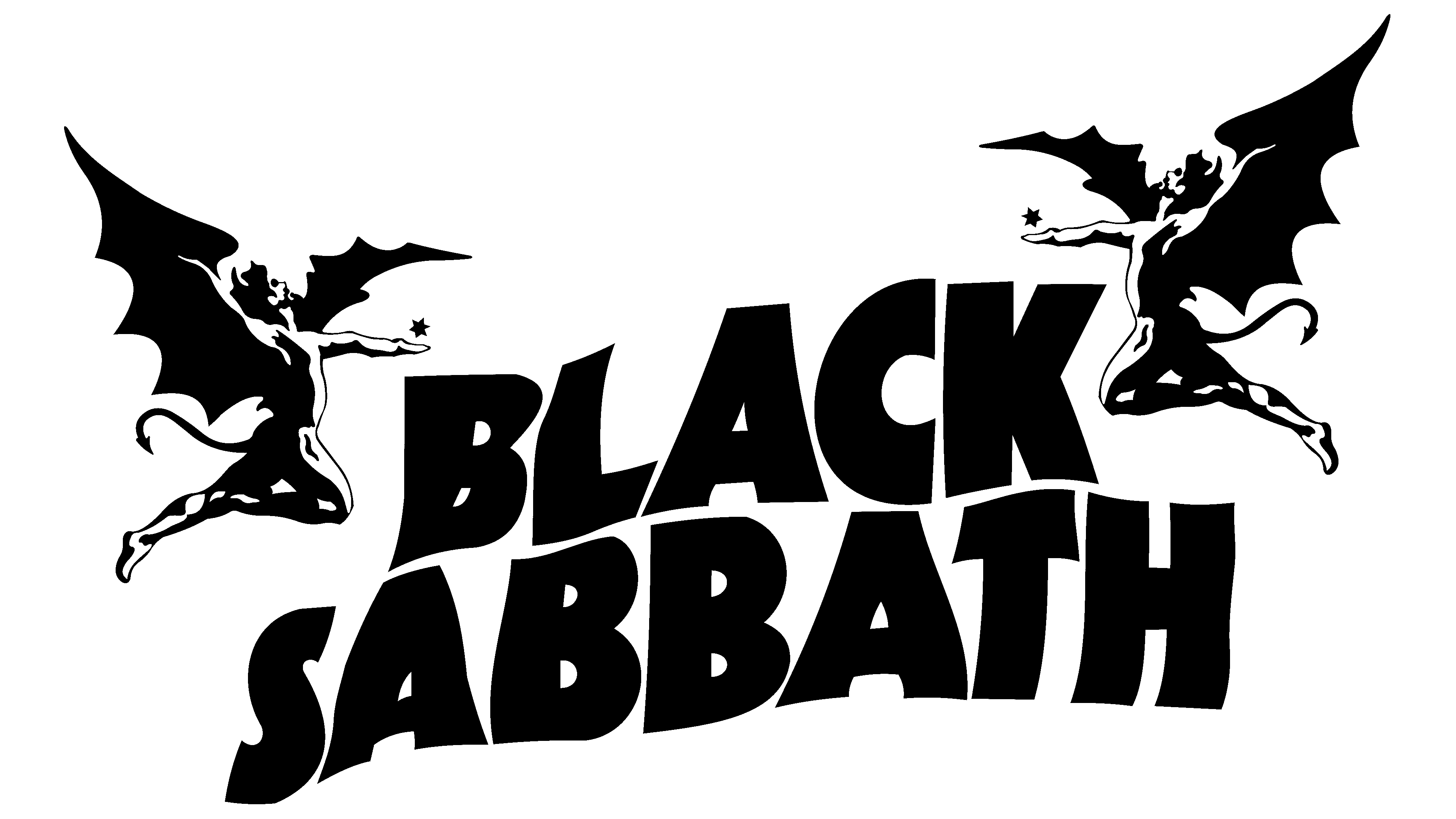
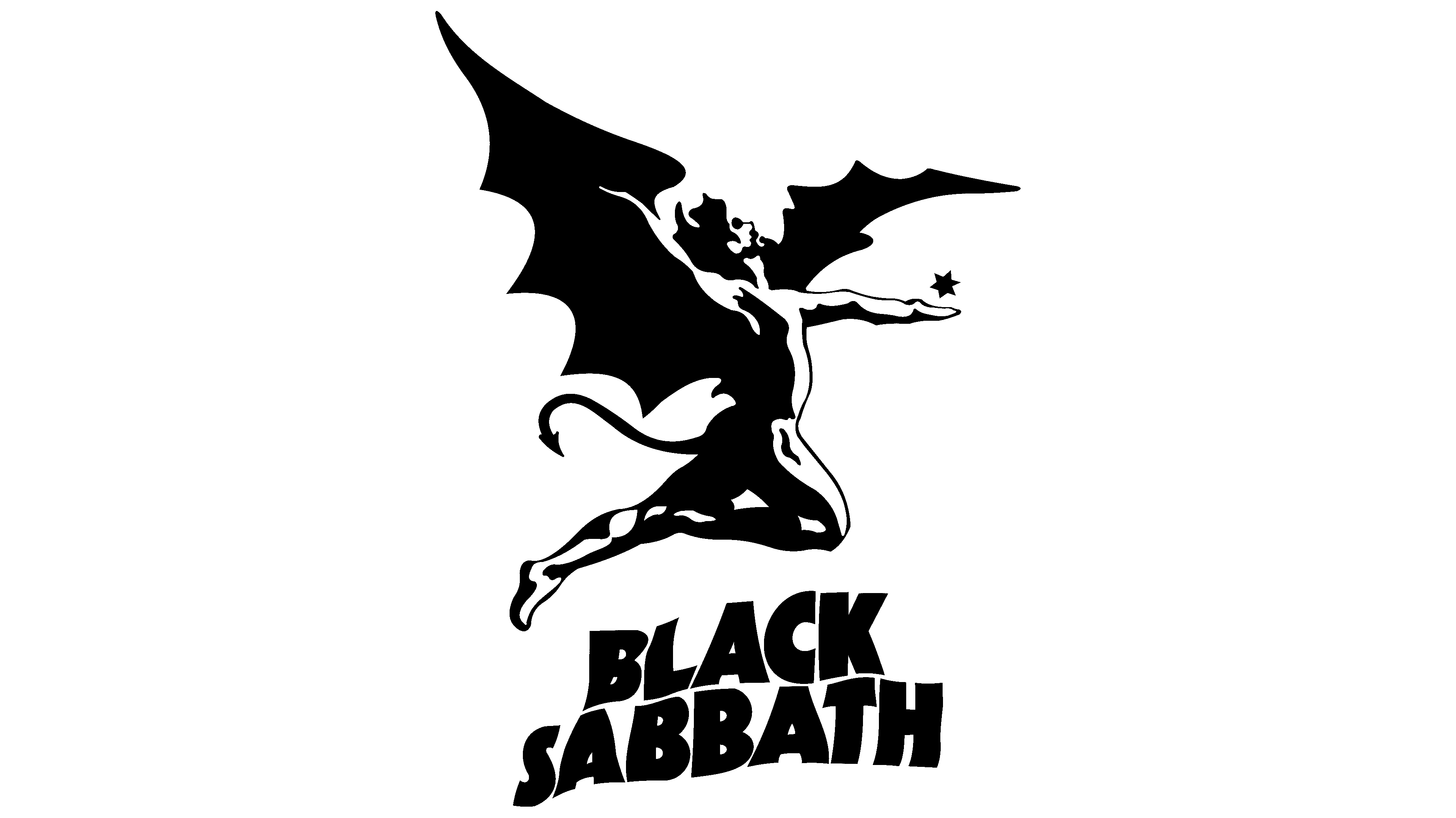
Wordmarks for Black Sabbath changed along with the release of new albums. Each version was radically different from the previous one, even though the inscription’s content always coincided. The group had only one unchanging emblem depicting a winged demon named Henry. This image personified the satanic and occult mood of the music.
The Black Sabbath logos use many custom-designed fonts. More precisely, individual glyphs are not arranged in a system of characters. The latest version features bold capital letters with miniature triangular serifs. The colors are also very different. In most cases, black and white predominate, sometimes with the addition of red. This is classic heavy metal.