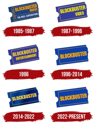
The Blockbuster logo directly communicates that it is a ticket into the world of spectacular entertainment, and without it, it is virtually impossible to get there. The emblem is considered timeless because it has a universal form, highly sought-after among those who love to spend time in front of a screen watching an interesting movie.
Blockbuster: Brand overview
| Founded: | October 19, 1985 |
| Founder: | David Cook |
| Headquarters: | Dallas, Texas, United States |
| Website: | blockbuster.com |
Meaning and History
David Cooke, who already had experience running an individual business, opened a video rental store in 1985 in Dallas, Texas. To obtain a suitable corporate style, he began collaborating with art director Lee Dean from Rominger Advertising. As a result of their joint efforts, a unique design was created, which became the basis of the logo for many years. The brand has never strayed from its individuality, adhering to it for several decades.
According to some experts, this emblem could be considered the most successful application of Carnase and Bonder’s font, as it is central to the visual identity. Blockbuster chose the ITC Machine typeface, complementing it with a fitting background that accurately conveys the atmosphere and the company’s line of work. However, oblivion followed due to bankruptcy. Afterward, the service could not recover and closed its entire network of rental points, leaving only one store – in Bend, Oregon.
What is Blockbuster?
Blockbuster is an American video content rental service – offering movies and games. It was once a large network but now consists of just one store located in Bend, Oregon. In addition, the company has evolved into a franchise and a website with the same name.
1985 – 1987
The company’s name is set against the background of a classic movie theater ticket. It is depicted sideways because the diagonal placement adds dynamics as if the ticket controller is returning the torn ticket to the viewer who wants to enter the theater. On the blue background, the yellow-white lines and inscriptions stand out effectively: “Blockbuster Videos” aligned to the right side, “The Reel Superstore,” and “10,000 videos.” They are set in a simple font without any serifs, complex structures, or smooth strokes. All sides of the glyphs are even, sharp, and precise. The right edge of the ticket is torn, while the left has a notch in the middle.
1987 – 1996
The new visual identity of Blockbuster did not undergo significant changes. However, at first glance, the logo’s main feature, the typography, has changed. Moreover, numerous inscriptions have disappeared, leaving only one with the brand name arranged on two levels. The right-aligned text was disrupted, so the word “Video” in the second line seems to hang uncertainly in space. This happened due to the removal of the final letter “S.” The designer also replaced the bright yellow color with lemon.
1996
The rebranding resulted in the modernization of the logo. The word “Entertainment” appeared in the bottom row, set in the same font as “Blockbuster.” This time, the alignment is visible: it is centered. The pale yellow letters and lines have acquired an intense sunny shade, while the neutral blue color has transformed into a dark purple.
1996 – 2014
The word “Entertainment” disappeared from the inscription. Only the short name remained, placed in the center. To avoid the space around it seeming too empty, the designers moved the borderlines slightly closer. They are now a bit farther from the edge. The color underwent a significant transformation: the purple shade was left behind, replaced by a neutral blue.
2014 – 2022
The visual identity was adapted to the realities of the time: this Blockbuster logo appeared in the store and on the website. It looks like a traditional ticket with a torn edge but with gradient transitions of blue. Shadows and highlights give the logo a three-dimensional effect. The inscription’s color has become soft yellow.
2022 – today
This emblem is an exact replica of the logo adopted in 1996. After the brand’s revival, management decided to use the old version – two-dimensional, flat, with a yellow-orange inscription.
Font and Colors
The Blockbuster logo has always maintained its original typography, created in collaboration with Lee Dean. The smooth, bold, and straight glyphs look strict, supporting the business atmosphere of the company. For several decades, the visual identity has been built on the simple font family of Carnase and Bonders. This typeface is called ITC Machine.
The color palette has also not undergone significant changes, except for playing with shades. The main color of the video rental service has always been and remains blue. At different times, it has varied from purple to neutral hues.
Blockbuster color codes
| Chrome Yellow | Hex color: | #ffa903 |
|---|---|---|
| RGB: | 255 169 3 | |
| CMYK: | 0 34 99 0 | |
| Pantone: | PMS 137 C |
| Royal Azure | Hex color: | #0d3fa9 |
|---|---|---|
| RGB: | 255 169 3 | |
| CMYK: | 0 34 99 0 | |
| Pantone: | PMS 2728 C |

