Bloomingdale’s logo is sophisticated. It has to do with the brand’s field of activity, a chain of luxury department stores selling everything from jewelry to furniture. Thin lines, elegant glyphs, and smooth strokes turn the logo into a symbol of lightness. And it’s not just a hint of elegance; it’s proof that shopping in such boutiques is easy.
Bloomingdale’s: Brand overview
| Founded: | 1861 |
| Founder: | Joseph B. Bloomingdale, Lyman G. Bloomingdale |
| Headquarters: | New York City, New York, U.S. |
| Website: | bloomingdales.com |
Meaning and History
A lot of time has passed since the opening of the first store with a full range of goods. The network was either an independent commercial unit or a subsidiary during this period, but it has invariably developed and retained its own identity. Her “face” is simple, based on dynastic roots rather than historical facts or stages of development. Therefore, the leaders have always paid tribute to the creators of this commercial structure – particularly in the form of logos dedicated to them.
Modern Bloomingdale’s is a very large retailer, but in 2020 Macy’s, Inc. (owner) announced the closure of the oldest department store in Florida. In the same spring, the work of all offices was temporarily stopped to prevent the spread of COVID-19. The management assumed that this break would last about six weeks, but they were mistaken. As a result, it launched several outlets with anti-covid measures to protect buyers. Unable to withstand such a situation, the trading network was reduced by one more department store – this time in the state of California.
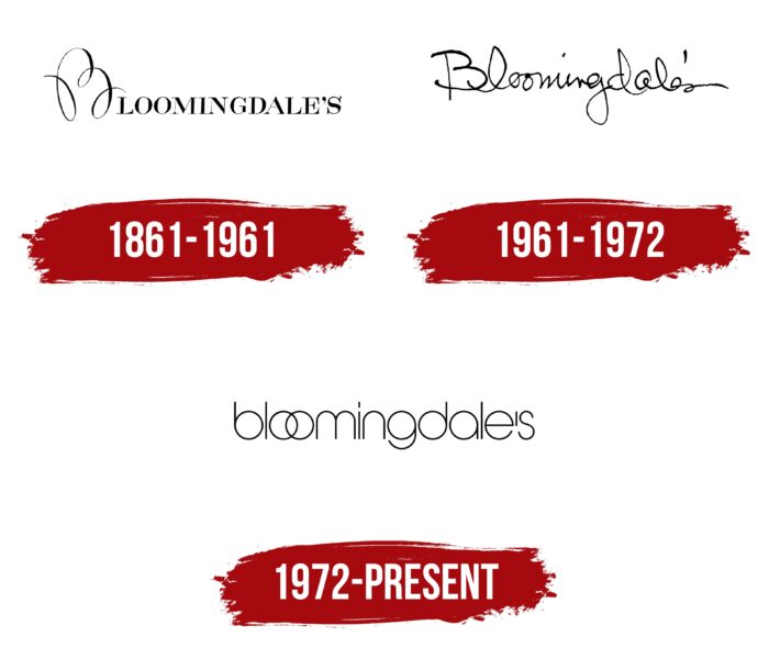
The remaining stores use the old sign, which appeared in 1972. And before that time, they had two more emblems, but they were almost no different from the modern one: the same design and the same concept. The difference between them is only in the style of writing the name of the trading network. In one case, it imitates handwriting; in another, it represents a set of classic printed letters; in the third, it is built on the graphic principle of similarity of glyphs.
What is Bloomingdale’s?
Bloomingdale’s are American retail stores located throughout the United States. The network includes 55 department stores with a full and partial range of goods. They first appeared in 1861 in New York, where their head center and administrative office are still located. The founders of a large-scale trading structure were the Bloomingdale brothers: Lyman G. and Joseph B. launched the business simultaneously, and Emanuel Watson joined them later. The parent company of this commercial network is Macy’s Inc.
1861 – 1961
Bloomingdale’s debut logo was used for a full hundred years. It was an elegant inscription made up of unusually shaped block letters in the upper case. Although they were located on the same line, they were uneven, clearly seen in the “G” and “S.” The effect of such unevenness arose due to the combination of too thin strokes and wide stripes. But the serifs are distinct, sharp, and straight. “B,” standing first, is much larger than the rest of the characters. It is as if drawn in an outline – with one stroke, an inextricable line, in which there are three loops and two half-arcs. Smooth curves effectively contrast with needle serifs.
1961 – 1972
The age of the second logo was very short: it lasted just over ten years. The emblem of the time contained Bloomingdale’s original signature, with the addition of an apostrophe and an “s” at the end, indicating that it was not one person but several. The idea of a family business was conveyed in a white handwritten nameplate. She was the poster. The word was completely coherent: all the characters had different forms of transition from letter to letter, forming a single whole.
1972 – today
In 1972, Bloomingdale’s launched a visual identity brand still in use today. It is elegant and unusual. The letters in it look like geometric glyphs in thin frames. Straight lines are harmoniously combined with rounded elements resembling rings. Among them are “b”, “o”, “g”, “d”, “a”. To achieve this effect, the designers have converted the inscription to lower case, consisting only of lowercase letters, where the first two “o” overlap each other, like tightly linked rings. The color scheme remains the same – black characters on a white background.
Font and Colors
Trading company Bloomingdale’s uses text logos: it does not have any graphic characters. Their evolution moved evenly, as redesigns were rare: since 1861, only three versions of the logo have been presented. The first and third are printed, and the second is handwritten.
For the debut logo, the developers chose an antiqua font with sharp serifs at the ends of the letters, consisting of thin and wide lines. The second time, a typeface imitating a handwritten style was used. The inscription in the third emblem is made by Quinfo ExtraLight by Alvaro Thomaz. The corporate palette is standard and combines black letters with a white background.
Bloomingdale’s color codes
| Black | Hex color: | #000000 |
|---|---|---|
| RGB: | 0 0 0 | |
| CMYK: | 0 0 0 100 | |
| Pantone: | PMS Process Black C |


