


![]() BMW M Logo PNG
BMW M Logo PNG
Cars bearing the BMW M logo are only for brave, energetic, and fearless people. High-speed riding on them causes a wide range of emotions. It attracts buyers more than the body’s exterior design.
BMW M began in January 1972 with a call from BMW sales director Bob Lutz to Jochen Neerpasch, a former Porsche driver and head of Ford’s racing department in Cologne. On 1 May 1972, Neerpasch took charge of the newly registered BMW Motorsport GmbH, a 35-person unit near Munich. The M tricolor logo also appeared that year, with blue for BMW, red for motorsport, and violet for their link.
The first major project was the BMW 3.0 CSL. In 1973, it won the European touring car title in its debut season. From 1973 to 1979, the car took six European endurance titles, raced at Le Mans, and won at Daytona. Its racing version reached up to 440 horsepower.
BMW then planned a road supercar with Lamborghini. Still, the Italian company collapsed, so Baur handled body construction, and Giorgetto Giugiaro of Italdesign shaped the design. The M1 debuted at the 1978 Paris Motor Show with a 277 hp inline-six. About 453 were built. In 1979, BMW launched the Procar series, in which Niki Lauda, Nelson Piquet, and other Formula 1 drivers raced identical “M1s”.
The M535i followed in 1979 as the first daily-use M car. In 1983, Nelson Piquet won the Formula 1 world title in a Brabham BT52 powered by BMW’s turbo engine. The M635CSi and M5 E28 arrived in 1984, and the E30 M3 followed in 1986, later taking more than 1,400 racing wins. In 1993, BMW Motorsport GmbH became BMW M GmbH. Later milestones included the 1999 Le Mans-winning V12 LMR, the M3 E46, the V10-powered M5 E60 in 2005, and the X5 M and X6 M in 2009.
Meaning and History
![]()
According to the BMW Group archives, the first version of the BMW M logo was introduced in 1973. It adorned the legendary 3.0 CSL from the New Six family, which was then making its debut in races. The final design of the model was developed by two people: Manfred Rennen (an employee of the company responsible for the exterior) and Pierre Mendell (a hired specialist). True, there was only a color scheme combined from red, purple, and blue at that time. And the letter “M” appeared much later, in 1978, when the BMW M1 left the track.
Over time, the logo has been improved. Instead of purple, a completely different color is used, dark blue. White has also been added to highlight the “M,” which used to be voluminous and silver but is now 2D in a 2020 update.
It is known that many people contributed to the unit’s emblem. In addition to Manfred Rennen, who came up with the stripes, Wolfgang Seehaus (automotive interior designer) was involved in the process. Specialists at the Italian design bureau Italdesign were responsible for the “M” symbol, employees of the Swiss company Müller for the first version of the logo, and representatives of the German agency Pierre Mendell for the final version. Together, they created an iconic sign that has hardly changed over the decades.
What is BMW M?
BMW M is the high-performance division of the German company Bayerische Motoren Werke AG. It was established in 1972 to produce sports cars and was originally known as BMW Motorsport GmbH. In 1993, the name was shortened to simplify the brand’s perception.
1972 – 1973
![]()
The BMW M sports car division was originally known as BMW Motorsport GmbH. This was reflected in its old logo, which featured concise black text on a white background. The bold sans-serif font, similar to Roger White’s Yoxall Bold, emphasized the brand’s seriousness and responsibility.
1973 – 1978
![]()
In 1973, a multilayered circular logo appeared on racing cars. In the center was a small circle divided into four white-and-blue segments, surrounded by a black ring with the white lettering “BMW.” The outer layer of the emblem consisted of asymmetrical blue, white, and pink semicircles.
1978 – 1993
![]()
In 1978, the BMW M1 car debuted with a new emblem. The designers highlighted the main colors that characterized BMW Motorsport:
- Blue: part of the corporate style of Bayerische Motoren Werke (inspired by the flag of the Free State of Bavaria);
- Red: a symbol of motorsport;
- Purple: a shade that results from the merging of blue and red, used for a beautiful transition between them.
It is believed that the choice of this palette was made by Manfred Rennen and Wolfgang Seehaus, who are responsible for the exterior and interior design of cars. The logo featured three skewed stripes forming a single large parallelogram. To the right of the geometric shape was a dark gray “M,” the first letter of the word “Motorsport.”
Rumor has it that red was initially chosen to win over Texaco, which was set to become a BMW M sponsor. But the deal fell through after the emblem had already been developed. The designers decided not to change anything, as the three-stripe livery suited the cars perfectly.
1993 – 2020
![]()
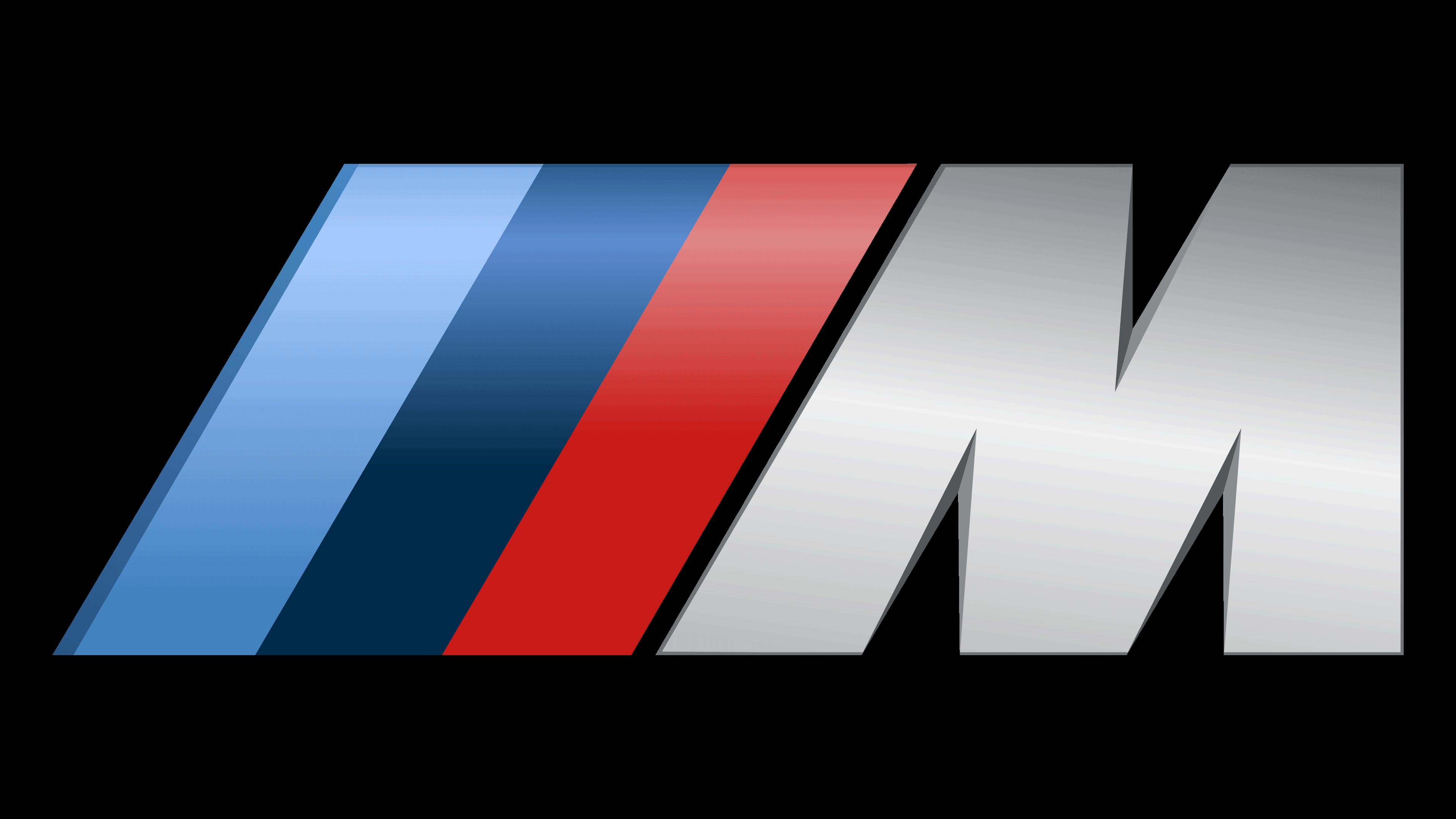
In 1972, the BMW Motorsport brand was born, later renamed BMW M. The racing cars of this division needed their recognizable symbol. It was a combination of three diagonal stripes of blue, dark blue, and red, based on a silver-gray letter “M.” The angles of the three-color lines and the leftmost stroke “M” coincided. For the design, the designers used a linear gradient. They also added darkened thin outlines to some elements.
2020 – today
![]()
BMW M executives decided to simplify the color scheme to make the logo easier to reproduce in printed materials. So the gradient disappeared, and the letter became just white. Shadows have also been removed. To the best of our knowledge, the employees of the Pierre Mendell studio worked on this option.
2022 – today
![]()
To celebrate its 50th anniversary, BMW M revived the circular logo used in the 1970s. Its new version appeared on cars released in March 2022. The emblem replaced the standard white-and-blue circles on the wheel hubs and on the front and rear bumpers. The modern version differs from the classic one with a darker color scheme. The letters “B,” “M,” and “W” are no longer white but gray. The semicircle, which used to be a soft pink, is now burgundy. The inner circle has become larger, as has the black ring surrounding it.
Font and Colors

Given that the division produces racing modifications to cars, its graphics should be dynamic. Designers conveyed the energy of movement through speed lines, three stripes pressed against the “M.” The fact that they are directed in the same direction and have identical width and length emphasizes the high speed of sports cars. This emblem was given the unofficial name Giugiaro M.
The large “M” for the brand name is in italic, bold sans-serif. The current version is white, and the lines adjacent to it have three colors: blue, dark blue, and red. In the past, purple was used instead of dark blue. The red originally symbolized the Texaco Grand Prix, while the blue was taken from the BMW logo. As director Jochen Neerpasch admitted, this color scheme was chosen because the shades did not merge in black-and-white shots.