


![]() Bobcat Logo PNG
Bobcat Logo PNG
The Bobcat logo looks sinister, but the company does not do anything as mystical as producing construction and agricultural machinery. The graphic sign symbolizes power, strength, and aggression. It also shows the company’s desire to innovate.
Bobcat’s history began in Gwinner, North Dakota, before the company built its first loader. In 1939, Edward Gideon “E.G.” Melroe created a windrow pickup attachment for harvesting grain. John Deere bought the invention for $5,000. After World War II, his sons restored the business and registered the company as Melroe Manufacturing Company in 1947. The company made pickup attachments and spring-tooth harrows, then opened a separate factory building in 1948.
The turning point came through Cyril and Louis Keller of Rothsay, Minnesota. In 1957, turkey farmer Eddie Velo needed a machine that could clean two-story barns and maneuver between support posts. The Kellers built a three-wheeled, belt-driven loader that could turn in tight spaces. After their uncle Anton Christianson, a Melroe dealer, introduced them to Melroe, the machine was shown at the 1958 Minnesota State Fair. Melroe hired the Kellers, and the M60 production model followed.
In 1960, Melroe introduced the M400, the world’s first four-wheel skid-steer loader. Its steering worked by varying the speeds of the left and right wheels, allowing it to operate where tractors and tracked excavators could not. In 1962, the M440 became the first model to carry the Bobcat name. Les Melroe and advertising agent Lynn Bickett chose the name during a drive from Minneapolis to Gwinner, pairing it with the slogan “tough, quick, and agile.”
By 1967, Bobcat loaders generated 65% of Melroe Manufacturing’s revenue. In 1969, the Melroe family sold the company to Clark Equipment Company. Clark expanded production, patented the Bob-Tach attachment system in 1972, and reached the 100,000th loader in 1981. Bobcat was later acquired by Ingersoll-Rand in 1995, became Bobcat Company in 2000, and was sold to Doosan Group in 2007 for $4.9 billion. In 2008, the 750,000th loader was produced.
Meaning and History
![]()
The company’s logo was changed three times in search of an image that best matched the name.
What is Bobcat?
American manufacturer of small excavators and lifts, founded in 1947.
1947 – 1962
![]()
The first logo could have been more original. The name is in white letters on a black oval, reminiscent of an exit sign. entrance
Melroy attachments have been designed for planting and harvesting applications. Therefore, the black background serves as a prototype of Earth.
White letters symbolize easing the burden of hard work. For an emigrant from Norway, they reminded them of the cold and snow of their native country. Unusual uneven type, like clods of earth that spring harrows designed by Melrow harrowed.
However, for uninformed potential customers, the logo needed to convey more information to convey what the company was offering.
1962 – 1972
![]()
In 1955, the plant’s founder died. Management passed to his children, and the enterprise concept was gradually revised. The new owners immediately changed the list of manufactured goods, and in 1962, they changed the company’s name. This led to a change in the logo.
The previous visual sign with the same name was left as a small oval on the left side of the composition. And from it to the right, a more extensive white oval with a black border moved. Inside is a red image of a lynx and a bold black capital-letter signature with the new Bobcat name.
Such a composition made it clear that another, more promising, and larger one had developed from an existing company. Its products make life much easier for workers, as evidenced by the changing background.
The word Bobcat in translation means “lynx.” So the people began to call the first mini-loader that came off the company’s assembly line. The nickname reflects its small size, speed, agility, and strength. The car allowed moving in tight spaces and rearranging loads. At the same time, its lightweight design made it suitable for use in the mountains.
The jumping red lynx was the focus of the new logo design. The animal indicated an aggressive takeover of the market, a significant leap forward. The red color was associated with the pace of technological change. She is as fast as fire.
Bold, large letters of the name attracted attention, making it well remembered. They showcased the new brand’s confident positioning, as the company’s offer was the best in its segment.
1972 – 2001
![]()
In 1969, the company was acquired by Clark Equipment and began modernizing production and rebranding.
The emblem was simplified by removing the first logo. The name “Bobcat” is located in the lower-right corner of the composition. All letters in the inscription have been rendered lowercase, which hints at the models’ diminutiveness. The roundness of the letters suggests a resemblance to wheels, and the absence of sharp corners indicates the loaders’ maneuverability. They were distinguished by their ability to avoid collisions with corners and obstacles, even in tight spaces.
From the upper left corner, the muzzle of a grinning lynx looks at the inscription. The animal is not directly related to the company’s products but is the company’s visual mascot, and the nickname “Bobcat” had been fixed in America for all miniature loaders by that time.
The logo looks like the lynx is about to jump out of its hiding place. She has a lot of energy, and she is strong and fast. It is these characteristics that distinguish the manufacturer’s technique.
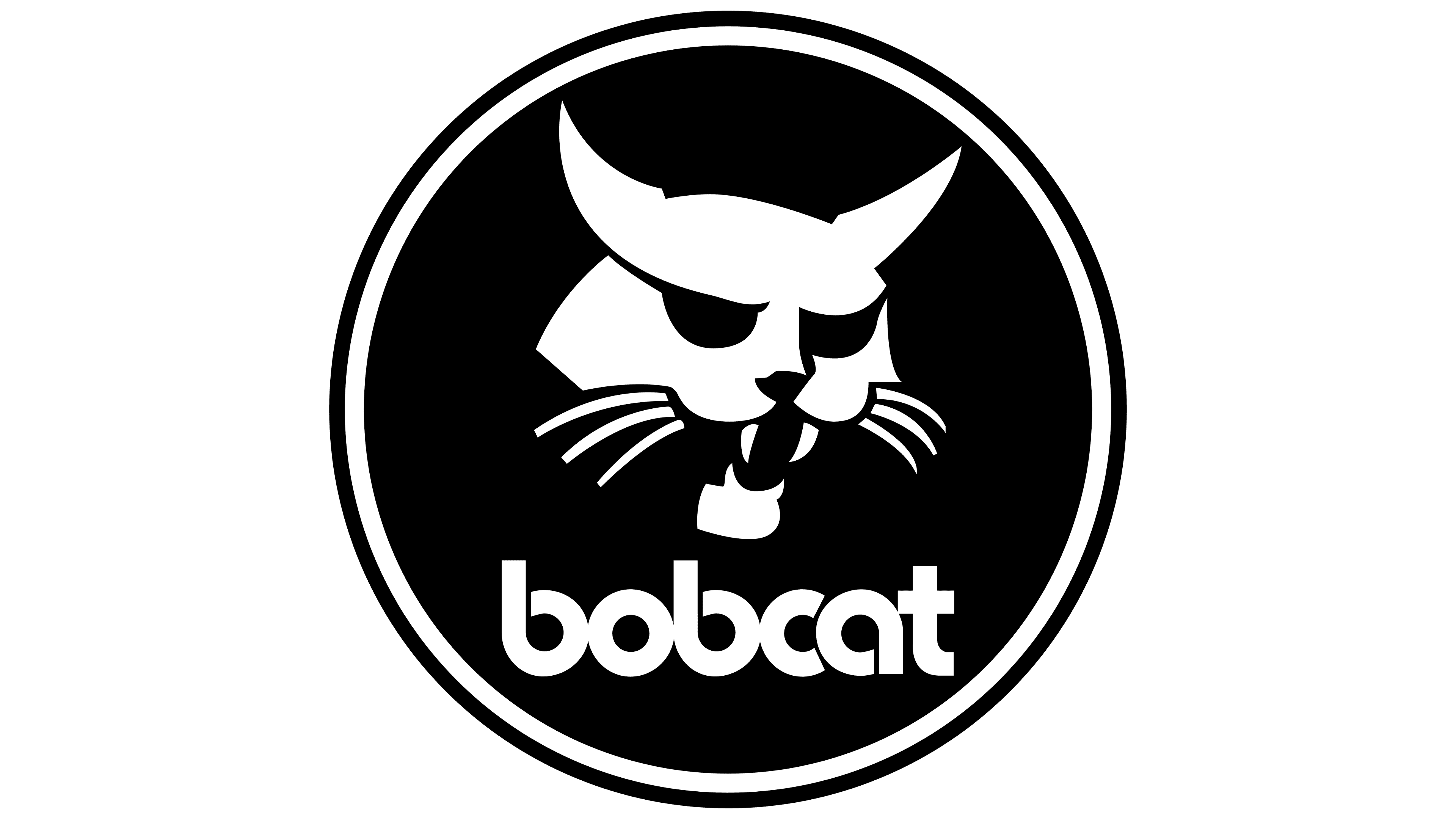
2001 – today
![]()
Bobcat teamed up with the Czech excavator firm Superstav to launch mini excavators in 2002. While expanding the product list, we also worked on the logo.
The lynx’s head was lowered right in front of the name. The firm has grown so much that it no longer deserves to be looked down upon. The composition shows that at first the models resembled a predator; a nickname was coined, and only then was the company’s name changed.
The name is capitalized, indicating that Bobcat has become a major, worldwide brand. The close arrangement of letters in the inscription hints at the technique’s compactness.
Font and Colors
The logo is built on the contrast of black and white.
- Black is a symbol of earth, hard work, and the strength and power of Bobcat equipment.
- White indicates the lightweight, maneuverable nature of the machines, which significantly simplifies work. The color is also used to color many of the firm’s models and symbolizes purity and sterility. The machines work neatly on “jewelry” and leave the workplace clean.

The lettering font is similar to the Bahnschrift SemiBold Condensed.